Alexey Brodovitch

kimair

frozen
Joined
May 8, 2003
Messages
14,463
Reaction score
1
from communication arts magazine:
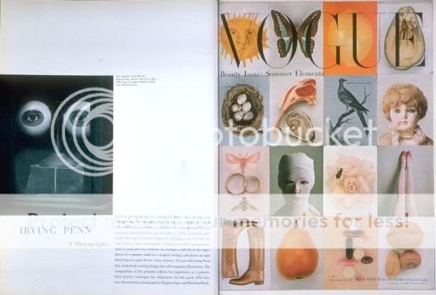
His contribution to contemporary magazine design while art director of Harper’s Bazaar would be sufficient enough to honor Alexey Brodovitch as a pioneer in graphic design, but his influence was much greater. He was one of the first to introduce European modernism of the 1920s to the United States both by his own work and by commissioning art and photography from leading European artists and photographers, including A.M. Cassandre, Salvador Dali, Henri Cartier-Bresson and Man Ray. Through his lifelong dedication to teaching, he created a generation of designers who shared his belief in visual vitality and immediacy. Fascinated with photography, he fostered an expressionistic approach that became the dominant photographic style of the 1950s.

Born in Russia in 1898, Brodovitch fled the Bolsheviks in 1920 with his family and future wife and settled in Paris. Brodovitch’s design career flourished in 1924 after his poster design for Le Bal Banal, a benefit dance for poor artists, was selected over many other artists including Pablo Picasso. Soon he was in great demand, designing fabric, jewelry, restaurant décor, posters and department store advertisements.

Invited to the United States in 1930 to start an advertising art department at the Philadelphia Museum School of Industrial Art, Brodovitch began his teaching career while completing numerous freelance assignments. In 1934, Carmel Snow, the new editor of Harper’s Bazaar, saw his design work and immediately hired him to be its art director. It was the beginning of a 24-year tenure that would revolutionize both fashion and magazine design.

By the 1950s, Brodovitch had perfected his style of combining text and photography with copious amounts of white space. Despite his easily recognizable work, Brodovitch did not formulate a theory of design. “There is no recipe for good layout,” he said. “What must be maintained is a feeling of change and contrast. A layout man should be simple with good photographs. He should perform acrobatics when the pictures are bad.”

Henry Wolf, Brodovitch’s successor at Harper’s Bazaar, commented on his unique approach to magazine layout. “Oh, of course he was a good designer and superb typographer and had an innate sense of elegance about space,” Wolf said. “But his layouts were done only as approximations. He stood in the middle of the room and, with a scissor, cut out photostats which he taped to a piece of paper. Others later straightened them. It was communicating an idea, a mood, a criticism that he was precise and masterful.”

Besides his achievements at Bazaar, Brodovitch’s legacy as a publication designer included the influential but short-lived Portfolio. Only three issues were published in 1950 and 1951. An innovative quarterly aimed at the design profession, Portfolio contained vividly illustrated features on Alexander Calder, Charles Eames, Paul Rand, Saul Steinberg and others. It also contained the work of pioneering photographers, many of whom were Brodovitch’s students. As art editor, Brodovitch helped determine the magazine’s contents, and created its distinct design with the help of elaborate devices such as die-cuts, transparent pages and multi-page foldouts. Those three issues are considered by many to be the pinnacle of Brodovitch’s design.

He continued to teach throughout his career. His Design Laboratory, which he began in 1941 at the New School for Social Research in New York, focused on illustration, graphic design and photography. As a teacher, Brodovitch was considered harsh in his criticism but inspiring, and his student list reads like a who’s who of visual communication, including photographers Irving Penn, Richard Avedon, Art Kane and Hiro, and art directors Bob Gage, Helmut Krone and Steve Frankfurt.

Today Brodovitch’s layouts continue to inspire with their energetic vitality and immediacy. His dedication to education directly influenced a generation of visual communicators and indirectly everyone else. Irving Penn said, “All designers, all photographers, all art directors, whether they know it or not, are students of Alexey Brodovitch.”

Phaidon Press has published a new monograph of Brodovitch’s work, which includes interviews with colleagues and never-before-published archival material (www.phaidon.com).
—Patrick Coyne

cover from 1956

3013p9.jpg


from April 1951 issue of Bazaar

Bazaarfingers_041941.jpg


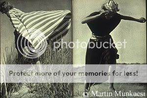
Bazaar, November 1935

Bazaarspread_111935.jpg
 
from aiga.org

2_alexey_brodovitch_bazaar4c.jpg


clockwise from top left: Sept. 1939, Oct. 1939, May 1947, Nov. 1952

5_alexey_brodovitch_blackdre.jpg


from feb. 1957 bazaar

7_alexey_brodovitch_women.jpg


from feb. 1955 issue, photography by richard avedon

10_alexey_brodovitch_picture.jpg


brodovitch at work
 
Oh I'm such a fan. He's probably the biggest influence on graphic design today. A lot the techniques he championed are now common practice. Major legend here.
 
Great man. I love the pics you posted, kimair. I really like the one of him at work...very inspirational! :heart:

I don't think there are many examples of his work on the internet, but I found a few things...

For Bazaar

brodonew.jpg


Portfolio Magazine, 1950. Photography by Irving Penn

034.jpg


Portfolio Magazine, 1950. Photography by Richard Avedon

039.jpg


http://design.rit.edu/biographies/brodovitch.html
 
Last edited by a moderator:
thanks for the topic, kimair!
and thanks for the additional pictures, luxmode!
he really is inspirational! i think i'm going to get that phaidon book:blush:
 
kimair said:
great pics...thanks luxmode! :flower:

you're welcome. thanks again for the topic :flower:

anna karina said:
i think i'm going to get that phaidon book:blush:

i have it...it's very good. here's the one i want, but it's $196 (used) on amazon :doh: :cry:

by assouline

brodovitch.gif
 
:shock:

is assouline that pricey in general, do they only print limited editions or is that special?
 
anna karina said:
:shock:

is assouline that pricey in general, do they only print limited editions or is that special?

i'm not really sure about assouline, but i just checked amazon and i think the price i quoted was for a first edition. it looks like they have other used editions for $35!!! :woot:

i'm ordering it :D
 
oh, wonderful!
maybe you can post something, some time ...^_^
 
luxmode...i have that book and it's great. i would also recommend the one by kerry william purcell published by phaidon (at phaidon.com). that one is $75, but it's a much bigger book...i'm sure you could find it cheaper at amazon.com.
 
^ i have that book too--i really love the section about his ballet book (now that's a book i'd love to own)
 
I have the Assouline book. It's great. But the Kerry William Purcell book should be better.
 
thought i could bump this thread ....

Alexey Brodovitch (also Brodovich; Russian: Алексей Бродович; 1898 –April 15, 1971) was a Russian-born photographer, designer and instructor who is most famous for his art direction of fashion magazine Harper's Bazaar from 1938 to 1958.

Early life in Russia

Alexey Brodovitch was born in Ogolitch, Russia to a wealthy family in 1898. His father, Cheslav Brodovitch, was a respected physician, psychiatrist and huntsman. His mother was an amateur painter. During the Russo-Japanese War, his family moved to Moscow where his father worked in a hospital for Japanese prisoners. Alexey was sent to study at the Prince Tenisheff School, a prestigious institution in St. Petersburg, with the intentions of eventually enrolling in the Imperial Art Academy. He had no formal training in art through his childhood, but often sketched noble profiles in the audience at concerts in the city.

(...)

Influential years in Paris

An émigré

Upon arriving in Paris, Brodovitch wanted to be a painter. A Russian émigré in Paris, Brodovitch found himself poor and having to work for the first time in his life. He took a job painting houses, while his wife Nina worked as a seamstress.[8] They lived in a cheap, small apartment in the area of Montparnasse, among other Russian artists who had settled in Paris at the end of the 19th century. This group of artists, including Archipenko, Chagall, and Nathan Altman, would meet at the inexpensive Académie Vassilieff, which offered painting and sculpting classes without an instructor.[9] His connections with these young Russian artists led to more artistic work as a painter of backdrops for Diaghilev's Ballets Russes.[10]
Paris was a cosmopolitan city through which many artists and art movements passed. Brodovitch was exposed to everything from Dadaism from Zurich and Berlin, Suprematism and Constructivism from Moscow, Bauhaus design from Germany, Futurism from Italy, De Stijl from Holland, and the native strains of Cubism, Fauvism, Purism and Surrealism. Among these various artistic influences, Brodovitch found his beginnings as a designer.[11]

The move to graphic arts
On nights and weekends away from the Ballets Russes, Brodovitch began sketching designs for textiles, china, and jewelry. By the time his work for the ballet had finished, he had already compiled an extensive portfolio of these side projects and was selling his designs to fashionable shops.[12] He worked part-time doing layouts for Cahiers d'Art, an important art journal, and Arts et Métiers Graphiques, an influential design magazine. While working on layouts, Brodovitch was responsible for fitting together type, photographs, and illustrations on the pages of the magazines. He had the rare opportunity of having influence over the look of the magazine as there was no art director.
He gained public recognition for his work in the commercial arts by winning first prize in a poster competition for an artists' soiree called Le Bal Banal on March 24, 1924. The poster was exhibited on walls all over Montparnasse along with a drawing by Picasso, who took second place.[14] Brodovitch remained proud of this poster throughout his career, always keeping a copy of it pinned to his studio wall. The graphic, light-to-dark inversion of its mask shape, type, and background suggest not only the process of photography, but also represents the process of trading one's identity for another when wearing a mask.[15] It is the oldest surviving work by Brodovitch. He continued to gain recognition as an applied artist due to his success at the Paris International Exhibit of the Decorative Arts in 1925. He received five medals: three gold medals for kiosk design and jewelry, two silver medals for fabrics, and the top award for the Beck Fils pavilion "Amour de l'Art."[16]
After these wins, Brodovitch's career as an applied artist took off. In 1928 he was hired by Athélia, the design studio of the Parisian department store Aux Trois Quartiers, to design and illustrate catalogues and advertisements for their luxury men's boutique, Madelios.[17] Brodovitch was aware that many of the customers were fairly traditional in their tastes, so he balanced out his modern designs with classical Greek references.

Although employed full-time by Athélia, Brodovitch offered his service as a freelance designer on the side. He started his own studio, L'Atelier A.B. , where he produced posters for various clients, including Union Radio Paris and the Cunard shipping company. He was also commissioned by the Parisian publishing house La Pléiade to illustrate three books: Nouvelles by Alexander Pushkin, Contes Fantastiques by Fyodor Dostoyevsky, and Monsieur de Bougrelon by Jean Lorrain.[18]
Brodovitch embraced technical developments from the spheres of industrial design, photography, and contemporary painting. His broad curiosity began to assimilate the most interesting aspects of all these fields into his work, eventually making them his own.[14] He later instilled this same curiosity in his students, encouraging them to use new techniques like the air brush, industrial lacquers, flexible steel needles, and surgical knives.[19]
By the age of 32, Brodovitch had dabbled in producing posters, china, jewelry, textiles, advertisements, and paintings. Eventually specializing in advertising and graphic design, he had become one of the most respected designers of commercial art in Paris. By 1930, however, Paris had lost its luster for Brodovitch. The once-flourishing spirit of adventure and experimentation was fading away. Although he was offered many design positions, Brodovitch turned them down, presumably looking for new locales to advance his designs.
 
....
Brodovitch as instructor

[edit]A new approach to teaching
While still living in Paris, Brodovitch was offered a job by John Story Jenks, the father of a young girl Brodovitch had shown around the arts scene in Paris. Jenks, a trustee of the Pennsylvania Museum School of Industrial Art (currently the University of the Arts), was overwhelmed by Brodovitch's talents and asked him to head the school's Advertising Design Department. In September 1930, Brodovitch moved to Philadelphia with his wife and son to take the job. Brodovitch began teaching advertising design, creating a special department devoted to the subject.[3]
Brodovitch's task was to bring American advertising design up to the level of Europe's, which was thought to have a far more modern spirit.[21] Before his arrival, advertising students were simply copying the magazine styles of N. C. Wyeth and Howard Pyle. The illustrations were beautiful, but had evolved from the tradition of 19th-century romantic realism, a thing of the past.[22] Brodovitch's teaching technique, on the other hand, was unlike any other the students had been exposed to. He would always teach with a visual aid. Brodovitch would bring into class French and German magazines to examine the pages with his students, explaining the artist's work or technique. He would raise questions like, "Could this line be better? Could it be like, for example, Cocteau?"[23] When not in the classroom, Brodovitch would take the class on outings around Philadelphia to see factories, laboratories, shopping centers, housing projects, dumps, and the zoo. The students were then told to make a "graphic impression" of what they had seen, whether a photographic interpretation, a drawing, or an abstraction. Brodovitch did not teach in the conventional sense, but rather compelled his students to discover one's inner, creative resources.[19]
[edit]Design laboratory
In 1933, Brodovitch added the Design Laboratory to the classes he offered. It was meant to be a workshop for his advanced students who wanted to experiment with all aspects of design. Brodovitch shared the Bauhaus belief that you needed to educate the whole individual by directing his or her attention to a variety of modern solutions in their graphic projects.[24] His course description for the Design Laboratory read:
The aim of the course is to help the student to discover his individuality, crystallize his taste, and develop his feeling for the contemporary trend by stimulating his sense of invention and perfecting his technical ability. The course is conducted as an experimental laboratory, inspired by the ever-changing tempo of life, discovery of new techniques, new fields of operation...in close contact with current problems of leading magazines, department stores, advertising agencies and manufactures. Subjects include design, layout, type, poster, reportage, illustration, magazine make-up, package and product design, display, styling, art directing.[25]
The lab was split into two sections per week, one for design and one for photography. The workshops were immensely popular, and it was not unusual for more than sixty people to show up to his class on the first night. Among the photographers who attended his classes were Diane Arbus, Eve Arnold, Richard Avedon, Lisette Model, and Garry Winogrand.[26]
[edit]Students on Brodovitch
"He taught me to be intolerant of mediocrity. He taught me to worship the unknown." - Art Kane, fashion and music photographer[27]
"I learned from him that if, when you look in your camera, you see an image you have ever seen before, don't click the shutter." - Hiro, fashion photographer[28]

Notable students
Graduates of these early courses went on to prominent careers in the field. Brodovitch's department came to be known as a 'prep school' for agencies and magazines around the country.

Richard Avedon
Lillian Bassman
Paul Himmel
Hiro
Roy Faulconer
Mary Fullerton, assistant to Brodovitch at Harper's Bazaar and art director of Mademoiselle
Stewart Graves
Joseph Gering, Brides
Robert Greenwell, art director of RCA Records
Nelson Gruppo, art director at Stage, Promenade, and This Week
Joe Jones, House Beautiful
Elizabeth Lovett
Allan Porter, editor in chief Camera magazine
Alfred Lowrey, art director at Good Housekeeping, American Weekly, and Newsweek
Ed Schartzer, with N. W. Ayer and Son
David Steck, Life Magazine
Victor Trasoff, art director of CBS
Irving Penn Vogue Magazine
Ted Croner

Harper's Bazaar

In spring of 1934, the Art Directors Club of New York asked Brodovitch to design their "13th Annual Art Directors Exhibition" at the Rockefeller Center, New York.[30] It was there that Carmel Snow, the recently appointed editor-in-chief of Harper's Bazaar, saw Brodovitch's work for the first time. She knew right away that Brodovitch would be the one to transform the magazine into a real revival of Vogue, where she had started her career.[31]
I saw a fresh, new conception of layout technique that struck me like a revelation: pages that "bled" beautifully cropped photographs, typography and design that were bold and arresting. Within ten minutes I had asked Brodovitch to have cocktails with me, and that evening I signed him to a provisional contract as art director.[32]
The offer was, of course, dependent on the approval of the owner of Harper's Bazaar, William Randolph Hearst. Brodovitch eagerly returned to Philadelphia and assigned his students apprenticing at his Van Pelt Street studio to make two dummy issues of the magazine. He insisted that each page have a "shock value" of its own to set the magazine apart, "cutting paper dolls out of patterned paper, or illustration perfume bottles to look like high key photography - whatever was unlike other fashion magazines was tried."[33] Although preferring more conservative design, Hearst put his trust in Carmel Snow and allowed her to take on Brodovitch as art director where he remained for 24 years.
The new look of Harper's Bazaar emphasized culture for its own sake. Taking advantage of Brodovitch's contacts in Europe and his wide knowledge of photography, the magazine introduced the work of may artists and photographers to its American audience. Before starting at Harper's Bazaar, Brodovitch organized a return trip to France, hoping to convince old friends to work with him at the magazine. Each summer he would return to offer commissions to artists and photographers until 1939 when the start of World War II made it impossible. By continually bringing in creative forces from overseas, he kept the magazine permanently fresh and cutting-edge. Among the artists that worked for Bazaar were Jean Cocteau, Raoul Dufy, Leonor Fini, Marc Chagall, Man Ray and A. M. Cassandre, the most eminent poster artist in France at the time, replacing the former cover favorite, Erté.[34][35]

The style of Harper's
To those who worked with him at Azar, the pinnacle of Brodovitch's career as a designer was the unfailing elegance of his pages. This elegance, combined with an element of innovation was the ideal mix for a fashion magazine. The quality that guaranteed his success was his devotion to the new, unending surprise and vitality.[36] Frances MacFadden, Bazaar's managing editor for much of Brodovitch's tenure, explained his working method:
It was a pleasure to watch him work. He was so swift and sure. In emergencies, like the time the Clipper bearing the report of the Paris Collections was held up in Bermuda, his speed was dazzling. A quick splash or two on the cutting board, a minute's juggling of the photostats, a slather of art gum, and the sixteen pages were complete. His layouts, of course, were the despair of copywriters whose cherished tone poems on girdles or minks had to be sacrificed to his sacred white space. Just before we went to press, all the layouts were laid out in sequence on Carmel Snow's floor, and there, under his eye, re-arranged until the rhythm of the magazine suited him.[37]
Typically, Brodovitch would begin his layouts by designing the layouts as illustrations by hand. His assistant would receive these sketches to look over, but the photographers and freelance writers were often given little or no direction at all besides to come up with something new and unusual. When the photographs for the issue arrived, he would pick the most visually interesting and have a variety of sizes of reproductions made on a photostat machine. From these, each spread would be made one at a time, then arranged among the others to create a well-paced magazine.
His style for the magazine was radically different than any of its contemporaries. Brodovitch wanted his spreads to be innovative and fresh. While other fashion magazines thought it important to show the whole garment, Brodovitch would crop images unexpectedly or off-center to bring a new dynamism to the layout. He used forms in the photographs or illustrations as a cue for how to handle the shape of the text. In his earlier layouts, he would arrange photographs like playing cards, splayed out on the page or in the shape of a fan. Later in his career, however, he abandoned this technique in favor of using only one or two images to a page. Surrealism found its way onto the pages of the magazines in various experimental forms. For example, Brodovitch once used fashion photographs sent via radio from Paris to New York in blurry forms to communicate this new way of sharing information. Designs also included torn edges on photographs, or pages made to look as they had been torn through with a woman's figure stepping out of them. The motif of isolated body parts, another common Surrealist theme, could be seen on the covers and spreads of Harper's in the form of lips, hands, and eyes.
Brodovitch was sensitive to the fact that color was relatively new in magazines, with laborious preparation and high costs. By using process or second color inventively, Brodovitch was able to give the magazine an added sense of currency and luxury. He applied color to his layouts expressively, often choosing to use colors bolder than might be seen in the real world. Even after full-color reproduction became standard practice, he still used broad swaths of single colors for bold emphasis.
In terms of photography, Brodovitch had a distinct feel for what the magazine needed. He favored on-location fashion photography as opposed to the studio shots normally used in other fashion publications. He urged his photographers to look for jarring juxtapositions in their images. One such spread features a woman in a full-length Dior gown posed between two circus elephants. The cinematic effect, a trademark characteristic of his layouts, involved using photographs as if they were stills from a film. He would repeat a pose or a dress several times across a spread to give a narrative, temporal feeling. At times, Brodovitch would arbitrarily take a series of photographs and adopt a story line to go with them, as though recapping a movie. He was known to push this idea even further by adding film sprocket borders to photographs at times. Brodovitch also often emphasized spatial illusions, using type and photographs to create multiple perspectives within a space. The notion of mirroring and doubling also interested him, as can be seen in how he paired similar pictures on a spread or dividing halves of one image across the gutter of the page.
With this goal of story-telling, Harper's Bazaar can be seen as an example of a mediascape, in that Brodovitch was trying to construct a reality for the imaginations of the readers. He would create versions of small movie stills or spreads in which woman were supposed to see themselves rather than the model. For example, he would often use a model's silhouette rather than her whole form, or keep her face in shadow, so that any reader could place themselves in those fashions, leading a charmed life. The result would be a magazine of images "out of which scripts can be formed of imagined lives."

wiki ...
please find the whole article, here : http://en.wikipedia.org/wiki/Alexey_Brodovitch
 

Users who are viewing this thread

New Posts

Forum Statistics

Threads
210,746
Messages
15,126,495
Members
84,474
Latest member
YourGalSylvia
Back
Top
monitoring_string = "058526dd2635cb6818386bfd373b82a4"
<-- Admiral -->