Roberto Cavalli F/W 07.08 : Kate Moss, Jessica Stam and Pete Doherty by Mert & Marcus

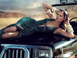
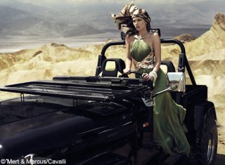
can someone confirm if its Stam? Rimoe perhaps?

heheh, I think it looks a bit like Jeisa - I guess it's blurry enough we can all insert our fave models. Anyway, I'm quite happy that Kate&Pete got this one, icons as they are, rather than the "classic beauty" Catherine...that girl needs time to develop rather than sink a bunch of ads the first thing she does. Remeber FW05/Bianca Balti, anyone?
 
Pete doesn't look half-bad, to be honest, and I'd never have thought I'd be saying that. Though they look more like images from an editorial than actual ads.
 
Actually, to be honest, these aren't half bad. Despite the fact that I have seen the style a couple of times, I think the approach they took was just great. =] Of course, I am a fan of Kate Moss, so that might be it also. xD
 
matsudaseiko said:
'm quite fed up with all these subjective one word negative comment sometimes, just because personal views on the model or the designer's private life should have NOTHING to do with the appreciation of an art work, even a commercial ones that is.

Would you rather everyone make comments such as "well designed", "excellent photos", etc.? This is a forum filled with completely different people; you cannot expect everyone to abide by your feelings. I for one will not change my opinion over this advertisement just because you're fed up with comments like mine.
 
honestly, is this the roberto cavalli man?

pete_doherty.jpg

http://www.people.com/people/gallery/0,,20043510_3,00.html
 
Pete looks great! However the shoot in general suck big time. Cavalli has gone beyond kitsch/boring.
 
Kate looks great but....who is paying attention to the clothes?? anyone? anyone? bueller? Anyways, it's probobly GOOD that they have this gimmick for their new ads...it peaks a little more interest.
 
More of the campaign..
 

Attachments

  • petekate6L2506_468x352.jpg
    petekate6L2506_468x352.jpg
    42.7 KB · Views: 79
  • petekate7L2506_468x345.jpg
    petekate7L2506_468x345.jpg
    36.6 KB · Views: 94
THATS Kate!!! OMG they've actually edited her BEYOND recognition! I was about to ask someone to ID that model! :innocent: :lol:
 
Personally I think Catherine McNeil would've looked great for the mood of the collection. She has that silver screen vamp look. Imagine her, at night in soft focus lighting, with some fog maybe.....again, my mind goes back to Casablanca with this collection, totally film noir.

Although I like the overall look of this campaign, I have to say that this sounds absolutely divine. I'm imagining those eyes already :wub:
 
very very boring i hate m&m and i just don't understand how they can choose pete as the face of men's line they must be out of mind
 

Users who are viewing this thread

New Posts

Forum Statistics

Threads
210,680
Messages
15,123,570
Members
84,382
Latest member
ericbaig68
Back
Top
monitoring_string = "058526dd2635cb6818386bfd373b82a4"
<-- Admiral -->