Baby steps.
However, the layout looks good, but how sad is it that UK VOGUE, is now the home of UK Harper’s Bazaar’s old layout. I mean, how unoriginal can you get.
The sadder part is, notwithstanding the unoriginality, this layout still looks WAY WAY WAY WAY better than his first one. And PS, Edward shouldn’t get a free pass for having to change his art direction in less than a year. That show’s lack of a firm direction. Remember how people here criticized Alt for changing her art direction often?
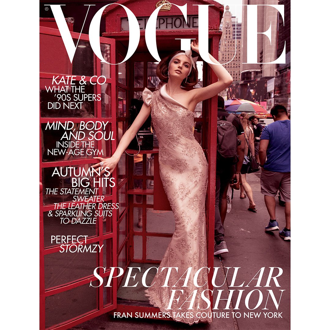
The image, like what Vogue28, said, is too busy for my taste. It had a lot of potentional to be honest. However, the busy streets killed it for me. This looks like an ANTM photo of the one who gets eliminated in that episode.
Having said that, I still prefer this over his recent covers.
But you should all CHECK OUT INEZ’S Instagram! The editorial looked DIVINE!

 . Joke aside. I don't like the styling but like the glamorous vibe. Will see


