Balenciaga S/S 2019 by Robert Yager

quite boring, I am afraid... like the diversity though...
 
The American Version of Dolce & Gabbana’s La Famiglia Italiana has arrived people.
 
In a time where everything is photoshopped, filtered and enhanced, it's refreshing to see images like these.
 
I like this! Curious to know who shot it... Feels a bit Dana Lixenberg and a bit Christine Osinski. I'm on board!
 
I hope there are more images because this is great. The cold atmosphere really suits the brand and even though it's black and white, the clothes still really speak for themselves.
 
Very boring!!! It makes me yawn. Why Balenciaga treats poverty so banally?
 
Bloodless. His first campaign has been the only one I've liked, the sideways format lent his clothes some magnificence and it elevated his love for banality.
 
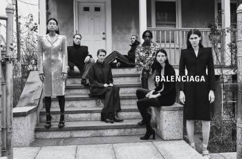
Wonder whether this was shot by Ethan James Green. I like it! Very dark and austere. Plus the clothes are shown off in a very flattering light.

Balenciaga appears to be following a very strict advertising approach for this campaign. Based on the 5 x March magazines I've seen so far, the campaign only appears after the first fashion editorial in the magazines, and in 4-page format, which means that it's not in the front of the book next to Gucci, LV, Chanel and all the others. Should be noted that magazines don't generally slot in advertising space between editorials because they want a seamless flow.
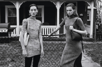
I imagine having the campaign much further in the magazine also guarantees that the reader can't flip past it to rush to the content, plus the styling of the campaign is in such a way that it's quite easy to mistake it for actual magazine content when it is, in fact, an ad. Note how there's no logo on the second double page shot.
 

Users who are viewing this thread

New Posts

Forum Statistics

Threads
210,723
Messages
15,125,164
Members
84,423
Latest member
Figedifug
Back
Top
monitoring_string = "058526dd2635cb6818386bfd373b82a4"
<-- Admiral -->