-
Live Streaming... The S/S 2026 Fashion Shows
New York Fashion Week S/S 2026 Show Schedule
You are using an out of date browser. It may not display this or other websites correctly.
You should upgrade or use an alternative browser.
You should upgrade or use an alternative browser.
Bottega Veneta S/S 2023 by Maria & Louise Thornfeldt
- Thread starter ChicSaks
- Start date
WAVES
Well-Known Member
- Joined
- Aug 29, 2020
- Messages
- 3,292
- Reaction score
- 3,531
this campaign is so confusing it hurts.
unless it will be shown separate?
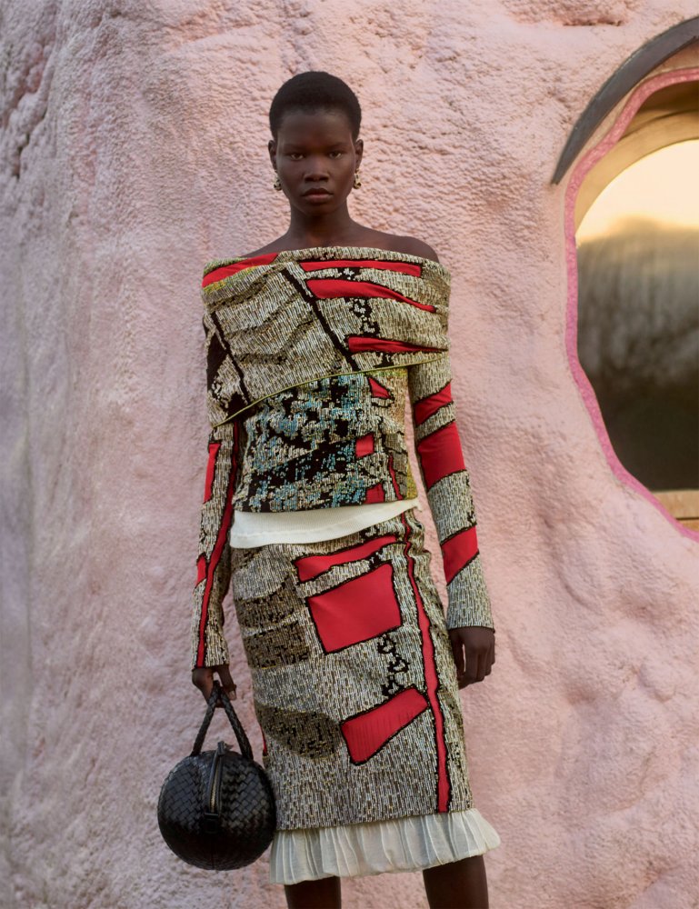
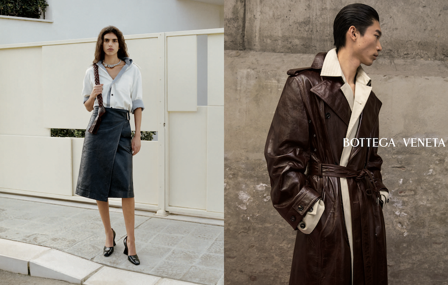
after looking at it a few times (I know but I had to), both sides of the campaign have good shots.the good collection side has the shots of the leather trench and the one with the flowing scarf (?) for instance - that little extra adds so well to it. it’s been done loads but has impact in the photography.
however I do dislike the background. it’s extremely pedestrian. find an amazing building or street with an impressive Contemporary or Modern architecture and shoot there.
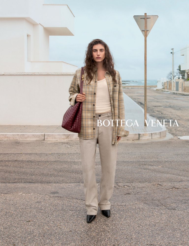
the other side of the campaign, the shirts as I will call it, is saved only by some shots where the smiles of the models are infectious enough that I cannot dislike it. that much. would I want it as a campaign? no.
those shirts should had never been on a Bottega ad campaign. reminds me of GAP!! leave it for the rails at the store nicely hanged in a corner with the denim jeans that go with it.
it’s confusing, right? or I’m just tired.
dodencebt
Well-Known Member
- Joined
- Sep 11, 2010
- Messages
- 5,235
- Reaction score
- 2,971
those shirts should had never been on a Bottega ad campaign. reminds me of GAP!! leave it for the rails at the store nicely hanged in a corner with the denim jeans that go with it.
They're actually all leather, so they're really some of the most luxurious items in this campaign.

D
Deleted member 1957
Guest
Several of these look much better but there are still a few that are more Walmart catalogue
Frederic01
Well-Known Member
- Joined
- Jun 7, 2021
- Messages
- 1,890
- Reaction score
- 4,639
Similar Threads
- Replies
- 7
- Views
- 6K
- Replies
- 0
- Views
- 708
- Replies
- 4
- Views
- 2K
- Replies
- 8
- Views
- 1K
Users who are viewing this thread
Total: 1 (members: 0, guests: 1)


