Chanel Eyewear S/S 2021 : Jill Kortleve by Oliver Hadlee Pearch

Has to be the most boring eye wear I've seen from Chanel but seems fitting for an equally boring campaign.
 
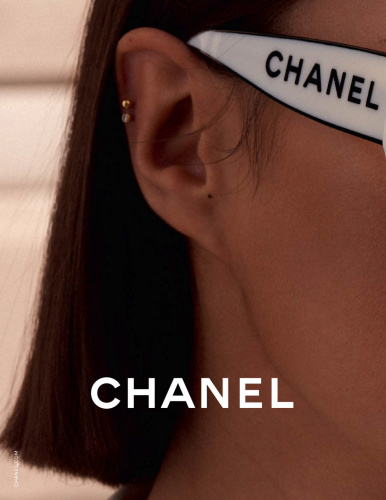
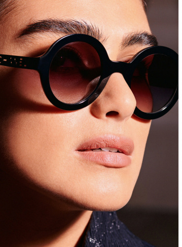
^^Just wanted to say that anyone who would buy this is getting it for the channel logo only, which looks minuscule anyway. The frames are so basic.

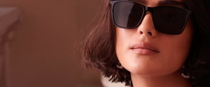
Would this be her first OG campaign? Always wondered if she'd be able to carry a campaign on her own. And I'd say no.
These images look like the search result for 'millennial CEO boss' on a stock website. Not terrible, but very generic.
 
The framing of these pictures is really awful...I only approve of the second one, the rest really don't do much in the way of selling the Chanel fantasy (and with such basic, entry level products that's vital)
 
it’s an excellent display of where Chanel is unfortunately heading these days: boring and basic. 1st and last pictures are cute...
 
I love seeing Jill got big campaign but the campaign itself looks so generic.
 
Jill is such an effortlessly gorgeous woman with a genuine smoulder that’s reminiscent of Monica Bellucci— and that she has more of an athletic body than plus sized is beside the point. It’s just unfortunate that no one thus far has been able to capture her in any images worthy of remembrance. I really hope Zara will cast her for their next campaign, so that a least she will be presented to her full potential by Meisel/Baron/Templer.
 

Vogue Mexico Digital Edition
 
  • Like
Reactions: KoV

UK Vogue Digital Edition
 

Elle France + M Le Magazine Digital Editions
 
I much prefer these last shots there’s something Mumsy about the first ones that makes them look dated advertisement wise.
 

Vanity Fair France Digital Edition
 
somebody explain her appeal to me. these look like outtakes/behind-the-scenes from the actual campaign.
 

Users who are viewing this thread

New Posts

Forum Statistics

Threads
210,677
Messages
15,123,405
Members
84,376
Latest member
Thtrfh65
Back
Top
monitoring_string = "058526dd2635cb6818386bfd373b82a4"
<-- Admiral -->