The only reason I got this issue was because I already had all my regulars and ran out of something to tie me over the weekend. There were two covers, Dev's and Mica's. Thought I'd support Tillmans by getting Dev's cover.
316 pages.
Review:
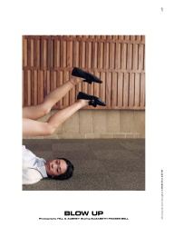
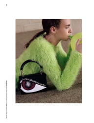
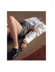
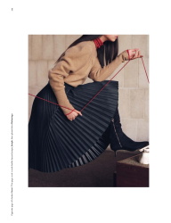
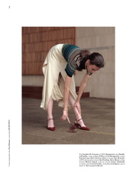
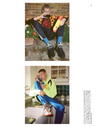
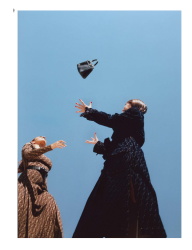
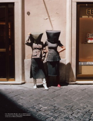
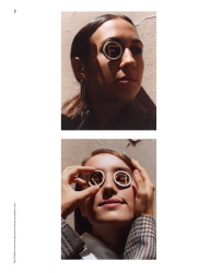
Blow Up - 6 pgs
Photographer: Hill & Aubrey
Stylist: Elizabeth Fraser-Bell
Model: Chen Liu and Emerson Lang
It's very much in the vein of those first edits you get in British Harper's where the emphasis is mostly on accessories and shoes and you never see the model's face. This one has a slightly more artsy edge, and I liked the focus on design elements.
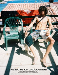
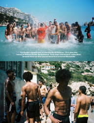
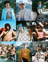
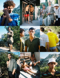
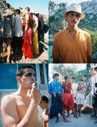
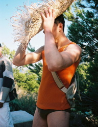
The Boys of Jacquemus - 6 pgs
Photographer: Pierre-Ange Carlotti
Stylist: No stylist credits, but Jacquemus name is bandied as the 'art director.'
Model: A bunch of young guys showing off their very newly acquired muscles in most cases. Imagine they're all models from the runway presentation.
Basically an advertorial disguised as a sort of moodboard of Jacquemus men's line. Shot in Marseilles. It looks very cluttered even though Jacquemus and Carlotti tried to pass it off as effortless. Because as with any business, the brand is trying to get as many pieces into each shot possible. The entire story eventually comes across as a fashion editorial because of all the guys. It's just not believable as story.
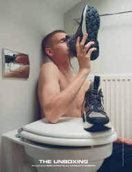
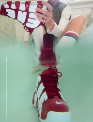
The Unboxing - 6 pgs
Photographer: Robbie Marks
Stylist: Charlotte Roberts
Model: Louis Hartley
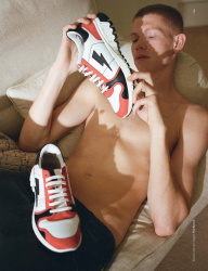
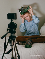
Sneaker edit, consisting of mostly the ugly variety, of course. The first shot opens with the ginger-haired male model, half naked, sniffing a pair of Stella McCartney sneakers. It's just about the most interesting shot of the lot. The rest bored me senseless and bore zero relevance to the first image. Sneaker culture is massive with the youth. And the unboxing of a new pair is always the most exciting bit. This edit missed out on building a story around those first few minutes of excitement.
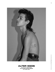
Alter Egos - 6 pgs
Photographer: Mel Bles
Stylist: Gary David Moore
Model: Patricia Reina, Vivien, Jack Hoban, Zoe Ose, Julie Rose and Johan Zoo.
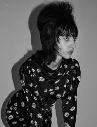
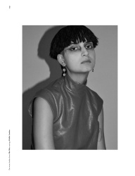
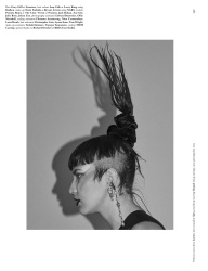
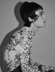
A set of b&w images showing stoic models, which looks like it was shot by Collier Schorr. The focus seems to be mainly on retro hairstyles, but still does the job of selling clothes.
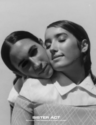
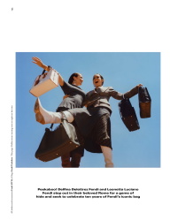
Sister Act - 8 pgs
Photographer: Tom Johnson
Stylist: Neil Kalonji
Public Figures: Fendi sisters, Delfina and Leonetta
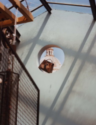
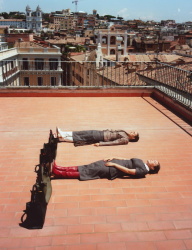
Essentially another advertorial to flog Fendi's decade anniversary of their handbag. Dressed in head to toe Fendi, naturally.
Night Flight - 8 pgs
Photographer: Tom Ordoyno
Stylist: Elizabeth Fraser-Bell
Model: Cara Taylor
A series of framed b&w portraits which highlighting the volume element of one key piece in each shot. Knitwear, tulle, frays, and ruffles. All from one designer ... Noir Kei Ninomiya.
In some of the shots Cara looks pensive and it works, in others I feel she's too young for this specific story. But overall beautifully shot.
Jaden Smith - 8 pgs
Photographer: Benedict Brink
Stylist: Emma Wyman
Interview with Jaden as he wax lyrical over his eco collab with G-Star. He comes across as a bit contrived and immature in the interview, and I wouldn't touch his 'designs' with a 10-foot pole, but it's somewhat heartwarming to see a guy of his age thinking beyond getting a front row seat at Louis Vuitton.
Midnight Cowboy - 12 pgs
Photographer: Patrick Bienert & Max von Gumppenberg
Stylist: Elizabeth Fraser-Bell
Model: Sasha Trautvein
Advertorial for Saint Laurent Menswear featuring a bunch of sullen-looking teens in an inner city setting. The accompanying copy was far more interesting to read. Vaccarello dared to city New York as his primary source of inspiration for Saint Laurent. So Hedivhad LA, and he's got NY. Hedi loved short proportions and Vaccarello likes short proportions, but some in colour, leather or prints. Can you see where I'm going with this?
Milly Shapiro - 12 pgs
Photographer: Charlie Engman
Stylist: Aveena Gallagher
Celeb: Milly Shapiro
Milly sounds like a cute, quirky girl and definitely more likeable than the other Millie, but I can't bear to finish more than one episode of Hereditary. It's mainly her creepy, doll-like looks. To make matters worse, some genius at Dazed cooked up the macabre idea of an edit where she's styled to look like those creepy ceramic dolls which collectors rave about. Someone should send those shots to Marie Osmond and watch her hyperventilate of excitement.
M.I.A. - 12 pgs
Photographer: Gareth McConnell
Stylist: Danny Reed
Lengthy interview with M.I.A. about her upcoming documentary. I've not read it yet, but the images looks great and I quite like the nomadic styling.
Dev Hynes - 12 pgs
Photographer: Wolfgang Tillmans
Stylist: Danny Reed
Interview in Q&A format, stopped reading after the 3rd or 4th question, will tackle it again when I'm bored.
Dunno why there's styling credits because the entire edit is Dev Hynes being Dev Hynes. Tillmans' photography is so so, but there's a shot of him on the beach, wearing a black swim trunks where I can see why some find him attractive. An no, no bulge in sight.
Kleptomaniacs - 20 pgs
Photographer: Johnny Dufort
Stylist: Robbie Spencer
Model: Sara Grace Wallerstedt, Xie Chaoyu, Hannah Motler, Giselle Norman and Victor Gutierrrez
Textbook Dufort, if you've seen his work once, you've seen it all. Think sparse studio setting, dim lighting and very light on props. As with the sneaker edit, the concept is beyond solid, that much can be gathered by the styling, which I thought was done by Lotta considering the excess use of Balenciaga. Calvin Klein knitted balaclava (robbers) paired with Balenciaga's voluminous multi-layered jackets (perfect for shoplifters), and in one double page shot the girls loot and destroy a convertible in Marc Jacobs and Simone Rocha. So the styling more than drilled the storyline home. But Dufort's cold and static photography style doesn't quite work here. I know he thinks he's being meta with his crazy angles, but it's an odd pairing.
Peach Kush - 12 pgs
Photographer: Clara Balzary
Stylist: Emma Wyman
Model: Selena Forrest
I'm big on Selena, but she's doing some odd pout throughout the edit which is rather bothersome. Styling is done beautifully, and had the photographer opted for more refined vehiclesx this could easily have been the one luxury edit in the issue. There's a dreamy shot of Selena in a Saint Laurent number leaning against a car.
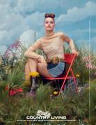
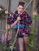
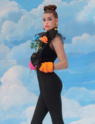
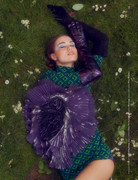
Country Living - 12 pgs
Photographer: Charlotte Wales
Stylist: Camille Bidault-Wellington
Model: Luna Bijl and Grace Hartzel
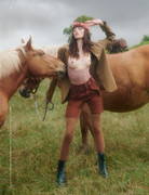
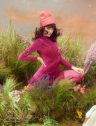
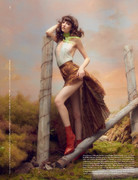
Wales takes a slight departure from her more commercial work which we're used to in POP and all the Vogues for something so unique and captivating. Doe-eyed Grace, who I can't abide at the best of times, really amazed me here. And it should have featured only her. Because Luna looked awkward throughout, probably at a loss that she wasn't required to revert to her standard fierce presence. With this edit I've come to the conclusion that Wales perform much better with a setting. She employed an interesting set designer (Alexander Bock) for this shoot, a rarity in current fashion magazines, who sort of blurred the lines between deliberately real and fake.
Techno Sorbet - 12 pgs
Photographer: Angelo Pennetta
Stylist: Robbie Spencer
Model: Mica Arganaraz
A selection of trench coats, all from Margiela Artisanal and mainline. Thank God I could marvel at Galliano's technical brilliance, because Pennetta and Mica would put me to sleep with their dullness. Not much was needed with such imposing works of art, after all. A few slouches from Mica, and Pennetta zooming in on the pieces was quite enough.
Golden Years - 10 pgs
Photographer: Heji Shin
Stylist: Tom Guinness
Model: Agnes, Ana, Ben, Dylan Jones, and Vita
Uneventful filler photography coupled with obvious millenial styling - uber luxury labels (Chanel, Prada, LV) but the stylist went for the most normcore looking pieces.
Qué Lo Que - 12pgs
Photographer: Liz Johnson Artur
Stylist: Akeem Smith
Model: Elibeidy, Carolina, Geraldina, and Ana Maria
Evening looks shot in the harsh daylight and dark nights of the Dominican Republic. The contrast between the grit, and we are not talking Parisian street grit here, and the luxe of the dresses are quite a winning match. Fashion travel story with a twist.
Overall the issue kept me entertained somewhat. I just feel like Dazed is too cookie cutter indie with their affected poses and refusal of refinement. Offering your readers some reprieve from can surely spice things up.
I'm also amazed at not only the sheer amount of advertorials, but also the crazy variety of ad campaigns. Everything from Chanel to Kane to Maje. Many which you'll probably miss out on if you fixate on the more commercial magazines. Definitely way, way more than your average Vogue.

 .. just feel good music and nice taste in everything he does. Most intriguing is that he is evidently quite busy with his occupation but somehow also takes the time to comment on two thirds of LA/London/NY's IG posts and he's probably buddies with your buddy.. probably doesn't know what low battery or sleeping like a baby means..