Diane von Fürstenberg S/S 2016 : Karlie Kloss by Angelo Pennetta

artemovartem

Well-Known Member
Joined
Jun 25, 2013
Messages
2,778
Reaction score
484

world.dvf. com
 
Last edited by a moderator:
Her smile isn't feeling very genuine, like the overload of colours.
 
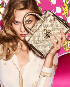
Yikes, looks a lot like Aldo! Very mediocre. So while Tory Birch is upping the standards of her campaign and logo, Diane seems to be downgrading?
The colourful styling helps a lot, but Karlie looked much better last season..
 
My eyes go to the background
Not on Karlie & not on the collection
 
it´s very different from what I think DVF stands for but all the print clash works somehow imo.
 
Not what I would have expected from DVF. As much as I love the playfulness with all the colors against the background, Karlie just isn't a fit her. She just looks like everything is too forced and unnatural.
 
Oh please it reminds Pinko ads! Too much of.. everything!
 
Great, i've got a headache now...

This is cheap to the max.
 
I agree, one of the worst I've seen all season. Next to the cheap photography Karlie looks incredibly disingenuous.
 

Users who are viewing this thread

Forum Statistics

Threads
210,680
Messages
15,123,578
Members
84,382
Latest member
ericbaig68
Back
Top
monitoring_string = "058526dd2635cb6818386bfd373b82a4"
<-- Admiral -->