Elle Canada June 2020 : Sandra Oh by Greg Swales

She looks fantastic on the cover (gloves aside), I don't even really mind the Gucci look chosen. The editorial has a few good images though, like the one with the orange dress.
 
Elle Canada June 2020

Set Free


Photographer: Greg Swales
Stylist: Martina Nilsson
Hair & Makeup: Michael Gayette
Cast: Ruby Aldridge


Elle Canada Digital Edition
 
Elle Canada June 2020

Pattern Play


Photographer: Mariana Maltoni
Set Designer: Nicola Bell
Stylist: Jenny Kennedy
Hair: Asahi Sano
Makeup: Celia Evans
Manicure: Nicholle Williams
Cast: Charlotte Carey


Elle Canada Digital Edition
 
Can somebody translate the phrase "that ___ is a choice"? I must be getting old:rofl:

It’s like when something is done that’s questionable but lingers more in bad taste...

or simply put, bad taste.
 
I look at the chic and neat layout of Elle Canada and it's really a thorn in the flesh of UK Elle. A layout that they've kickstarted and dropped like a hot potato is now the signature of this magazine. Because consistency paid off for the latter. In that sense, well played Elle Canada.

Was surprised to see Greg Swales shot the cover and original edit in this issue because it looks a lot like Alexandre Gilbert, who is a regular contributor to this magazine.
 
But the fact that it took a team of so-called professionals to produce this is just pathetic.

According to the editor the crew specifically waited for 'the golden hour' to start shooting, which is to say the lighting on the cover could very well be all-natural. Just a pity they didn't extend that to the editorial. The weak link is still the styling.

It's a pity the magazine is so generic overall. It took me 15 minutes to go through this issue, with zero takeaways. Zero substance. Everything in that magazine can be found on any mainstream website like Vogue.com. Even their writing style and text length are clearly modeled after digital style of writing. Compressed, rushed, with not much substance. I find it baffling that they're allowed to stay in print, maybe it's because there's no real competition.
 
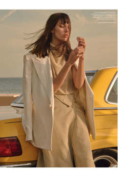
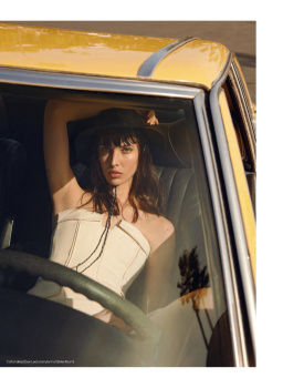
^^^ LOL because the output is so mediocre, they need to add in the useless gimmick of “it’s natural light from the golden hour” which frankly just looks like a pink overlay with some yellow tints… Unless there are more shots of which these people have skillfully and tastefully utilized the “golden hour” light (feast your eyes on Ridley Scott’s Blade Runner scene of Decker and Rachel’s first meeting :swoons at the stunning lighting:...) this covershot is utter mediocrity. It’s like Harley insisting she only shoots in analogue—which in principle is refreshing. But what does it matter when her selects need to be digitally scanned, than it’s reproduced on cheap paperstock for some rag, and not silver-gelatine print LOOL The results are the same had she shot with a digital camera— just like this “golden hour light” looks just the same level of quality as using an overlay on PS in post.

Gimmick gimmicks gimmicks instead of talent and creative vision. This is why print is dying/dead.

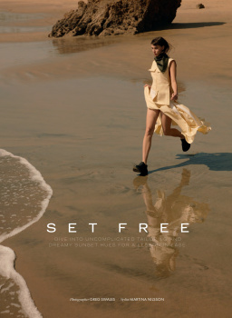
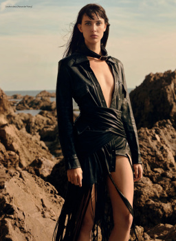
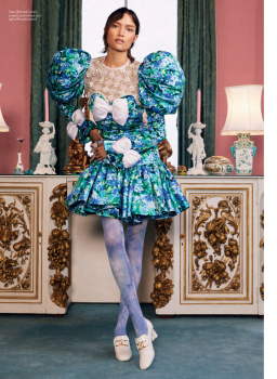
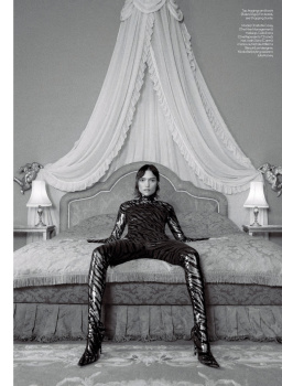
(The other 2 stories are actually decent...)
 

Users who are viewing this thread

Forum Statistics

Threads
210,715
Messages
15,124,726
Members
84,416
Latest member
barakz12
Back
Top
monitoring_string = "058526dd2635cb6818386bfd373b82a4"
<-- Admiral -->