You are using an out of date browser. It may not display this or other websites correctly.
You should upgrade or use an alternative browser.
You should upgrade or use an alternative browser.
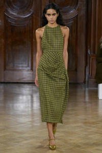
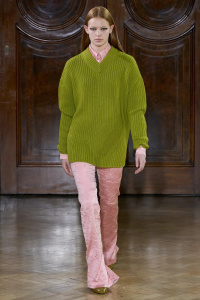
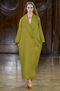
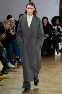
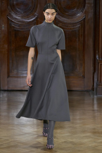
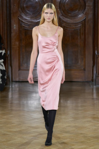
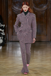
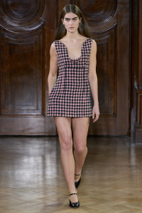
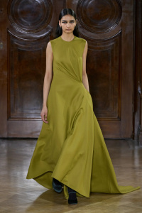
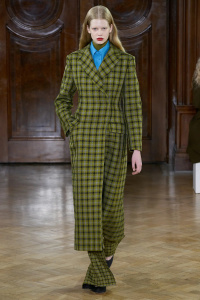
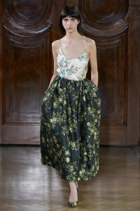
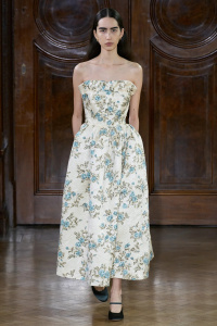
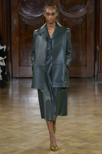
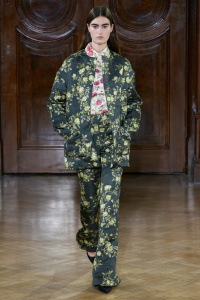
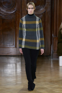
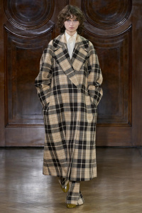
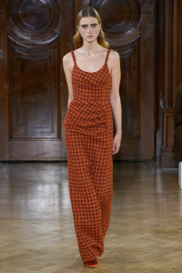
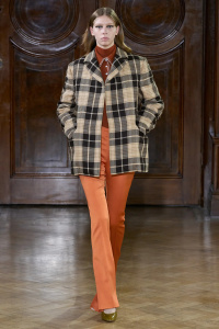
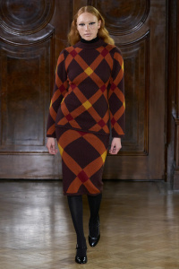
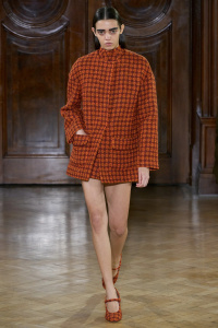
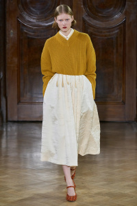
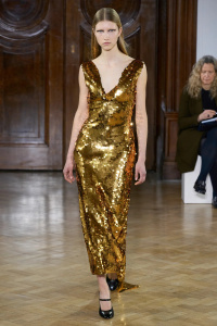
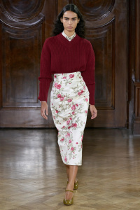
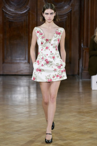
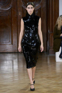
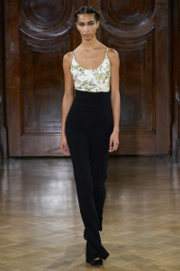
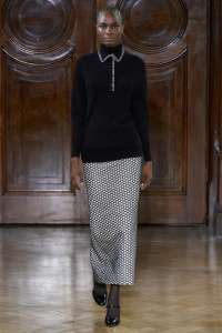
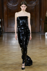
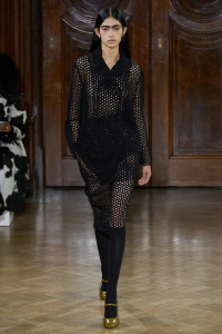
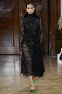
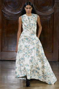
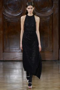
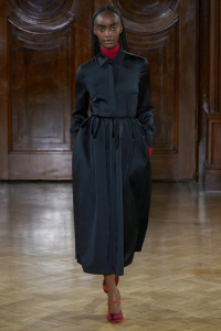
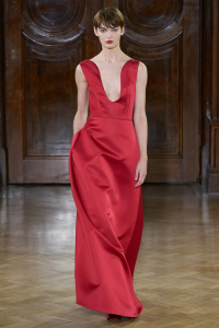
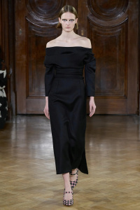
Emilia Wickstead F/W 2023.24 London
- Thread starter vogue28
- Start date
Cocteau Stone
Well-Known Member
- Joined
- Feb 12, 2022
- Messages
- 1,565
- Reaction score
- 3,499
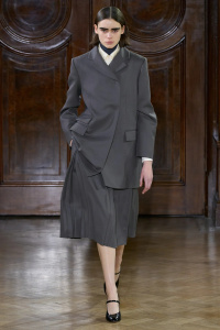
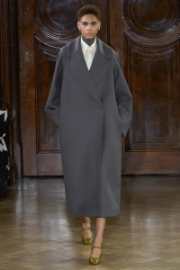
Much darker and more severe than her other offerings. And I don’t love some of the colour combinations.
But it’s well cut, and the pieces actually work on the body. Designers as of late forget that the garments have to work beyond the dress stand or singular fit model.
But it’s well cut, and the pieces actually work on the body. Designers as of late forget that the garments have to work beyond the dress stand or singular fit model.
liberty33r1b
Well-Known Member
- Joined
- Nov 9, 2003
- Messages
- 24,304
- Reaction score
- 691
hate most of the prints
D
Deleted member 1957
Guest
Almost looks more Burberry than Burberry.
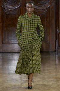
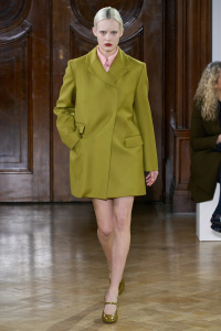
She used a cleaner shade of this green last season, in a triangular satin ball skirt. That green gave the skirt's geometry a startling liveliness ... at her best, Ms. Wickstead is not merely "correct." She can achieve a certain radiance.
Then, this season, she muddied that green ... allegedly she was moved by David Lynch's idea, "The more you throw black into a color, the more dreamy it gets." But the women wearing this 1996 Prada avocado are not dreaming. A muddy green calls for texture; instead, she mires her models in that lifeless, sleek wool... look 7 is especially dreadful. When she deepens the color further and gives it texture and pattern (as in look 14) it's much more successful.
I worry about her sense for texture in general. The dowdy florals on crinkled satin look like 80s wallpaper stuck to a popcorn wall. If she was going for a Twin Peaks look, she failed to understand how those characters achieved sensuality through ugliness. Perhaps she should stick to cleaner colors, a less adulterated idea of beauty.
Similar Threads
- Replies
- 1
- Views
- 878
- Replies
- 10
- Views
- 1K
D
Users who are viewing this thread
Total: 2 (members: 0, guests: 2)


