-
Share with us... Your Best & Worst Collections of Haute Couture F/W 2025.26
-
Xenforo is upgrading us to version 2.3.7 on Thursday Aug 14, 2025 at 01:00 AM BST. This upgrade includes several security fixes among other improvements. Expect a temporary downtime during this process. More info here
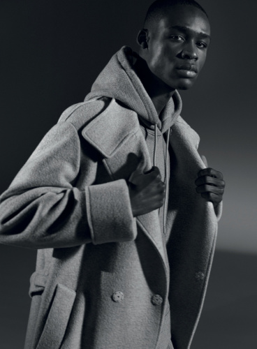
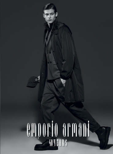
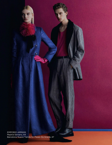
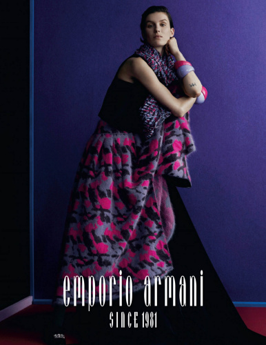
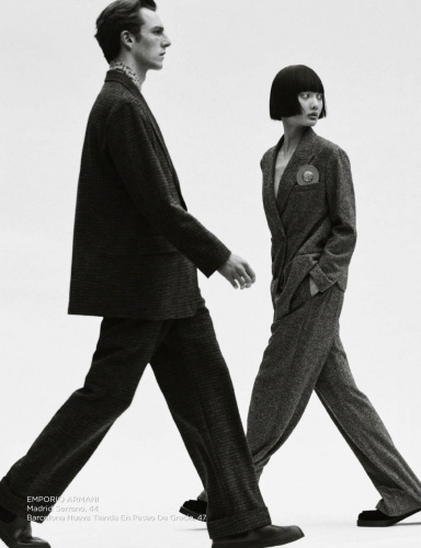
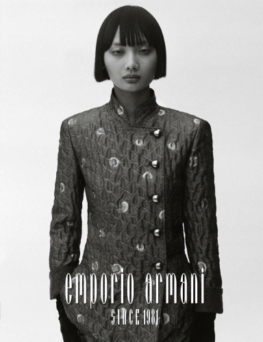
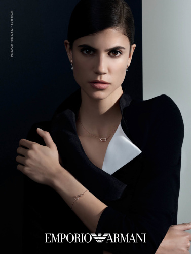
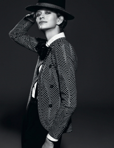
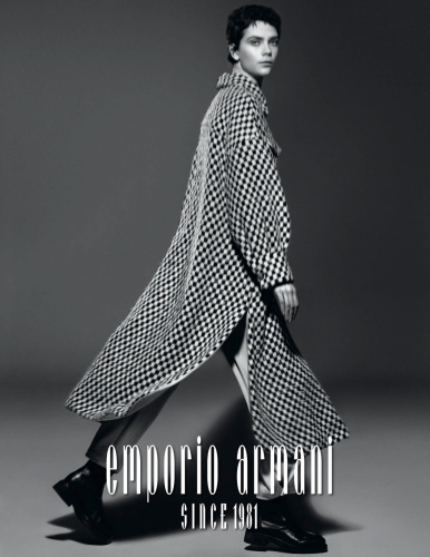
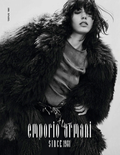
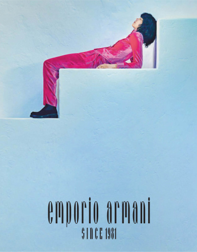
Emporio Armani F/W 2021.22
- Thread starter aracic
- Start date

Similar Threads
Users who are viewing this thread
New Posts
-
-
 Chanel 'Bleu De Chanel L'Exclusif' Fragrance 2025 : Timothée Chalamet by Mario Sorrenti (7 Viewers)
- Latest: chrisand489
-

-
Christian Dior 'Miss Dior Essence' Fragrance 2025 : Natalie Portman by Lachlan Bailey (5 Viewers)
- Latest: chrisand489
-