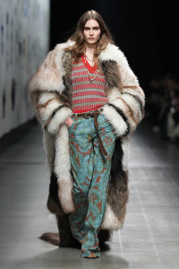
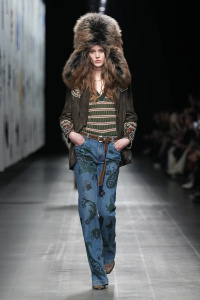
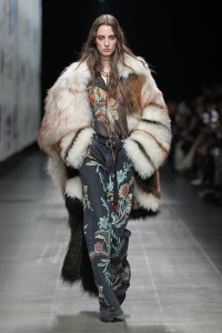
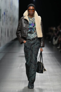
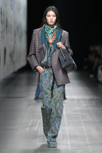
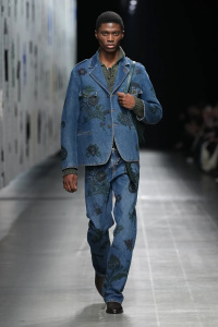
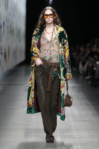
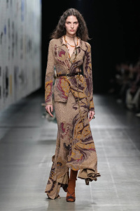
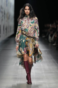
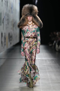
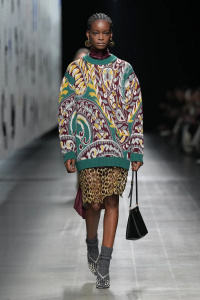
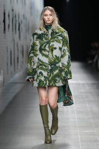
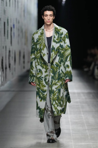
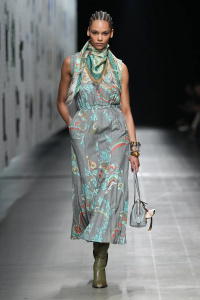
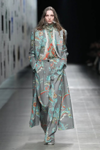
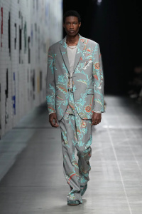
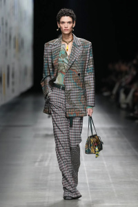
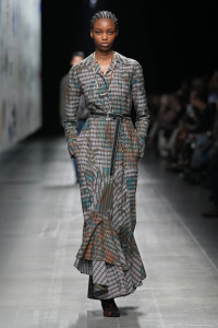
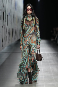
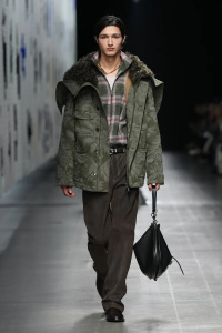
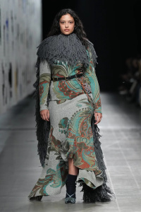
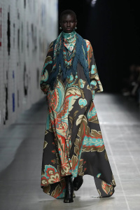
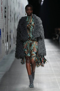
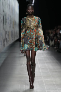
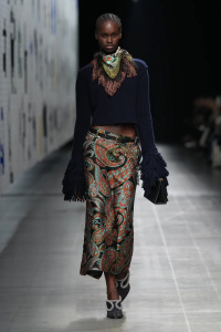
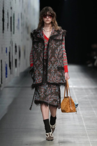
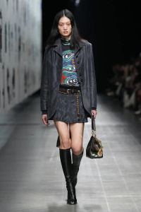
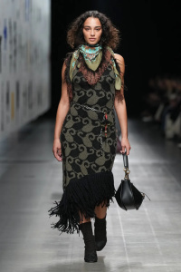
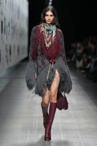
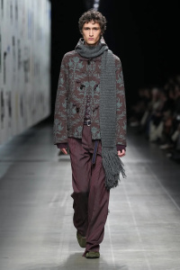
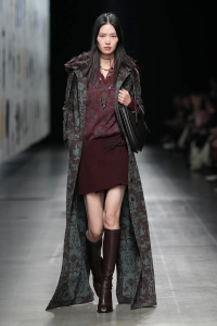
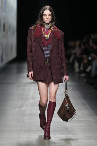
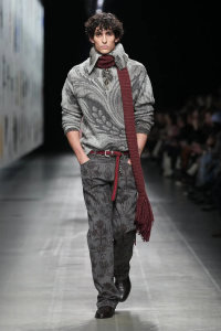
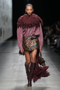
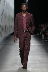
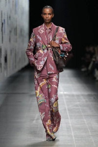
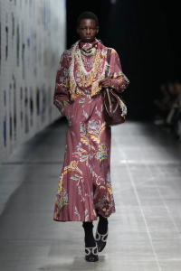
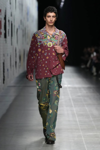
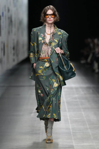
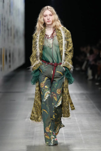
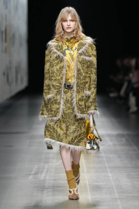
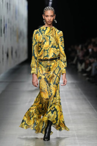
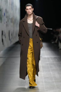
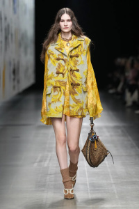
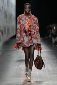
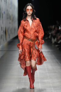
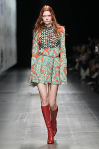
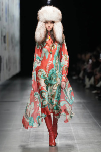
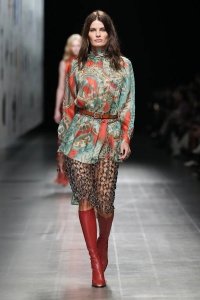
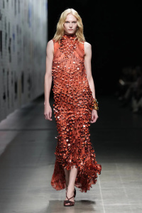
^ I do kind of agree that Etro doesn’t need to have paisley prints head to toe considering it was only introduced in the 80s.
I’d like to start to see more focus on the textiles and luxurious fabrics likes damasks, brocades, intricate weaves and so on. Something less “dusty”. Etro after all started as textiles brand and they could be an Italian equivalent to Dries Van Noten (who also comes from a family of textiles traders)
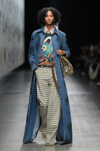
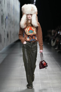
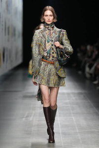
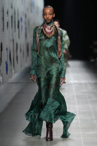
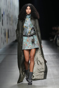
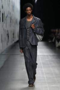
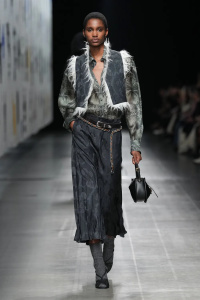
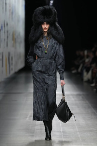
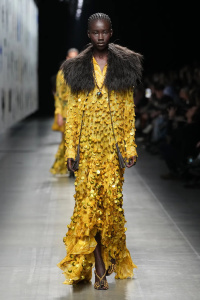
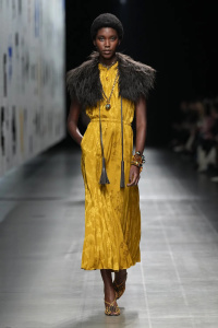
The colours palete here is beautiful and Marco seems to be talented enough and understand exactly what the Etro needs to stay relevant in current times.