-
The Red Carpet Highlights of... The 82nd Annual Venice Film Festival 2025!
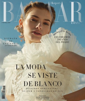
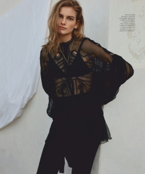
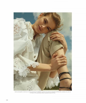
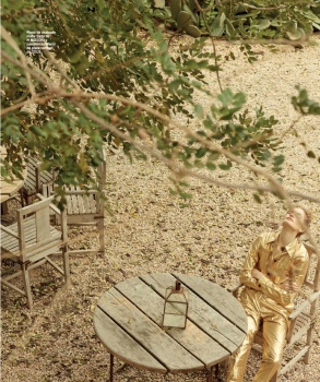
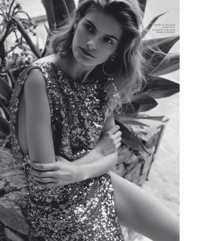
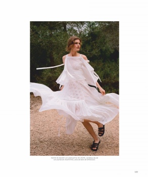
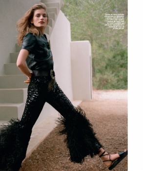
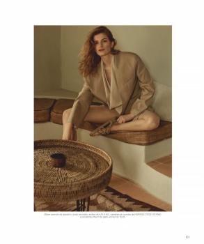
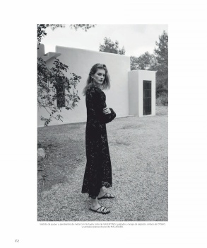
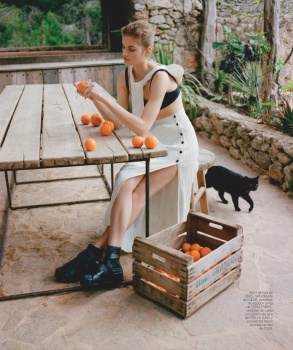
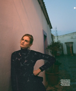
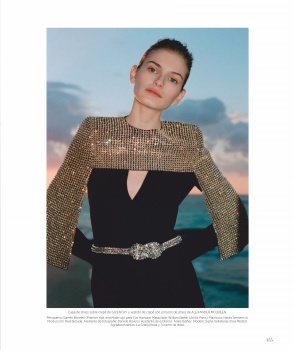
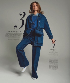
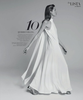
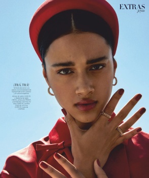
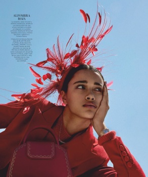
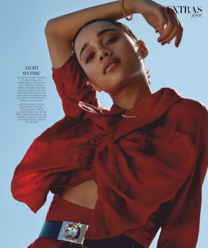
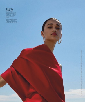
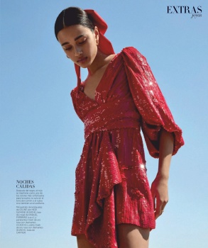
Harper's Bazaar España May 2019 : Signe Veiteberg by Agata Popieszynska
- Thread starter Benn98
- Start date
 I think even the placement of the text in the first cover is great; just enough to entice readers to pick up a copy but leave plenty of room to actually see Signe. The only quibble I have is the fading 'Bazaar' - why not just place it behind her head?


Similar Threads
Users who are viewing this thread
New Posts
-
 Jonathan Anderson - Designer, Creative Director of JW Anderson & Christian Dior (12 Viewers)
- Latest: youthinasia
-

-

-

-
