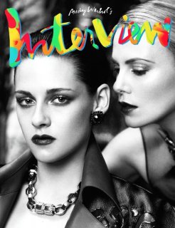
Follow along with the video below to see how to install our site as a web app on your home screen.
Note: This feature may not be available in some browsers.
Xenforo is upgrading us to version 2.3.7 on Tuesday Aug 19, 2025 at 01:00 AM BST (date has been pushed). This upgrade includes several security fixes among other improvements. Expect a temporary downtime during this process.
More info here
The title looks like a melted itzakadoozie icepop. I don't really care for that picture either, didn't like it in the original shoot, don't like it reprinted as a cover everywhere else.
Interview Russia and Germany started with promise and in just a few months they have become jokes. Their tacky fonts just din't go with Interview US' sleek, stylized pictures.
I know that, but the old Interview's fonts were tacky done well and most importantly, they actually suited and complemented the cover images. This on the other hand looks like a bad PS job.
This site uses cookies to help personalise content, tailor your experience and to keep you logged in if you register.
By continuing to use this site, you are consenting to our use of cookies.