
You are using an out of date browser. It may not display this or other websites correctly.
You should upgrade or use an alternative browser.
You should upgrade or use an alternative browser.
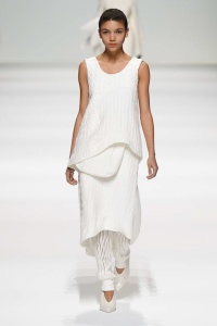
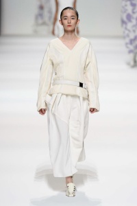
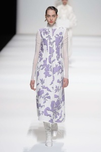
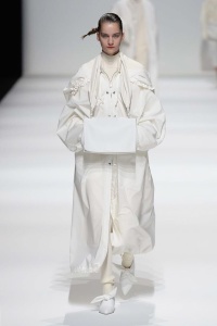
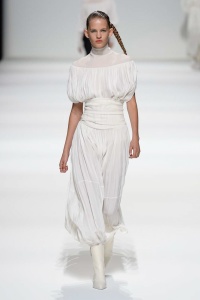
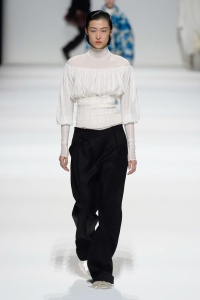
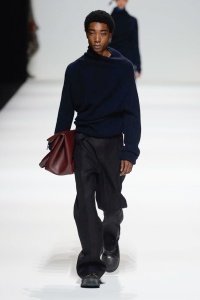
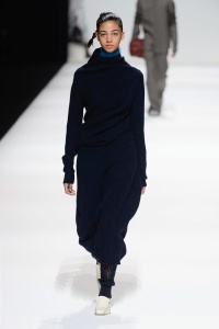
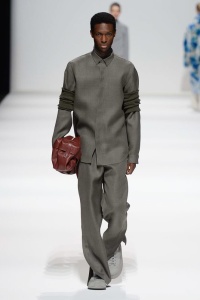
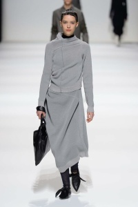
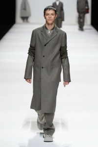
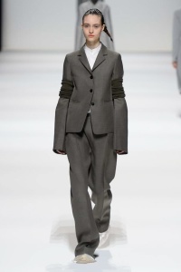
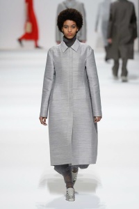
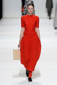
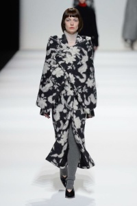
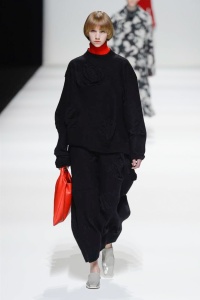
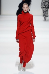
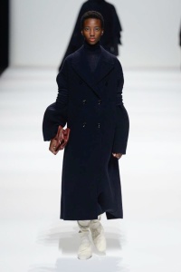
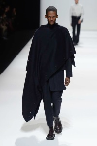
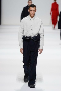
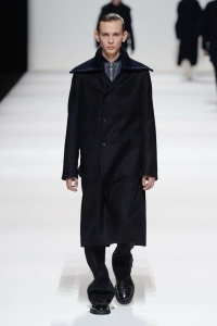
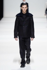
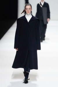
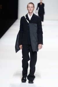
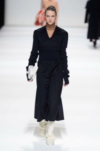
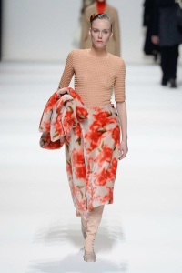
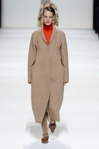
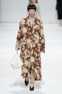
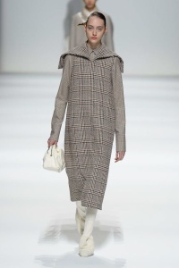
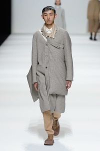
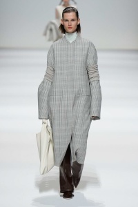
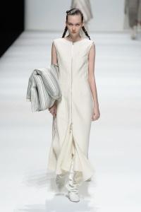
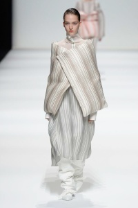
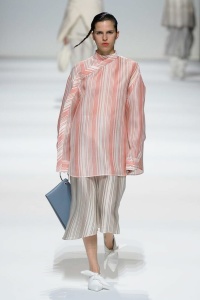
Jil Sander F/W 2018.19 Milan
- Thread starter vogue28
- Start date


IloveDiorHomme
Well-Known Member
- Joined
- Mar 29, 2006
- Messages
- 1,313
- Reaction score
- 795
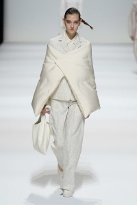
This collection made me fall asleep....not only because everything looked like pillows or blankets, but also because it's just a complete bore.
I don't see a clear message or vision here. Just some unexpressive proposals which are badly styled.
I don't see a clear message or vision here. Just some unexpressive proposals which are badly styled.
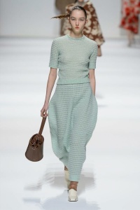
I guess those pillow-esque/tapestry looks are a nod to the S/S 1996 campaign ? Whatever It is - and this whole collection - makes me feel nothing but nostalgic about what this brand used to be. I think It's a real pity how the musical chair game ended at this house and the fact that since the last time Jil exited the house They weren't able to find someone who can design according to the ethos of the brand and what It stands for.
StoneSkipper
Well-Known Member
- Joined
- Jul 6, 2009
- Messages
- 8,521
- Reaction score
- 1,510
Oh my goodness, could this be the biggest waste of a fashion show ever? I literally could not remember the previous look once I went to the next. There's absolutely nothing noteworthy about this entire collection at all.
CrisGalaxy
Active Member
- Joined
- Jun 21, 2009
- Messages
- 2,336
- Reaction score
- 30
Before Raf Simons was at Jil Sander, Milan Vukmirovic was designing it and some of the stuff he did was not up to the Jil Sander DNA. I think brands live and die every now and then.
Lola701
Well-Known Member
- Joined
- Oct 27, 2014
- Messages
- 10,120
- Reaction score
- 18,867
I get what they are trying to do but it’s not the right approach.
I think the problem is that when people are hearing minimalism, they are trying to hard to be «*intellectual*», «*abstract*» or «*daring*».
Why Raf worked so well? Because he was very pragmatic. His clothes worked because they were designed for an active woman/man in mind. It was commercial but in a great way...
As long as people sees commercial and pragmatic as a bad word, Jil will never work.
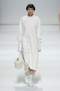
White is a tricky color to wear in winter and with all those pretentious volumes, it’s not inviting at all.
Luke has an urban oriented house and he should use it to his advantage. Simpler volumes, simple cut, strong separates and even of it’s too commercial, it will show an understanding of the brand.
Milan was too sexy and the one who came after RAF seemed to design for himself.
These two designers needs to remember to whom JS’s clothes were designed for. And it’s not for a woman lounging in her house. We have The Row for that.
I think the problem is that when people are hearing minimalism, they are trying to hard to be «*intellectual*», «*abstract*» or «*daring*».
Why Raf worked so well? Because he was very pragmatic. His clothes worked because they were designed for an active woman/man in mind. It was commercial but in a great way...
As long as people sees commercial and pragmatic as a bad word, Jil will never work.
White is a tricky color to wear in winter and with all those pretentious volumes, it’s not inviting at all.
Luke has an urban oriented house and he should use it to his advantage. Simpler volumes, simple cut, strong separates and even of it’s too commercial, it will show an understanding of the brand.
Milan was too sexy and the one who came after RAF seemed to design for himself.
These two designers needs to remember to whom JS’s clothes were designed for. And it’s not for a woman lounging in her house. We have The Row for that.
GivenchyHomme
Well-Known Member
- Joined
- Sep 3, 2009
- Messages
- 5,075
- Reaction score
- 3,638
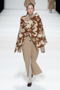
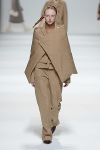
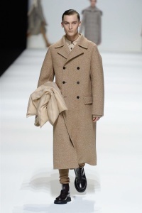
Why is everything so big and frumpy? Jil Sander is a master tailor, the complete opposite of this collection. Im surprised that they haven't referenced that, it seems odd to me. What woman wants to be smothered and wrapped up in these clothes? The striped pieces look like curtains for goodness sakes! And that hideous transparent blue monstrosity is horrible. It's been two seasons and both have been lackluster and amateur. It's time to move on from these two and hire a real pro. Stefano Pilati where are you?
rip_ian curtis
Well-Known Member
- Joined
- Jul 27, 2008
- Messages
- 674
- Reaction score
- 325
Their layering looks uncomfortably stuffy and suffocating, and they have demonstrated that in each of their collections. The end result looks frumpy and even a bit insane. All the styling elements are too obvious and desperate for attention. It's a pity they miss the mark so badly at this house. Even the pattern making, such as with those "twisted" sweaters, is not as sophisticated as Jil's when she did the same idea back in the day.
Raf was different from Jil in the end, but even some of his most daring proposals, such as the tribal/1920's collection, worked because he recognized the sensual side of Jil Sander. Sensuality is what this duo is missing.
Raf was different from Jil in the end, but even some of his most daring proposals, such as the tribal/1920's collection, worked because he recognized the sensual side of Jil Sander. Sensuality is what this duo is missing.
Last edited by a moderator:
tatouejeremie
Well-Known Member
- Joined
- Jun 28, 2009
- Messages
- 1,070
- Reaction score
- 650
who's doing the styling anyway? that's by far the biggest problem here imo
GivenchyAddict
Well-Known Member
- Joined
- Feb 5, 2012
- Messages
- 1,967
- Reaction score
- 4,235
who's doing the styling anyway? that's by far the biggest problem here imo
Sarah M Richardson styled the show.
helmutnotdead
Well-Known Member
- Joined
- Jan 29, 2018
- Messages
- 1,593
- Reaction score
- 3,651
This in three words: THE WALKING DEAD.
The most boring live stream of my life.
I was already scared by the pre fall for both men and women and this is just worse. It's a pity because the first one was ok and the campaign was glorious.
Poor Mario, he's going to have a really hardwork to do with these non sense-complicated-boring clothes. There isn't anything exciting here. The whole thing looks so heavy, I can bet my *ss that they have been thinking a lot about the styling. And ironically, Jil Sander is about the opposite: Clean and relaxed and confident clothes with the right touch of sexiness and intellectualism.
Mutterlein
Well-Known Member
- Joined
- Mar 14, 2004
- Messages
- 4,893
- Reaction score
- 2,913
WOW. I mean WOW. They really went and just did these blatant, poorly executed Comme Des Garcons knock offs. And then they tried to pass it off as Jil Sander! 
They clearly have no clue. They couldn't even buy a clue if they had a million dollars to spend on one. They would miss the clue even if the clue's head was chopped off and put in their bed while they slept. That's how clueless they are.
And Sarah did NOT help with the styling.
They clearly have no clue. They couldn't even buy a clue if they had a million dollars to spend on one. They would miss the clue even if the clue's head was chopped off and put in their bed while they slept. That's how clueless they are.
And Sarah did NOT help with the styling.
Last edited by a moderator:
YohjiAddict
Well-Known Member
- Joined
- May 26, 2016
- Messages
- 3,535
- Reaction score
- 4,721
Stuffy and dull, anything too elaborate feels wrong for this brand and we're now at a point where this type of boiled wool contraptions has been done to death. It doesn't help that the tailoring is utterly unremarkable. I don't see them improving in the near future...
Last edited by a moderator:
IloveDiorHomme
Well-Known Member
- Joined
- Mar 29, 2006
- Messages
- 1,313
- Reaction score
- 795
This in three words: THE WALKING DEAD.
The most boring live stream of my life.
I was already scared by the pre fall for both men and women and this is just worse. It's a pity because the first one was ok and the campaign was glorious.
Poor Mario, he's going to have a really hardwork to do with these non sense-complicated-boring clothes. There isn't anything exciting here. The whole thing looks so heavy, I can bet my *ss that they have been thinking a lot about the styling. And ironically, Jil Sander is about the opposite: Clean and relaxed and confident clothes with the right touch of sexiness and intellectualism.
Wow, couldn't agree more

Similar Threads
- Replies
- 35
- Views
- 7K
- Replies
- 58
- Views
- 10K
Users who are viewing this thread
Total: 2 (members: 0, guests: 2)
New Posts
-
 US Vanity Fair April 1996 : Special Issue: Hollywood '96 by Annie Leibovitz (4 Viewers)
- Latest: justaguy
-
-
-

-