M / M (Paris) - Graphic Designers

Astrid21

Active Member
Joined
Sep 4, 2002
Messages
8,718
Reaction score
6
Originally posted by Design Museum
M/M - Somewhere Totally Else: The European Design Show

Design Museum Exhibition
27 September 2003 to 4 January 2004

Through their work as graphic designers and creative directors in the fields of art, fashion and music, Michael Amzalag and Mathias Augustyniak have established M/M as a powerful force in contemporary French culture.

After meeting at art school in Paris, Michael Amzalag and Mathias Augustyniak founded M/M in 1992. They have sinced worked together as graphic designers and art directors on fashion and art projects mostly for longstanding clients and collaborators – such as the fashion designers Yohji Yamamoto and Martine Sitbon, and the photographers Craig McDean, Inez van Lamsweerde and Vinoodh Matadin.

After starting out with music projects, M/M became involved with Yamamoto and Sitbon in 1995 and have since worked for other fashion houses including Balenciaga, Louis Vuitton and Calvin Klein. Their work in the art world ranges from commissions for museums such as Centre Georges Pompidou and Palais de Tokyo in Paris, to collaborations with artists like Philippe Parreno and Pierre Hughe. Amzalag and Augustyniak also work as creative consultants to Paris Vogue.

See more of M/M's work at: http://www.mmparis.com

And on our Design Now - Graphics site:
http://www.designnowgraphics.co.uk


Q. What were your early design influences? What drew you to graphic design?

A. We chose graphic design not just for the sake of being graphic designers. It was some kind of social commitment, a way to earn a living and also to disseminate our ideas. The activities related to graphic design are very suitable for us. We enjoy the thinking process, but we prefer that it be related to form and that ideas have tangible results. Also, we don’t create things out of the blue, we want to form a relationship with someone. But, as such, graphic design doesn’t excite us more than any other media, than film or books for example.

Based in France, we were able to completely redefine the way we see graphic design. There are so few French designers that the field is not precisely defined in the way it is in say Germany, the UK or the US. There, you settle down to do corporate design, or record sleeve design, whereas in France there is still a great deal of room for experiment and crossover. Our early influences include everything, but nothing in particular. The way we see life, one thing isn’t greater than another. Everything is interwoven.

Q. Do you feel that your education (design or otherwise) influenced the way you work now?

A. We both studied at the École Nationale Supérieure des Arts Décoratifs in Paris. Michael left after two years, before receiving his diploma, to art direct the music magazine Inrockuptibles. I (Mathias) completed the degree and went on to study for two years at the Royal College of Art. We both went through very different things, and we find our two backgrounds very complementary. Education was a starting point. I left the Royal College feeling that I knew it all, but once I began working I had to reassess everything.

Q. Where did you meet and how did you start working together?

A. We met at the École Nationale Supérieure des Arts Décoratifs in 1988 and started working together in 1991. Immediately we both decided that we would never work for other people. Graphic design allows you to make a living out of your work and also to have a free voice.

Q. What were M/M’s early design commissions?

A. Because Michael was working for a music magazine, it was natural that we began to work for the music business, designing sleeves for bands and singers that you will never hear of. At that time in France, a lot of money was being spent marketing music which was French to the max. It was alright, not good, not bad, just part of our culture. Until four or five years ago when bands like Air and Daft Punk emerged, the French music scene was completely dead. Since then, the so-called "French Touch" has helped young French graphic designers to emerge. But back then – in the early 1990s – more established French design companies, such as Grapus, were doing all the work in the cultural field, work generated by the left-wing government of that era. We just took what was left.

Q. Over the last decade you have become more and more involved in fashion design. How did this come about and has it affected your work?

A. We first became involved in fashion by accident, through a friend of a friend who knew someone who worked at Yohji. Our first fashion job was to design the European launch of Yohji Yamamoto’s Y’s range in 1993. The work for Martine Sitbon came two or three months after. First we designed an invitation and that led to the whole Martine Sitbon adventure and naturally it attracted the interest of other clients. Likewise, several months later we met people who worked for the French art magazine Documents and that led to our working in art.

In fashion everything goes much faster, every six months you have to reinvent yourself. We have to keep a bit above and stay calm. It forces us to do bolder things, knowing that they will be copied and watered down. When we are working for fashion companies, we still try and mix in other projects in different fields. This is very important to our fashion work, which we see as looking at culture through fashion eyes. We always try and link one project to another. We want our work to be considered on a larger scale.

Q. How did your collaboration with Inez Van Lamsweerde and Vinoodh Matadin come about?

A. I remember meeting them at an APC party during Paris fashion week some years ago, probably in 1995. We thought their photographs were very daring
and very strong and we felt there was something we would like to work with.
It happened that they were aware of our work at that time. Collaborating together happened very naturally ... It is the same with all the photographers we work with, not just Inez and Vinoodh, but others such as Craig McDean. They become part of our process and we can be part of theirs; we produce images together.

Q. More recently you have worked with Björk, designing her CD package, her book and directing her video? How do you see that partnership developing?

A. We are currently working more with Björk. We tend to have a lot in common with the people we work with. We see graphic design as a conversation and we are always waiting for an answer. I think that it is important that the relationship develops until we realise that we've nothing to say to each other, and then to split amicably, without argument. At the moment it is a pleasure to work with Björk.

Q. You are very involved with the fine art scene in Paris, working with artists such as Philippe Parreno and Pierre Hughe and on projects such as the new art space Palais du Tokyo. How do you view your work in relation to fine art?

A. We see our work as more than providing a service. We are using our place as graphic designers strategically, in order to diffuse ideas. We are not against fine art, but we believe in some kind of relationship between the work and the people who commission the work. Very often in the art world relationships between the artist, the gallery and the collector are sterile, not productive or inspirational. In both fields we are dealing with ideas and often we find similar obsessions, that we are tracking the same line of thought. When we collaborate with artists, it is because the artists have asked us for our expertise. Whether what we produce is art or not, I don’t know. That is up to history to decide.

Q. How would you describe your current activities? Are you completely happy with the term graphic design?

A. It is not very poetic, but we don’t have anything against the term graphic design. It is more its definition that we question. Graphic design could embody a lot of activities and the definition is not fixed, but continually evolving. Because it is still a new profession, the best graphic designers are the ones who reinvent their field and surprise.

Q. Your work is characterised by the hand-made and the idiosyncratic. What do these qualities mean to you?

A. This is a way to see it. It might look spontaneous or "hand-made", but the way it is produced can be very complex, very highly crafted. Maybe it is about life, not pretending to do the impossible, allowing the mistakes to show. However, we’re however not sure this is an issue.

Q. Early last year you became art directors of French Vogue. Has taking on such a major commission changed the way that your studio operates?

A. We’re actually "Creative Consultants", if this can mean something. We’ve tried to establish a working relationship where we are external and we are not present full-time. We wanted to be out of the big machine and its everyday routine to have the chance to keep a fresh overview of the process of constructing the magazine, to be able to stay spontaneous. Even if it has been a bit difficult in the beginning, because what we were asking for was very unusual, now it proves to be a fruitful proposal. We take the design of Vogue very seriously, but we want to keep it in perspective. An ex-student of ours is working at Vogue full-time, training to become an art director. It is very important to nurture the next generation. We have spent a lot of time teaching in Lausanne in Switzerland and now the relationships we have built with students are beginning to blossom.

Q. Where will M/M be going in the next few years?

A. We are planning to release a book, an archive of ten years' work. Otherwise this question is too complicated to answer. We have will and desire, but they are not clearly formulated. It is good to have secret desires.

© Design Museum

47_5.jpg

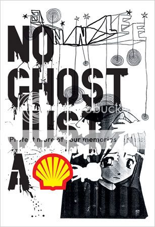
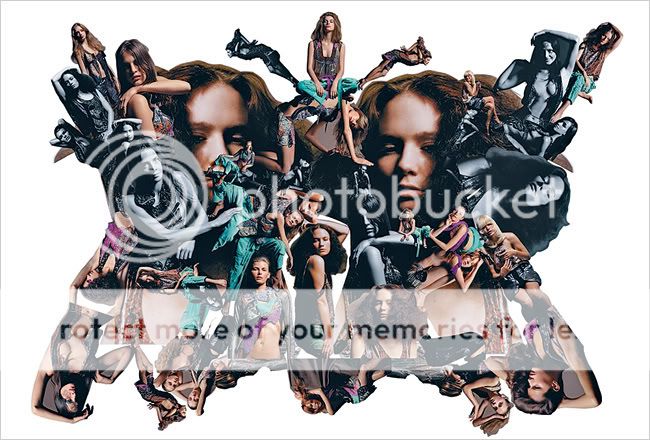
<span style='font-size:8pt;line-height:100%'>Yohji Yamamoto catalogue, 1999
Art Direction: M/M (Paris)
Photography: Inez van Lamsweerde + Vinoodh Matadin


47_6.jpg

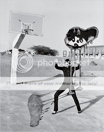
Yohji Yamamoto catalogue, 1998
Art Direction: M/M (Paris)
Photography: Inez van Lamsweerde + Vinoodh Matadin


47_8.jpg

Bjork: Hidden Place video still, 2001
Direction: Inez van Lamsweerde + Vinnodh Matadin with M/M (Paris)
Copyright: Bjork Overseas Ltd/One Little Indian Records


47_11.jpg

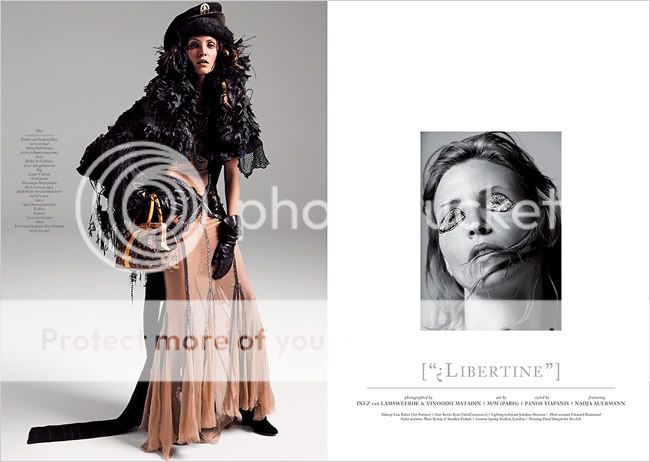
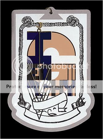
Balenciaga invitation card, 2002
Art Direction: M/M (Paris)
Photography: Inez van Lamsweerde + Vinoodh Matadin
</span>

A little old but I thought some might be interested in checking it out. :heart:
 
Do you mind if I use one of those pics as my avatar? :flower:
 
:heart: OH MY GOD I LOVE M/M SO MUCH!!!!!!!! :heart:

:heart:


tahnk you so mcuh
 
great article, great artists, thanks astrid.

i agree, their work for Balenciaga was quite so-so, i remember the campaign
 
alphamen photographed by inez and vinoodh
 
Last edited by a moderator:
one of my favorites by M/M.i'm such a sucker for the shell logo.
MAM.jpg

thanks for the thread
 
nytimes
June 3, 2007
The Strong, Not So Silent Type

By ALIX BROWNE

Mathias Augustyniak and Michael Amzalag have seen the future, and frankly, they are not impressed. The French graphic design duo known professionally as M/M (Paris) are sitting in their office in the 10th Arrondisement, having just returned from Digital, Life, Design, a new technology conference in Munich where their friend the Swiss curator Hans Ulrich Obrist was a panelist. “Mr. Craig Something was speaking,” Augustyniak says, referring to Craig Newmark, the founder of Craigslist. “It was this parallel world full of people you hear about but have never met.” Not that the two have anything against venturing into parallel worlds. It’s just that the worlds they are used to inhabiting are better-designed. “The reality they produce has nothing to do with the reality we are in,” Augustyniak continues. “We are crossing many realities. Then you enter this world with no visual culture.”

Since founding M/M (Paris) in 1992, Augustyniak and Amzalag have had a strong hand in shaping the visual culture of the art, fashion and music worlds. They have had longstanding creative relationships with artists like Pierre Huyghe and Philippe Parreno and curators like Obrist. They have worked on catalogs for institutions like the Musée d’Art Moderne and the Pompidou Center. In 2005, M/M was part of a contemporary art show at the Palais de Tokyo in Paris and early last year had their first solo exhibition in a commercial gallery — Haunch of Venison in London (in Paris they are represented by Air de Paris). They have also designed productions for the Théâtre de Lorient in Brittany, ad campaigns for Balenciaga, Yohji Yamamoto and Calvin Klein Jeans and fashion editorials for V Magazine with their close friends and constant collaborators, the Dutch photographers Inez van Lamsweerde and Vinoodh Matadin. For two years M/M (Paris) served as the art directors for French Vogue, redesigning the magazine for the current editor, Carine Roitfeld. This season and next, you can see their handiwork in new campaigns for Givenchy and Stella McCartney; a fashion shoot they art-directed with the photographer Craig McDean appears in the June issue of W Magazine. And in music they are perhaps best known for their collaborations with Bjork, for whom they directed a video and created a typeface.

“I really think they changed Paris in a way that goes beyond graphic design,” says Obrist, who has worked with them on books and catalogs since the mid-’90s. Obrist thinks of M/M (Paris) in much the same way that Augustyniak and Amzalag think of themselves: not as graphic designers but as creators of a visual language that not only bridges the parallel worlds in which they work but ultimately transcends them as well. “Today we are used to the interplay of art and fashion, art and design, art and music,” Obrist says. “It was not the case 15 years ago.”

Augustyniak and Amzalag met in the late ’80s, when they were both students at L’École Nationale Supérieure des Arts Décoratifs in Paris, a place they describe as having a stultifyingly classical approach to the practice of art but a surprisingly progressive one when it came to theory. According to Amzalag, the communications department was irreconcilably split between commercial and noncommercial design, and while students were provided with the tools to present a concept, they were rarely encouraged to come up with one on their own. “Advertising was evil — not to be touched,” Amzalag says. “It was a utopian approach to graphic design. We knew it was a dead end.” But a few of the lectures stuck with them, and one in particular, titled “My Friend Fernand Léger,” was something of an epiphany. “This is where we got the idea that there is no such place called art or culture but it’s all interwoven,” Augustyniak says.

Amzalag was eventually kicked out of the school, and Augustyniak went on to get a Master’s in graphic design at the Royal College of Art in London. The two started to work together in the fall of 1991, and their first clients were in the French music industry, more by default than by choice. “No one wanted to work with music in France because there is no such thing as pop culture in France,” Augustyniak says. “It was not exciting.” But they were excited to be working and approached each job with a seriousness perhaps far beyond its merit. For one of their first commissions, an album sleeve for the singer Silvain Vanot, they created a collage from Polaroids, paper clips and old-fashioned cloth labels like the ones your mother sewed into your underwear when you went to sleep-away camp. M/M are at pains to explain the multiple levels of spontaneity and experience they extended to the project, analyzing it as if deconstructing a dense literary text. “We are creating material for archaeologists,” Amzalag says, acknowledging that these layers of meaning were most likely lost on pretty much everyone except the two of them.

Around that time they were also asked to do an album for Mathilda May, a French actress who was trying to jump-start a singing career. “The biggest disaster in French history,” Amzalag says, not indicating whether he means the album’s sleeve, the album itself or the actress. But it was M/M’s first chance to work on a project from beginning to end, including hiring a photographer and a stylist. Amzalag pulls out a prop from the shoot — a dusty sign with a hand-painted double M — recalling how the two set out with ambitious ideas about type, signs, symbols, the history of graphic design. “In the end,” Amzalag says, “she looked like a hooker.”

It was becoming painfully obvious to them that the divide between art and commerce was wider than they had imagined. “People wanted a service. “ ‘I pay you, give me what I want,’ ” Augustyniak recalls. And yet they continued to insist that they were not guns for hire. They wanted to be thought of as equal partners, something they still insist upon today. “We are designers but as we define that role, not just as a vector for someone’s ideas,” Augustyniak says. “It comes through us so we somehow distort it. We make that clear rather than hiding it.”

M/M (Paris) is not of the school that believes good graphic design is transparent or, worse, altogether invisible. They have been known to cut up and reassemble photographs into densely layered collages or to deface them with elaborate, occasionally erotic illustrations and ornate, hand-drawn type. What may have started out as a fairly straightforward advertising image can end up looking like a Rorschach test. An early campaign for Balenciaga featured the model Christy Turlington being stalked by an ominous blob. In another, an orgy of cutout models unfolds like a magnificent butterfly.

By their own estimate, M/M have something like 40 typefaces in various stages of development. Many fonts are created for a specific project or proposal only to find their true calling in another context. Allegrette, a primary-school-inspired font, which has come to be known as Bjork type, was originally conceived for an album called “Art of Singing.” (“With this typeface,” Amzalag says, “everything looks very cute. Even a bad poem looks cool.”) That fell through, but Allegrette materialized on a poster for the Théâtre de Lorient and then made its way to the cover of Bjork’s DVD “Volumen,” where it finally struck the right chord. This progression is not irrelevant — not for them anyway. “An image never interests us as such,” reads M/M’s mission statement. “Its relevance lies in the fact that it contains the sum of preceding dialogues, stories, experiences with various interlocutors and the fact that it induces a questioning of these pre-existing values. A good image should be in between two others, a previous one and another to come.”

To create the font Cesar, they commissioned a small child who did not know how to write to draw the alphabet. Each of the resulting 26 cryptic scribbles corresponds to a different letter. (When asked to contribute to the design of a cafe on the rue Ãtienne Marcel, they incorporated this decorative font into the pattern on the carpet. Unbeknown to most diners, there is an entire text encrypted on the floor.) Yet another alphabet of theirs is carved out of portraits that van Lamsweerde and Matadin took of 26 models. Ann-Catherine becomes the A, Bridget the B and so on all the way to Zoe.

It is difficult to discern whether M/M’s philosophy is an honest, logical expression of their interest in the creative process or merely a defiant effort to assert their own importance. “They have a unique signature,” says Nicolas Ghesquière, who has worked with them since his second season as creative director for Balenciaga. The designer Stella McCartney is another satisfied client. “They bring a fresh eye to the advertising campaigns, and they understand who I am and the DNA of the brand.” But there are those who when they look at M/M’s work see nothing but the designers’ fingerprints, who say that the only ideas that they are interested in communicating are their own. “But these were people who weren’t working with us who were saying this,” Amzalag is quick to point out. “When you are going to work with us, be aware that you are working with two personalities — two individuals,” Augustyniak says. “That doesn’t mean that something won’t be conveyed, but accept that it will have a level of distortion.”

Continued....
 
...............

Nowhere was this level of distortion more evident than in the show at the Palais de Tokyo. What was originally conceived as two separate exhibitions — one of the contemporary art collection of a prominent Greek collector, the other an M/M (Paris) retrospective — evolved into “Translation,” which is described in the accompanying limited-edition catalog as “a visual trip operated and articulated by M/M (Paris) with the Dakis Joannou collection.” In the Palais de Tokyo’s sprawling industrial galleries, well-known pieces by Jeff Koons, Maurizio Cattelan, Chris Ofili and Mike Kelley duked it out with advertising images for Calvin Klein Jeans, Balenciaga invitations and a trove of posters created by M/M (Paris) for various Théâtre de Lorient productions. The artist Yinka Shonibare’s piece, “Dressing Down,” was installed upon a variation of the Café Étienne Marcel carpeting, in a room lined with frenetic M/M-designed wallpaper, while the title for Kara Walker’s “Being the True Account of the Life of N,” writ extra large in the model alphabet, threatened to overtake the artwork itself. However visually stunning, the raucous installation often seemed less like a dialogue and more like a shouting match, with M/M apparently winning. “An art collection,” M/M explained, “is an individual’s chance to write their own story using art. In our way of working over the past 10 years, we have also collected little stories. When someone asks us to do an exhibition, it’s the opportunity for us to de-archive and re-edit all those microhistories.”

And how did the art world receive this creative intervention? “They still don’t want to talk about it,” Augustyniak says.

Their solo show in London caused a similar sensation. Titled “Haunch of Venison/Venison of Haunch,” M/M (Paris) created a visual identity for the gallery, which has been open since only 2002, reflected in the mirror of their own experience. In other words, a portrait of the gallery but also a self-portrait. “It’s not like we are graphic designers and suddenly decided to become artists,” they insist. But the approach, they say, made both people from the art world uncomfortable and people from the design world uncomfortable. This, we are meant to understand, was a good thing.

Recently, Hans Ulrich Obrist commissioned M/M (Paris) to create a Web site for the Serpentine Gallery, where he is now a director. The Serpentine already has a perfectly functional if totally unremarkable Web site, with a nice picture of the gallery in its bucolic setting in Kensington Gardens, and useful information about opening hours and future exhibitions. “There is no one better to do this,” Obrist exclaims, “because we knew that they would never want to design a Web site. So what would it be? An anti-Web site? An invisible Web site?” In answering his own questions, Obrist veers off into a tangent about quantum physics, and suddenly he is no longer talking about a Web site as we — or for that matter even Craig Newmark — know it, but a virtual art institution, an entire parallel world unto itself. If you click a button on the Serpentine Web site, you can see the M/M work in progress. It is a fat, squiggly animated line that emerges and disappears in an endless loop — a serpent eating its own tail.

03STYLE-450.jpg

Inez van Lamsweerde and Vinoodh Matadin
MM (Paris:( 
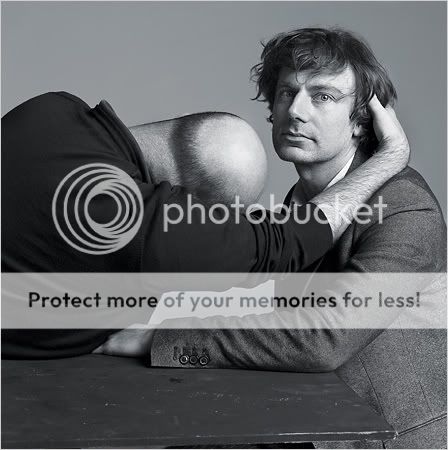
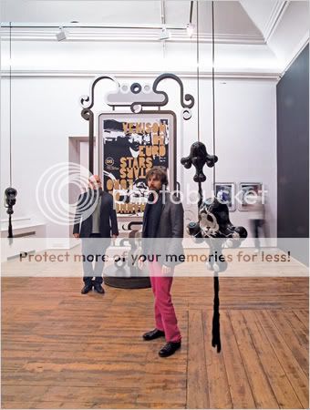
Michael Amzalag (left) and Mathias Augustyniak.

0603-STYLESS.jpg

M/M (Paris)

spacer.gif

"No Ghost Just A Shell" (2000), a collaboration with the artists Pierre Huyghe and Philippe Parreno.

0603-STYLESS-1.jpg

M/M (Paris)
Balenciaga invitation to Fall-Winter 2001-2 show, with a photo by Inez van Lamsweerde and Vinoodh Matadin.
0603-STYLESS-2.jpg

M/M (Paris)
Advertising image from Fall-Winter 2001-2 featuring Christy Turlington.

0603-STYLESS-3.jpg

M/M (Paris)
Stage design for Pluie d'été à Hiroshima at the Cloître des Carmes, Avignon, 2006.

0603-STYLESS-4.jpg

M/M (Paris)
Layout from Libertine, a fashion shoot for V Magazine by Van Lamsweerde and Matadin featuring the model Nadja Auermann.

0603-STYLESS-14.jpg

M/M (Paris)
Calvin Klein Jeans campaign for Fall-Winter 2002-3.

STYLESS.jpg

M/M (Paris)
Givenchy invitation to Fall-Winter 2007-8 ready-to-wear show.

0603-STYLESS-5.jpg

M/M (Paris)
Ad campaign for Balenciaga, Spring-Summer 2002.

0603-STYLESS-6.jpg

M/M (Paris)
Translation exhibition at Palais de Tokyo in 2005 with Jeff Koon's "Wrecking Ball" (2002), M/M (Paris) posters (2005) using photographs by Van Lamsweerde and Matadin and Café Etienne Marcel carpet (2002).

0603-STYLESS-7.jpg

M/M (Paris)
Cover for Bjork's album "Vespertine."

0603-STYLESS-8.jpg

M/M (Paris)
Amzalag (left) and Augustyniak at their exhibition "Haunch of Venison/Venison of Haunch," (2006).

0603-STYLESS-9.jpg

M/M (Paris)
Cover collage for Vogue Paris no. 831, 2002.

0603-STYLESS-10.jpg

M/M (Paris)
Translation exhibition at Palais de Tokyo in 2005 with Yinka Shonibare's "Dressing Down" (1997), M/M (Paris) wallpaper posters, two images by Van Lamsweerde and Matadin for Balenciaga (2000-2) and Café Etienne Marcel carpet (2002).
Continued......
 
Last edited by a moderator:
Last three images from nytimes

0603-STYLESS-11.jpg

M/M (Paris)
Study for the "Tree of Signs," a project in progress in Iceland in collaboration with Gabriela Fridriksdottir.

0603-STYLESS-12.jpg

M/M (Paris)
Fall-Winter 2007-8 ad campaign for Stella McCartney.

0603-STYLESS-13.jpg

M/M (Paris)
Silkscreened poster for the artist Pierre Huyghe for the video exhibition "This Is Not A Time For Dreaming."
 
Last edited by a moderator:
i never realized they where behind all of this work!! incredible... so much of there work stands out in my mind.. the balenciaga patchwork ad, yohji, bjork, its all wonderful!
 
Wow I love all of their work! Thanks for the starting the thread. Hope more is posted in the future.
 
one of my friend spent a night (working) and had dinner with them... he said they were really awesome/intelligent workers... but not really nice/polite....
they spent the dinner only three together (m&m and my friend)... and they didn't even talk to him at all!!!!
he was asst. for curating an exhibit', Printemps de Septembre, in Toulouse (France)...

but they're doing a very good job!!!!
 
Last edited by a moderator:

Users who are viewing this thread

New Posts

Forum Statistics

Threads
210,721
Messages
15,125,049
Members
84,420
Latest member
paulpaul
Back
Top
monitoring_string = "058526dd2635cb6818386bfd373b82a4"
<-- Admiral -->