-
Share your thoughts on the... 2025 Met Gala!
-
MODERATOR'S NOTE: Please can all of theFashionSpot's forum members remind themselves of the Forum Rules. Thank you.
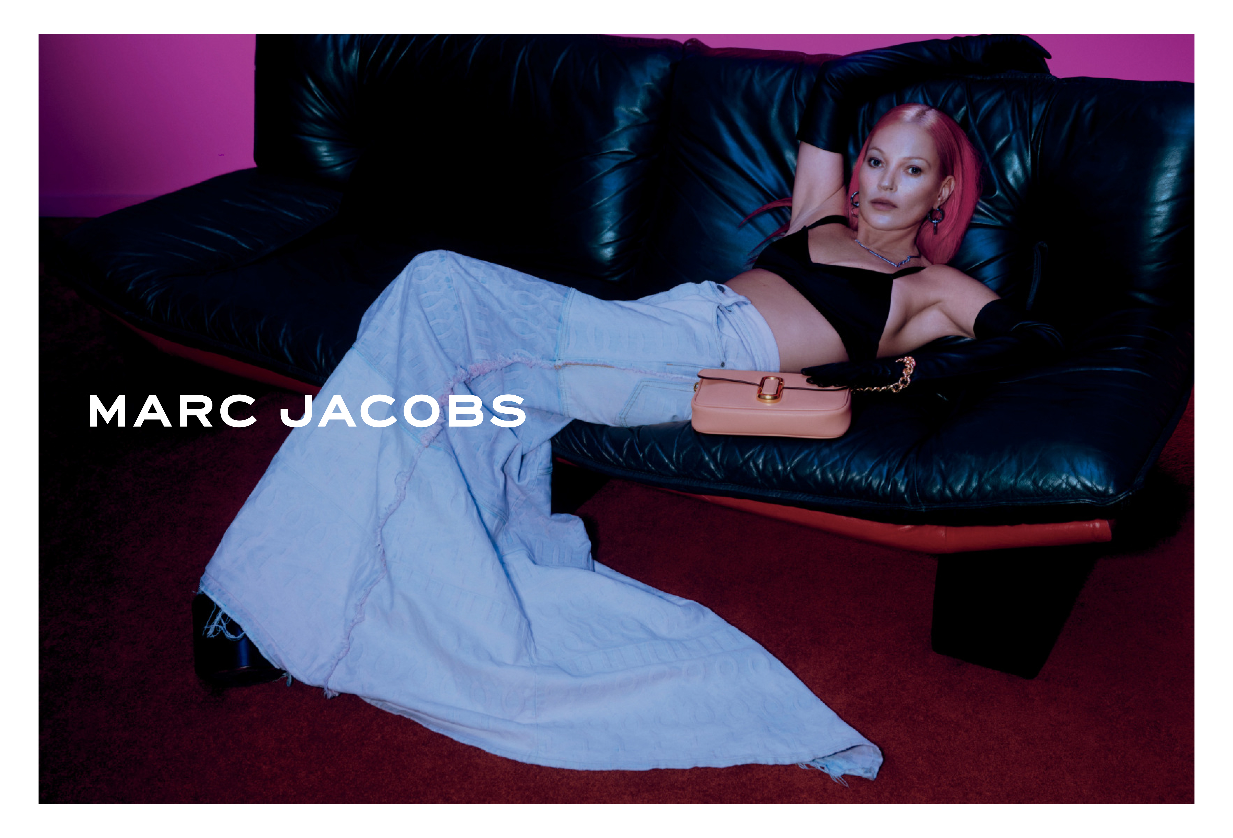
Marc Jacobs Resort 2023 : Kate Moss by Harley Weir
- Thread starter amby
- Start date