
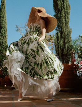
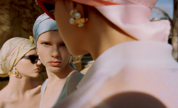
Porter #25 Spring 2018 : Natalie Portman by Cass Bird
- Thread starter amby
- Start date

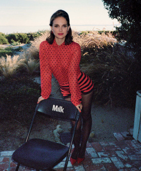
 high fashion Daisy Duke?


Similar Threads
Users who are viewing this thread
New Posts
-

-
-
-
-
 Dior Men 'Icons Capsule' 2024 : Robert Pattinson by Alasdair McLellan (4 Viewers)
- Latest: chrisand489