
You are using an out of date browser. It may not display this or other websites correctly.
You should upgrade or use an alternative browser.
You should upgrade or use an alternative browser.
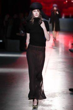
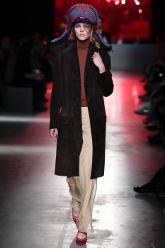
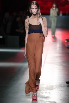
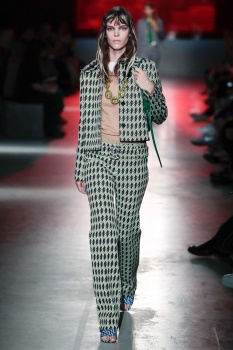
Prada Resort 2019
- Thread starter gazebo
- Start date


jeanclaude
Well-Known Member
- Joined
- Feb 12, 2012
- Messages
- 3,052
- Reaction score
- 6,763
Regurgitating her past once again. It started clean and minimal...then slowly became the same stylism mess from the last years.
Nothing new or interesting. This is Prada on training wheels; when she used to be a "high-speed" creative, ahead from the rest.
Nothing new or interesting. This is Prada on training wheels; when she used to be a "high-speed" creative, ahead from the rest.
Last edited by a moderator:


tatouejeremie
Well-Known Member
- Joined
- Jun 28, 2009
- Messages
- 1,071
- Reaction score
- 655
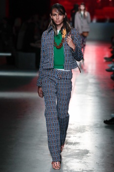
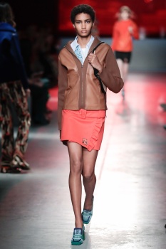
first look is definitely the freshest prada has looked in years
the rest looks, as usual, designed by the merchandising department
the rest looks, as usual, designed by the merchandising department
Lola701
Well-Known Member
- Joined
- Oct 27, 2014
- Messages
- 10,171
- Reaction score
- 19,035
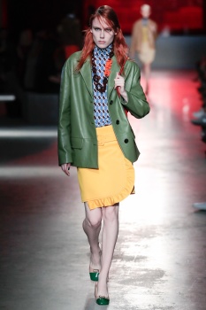
There was a time when Prada self-references were done with intelligence and somehow she managed to make a whole new collection with a detail or an outfit from the past. It was fresh and directional...
But it was the past.
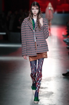
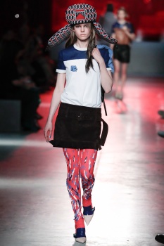
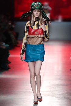
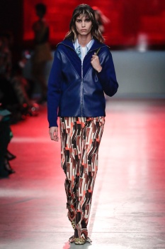
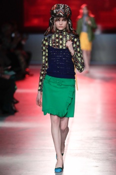
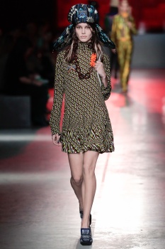
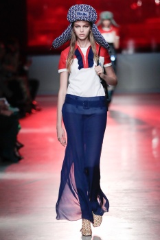
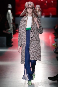
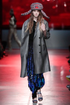
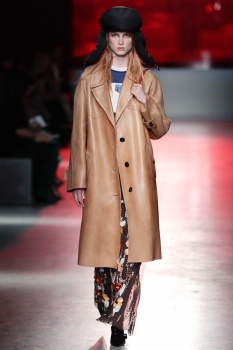
The first few silhouettes looked fresh for Prada but somehow they looks dated and not in a good way. But with the chapkas and all, it creates a fun dynamic..
Then, it’s «*go back to your glorious past*»: Prefall 2010 + SS 2002 + SS 2005.
Everything is so obvious! And then she added that silly ruffle detail Nicolas Ghesquiere did for the Rio collection.
Prada look so lost. I don’t think that people want to wear in 2018, the pants from SS2002, no matter how great that collection was. Prefall 2010 looked fresh and young and at the time it really connected with Prada customers.
Is it the case today?
Miuccia needs to change something in her team. Donatella managed to give a fresh take on the past of the brand and Prada is struggling.
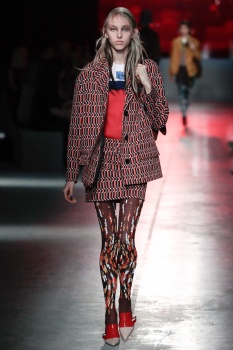
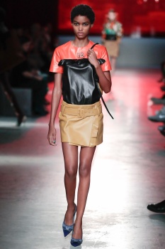
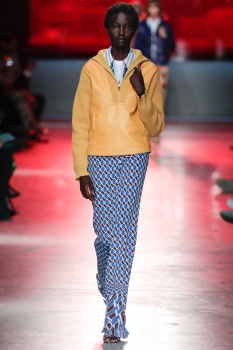
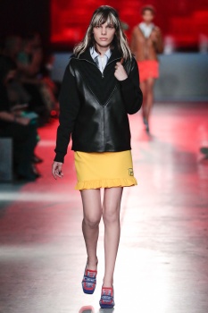
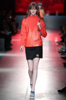
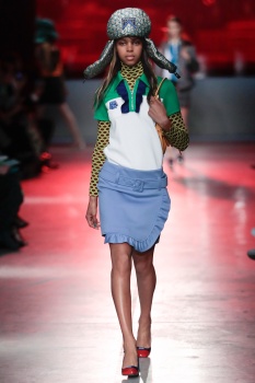
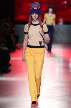
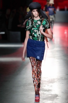
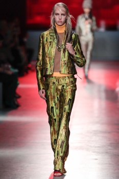
Apart from the yellow skirt and the orange sweater, I don’t see anything really desirable or young/fresh looking about this collection (except for the Hats).
FW 2018 was tragic and even in the stores, the S.A. are puzzled by that. This is not an indication of things going in the right way.
Showing in NYC was clever as the cult for the brand by the fashion scene there is still high but, this just looks like a throwback.
It’s weird, Chanel wasn’t that great but it looked more desirable, sellable than this. I really don’t know who is this for (and i’m A Prada fan/customer).
But it was the past.
The first few silhouettes looked fresh for Prada but somehow they looks dated and not in a good way. But with the chapkas and all, it creates a fun dynamic..
Then, it’s «*go back to your glorious past*»: Prefall 2010 + SS 2002 + SS 2005.
Everything is so obvious! And then she added that silly ruffle detail Nicolas Ghesquiere did for the Rio collection.
Prada look so lost. I don’t think that people want to wear in 2018, the pants from SS2002, no matter how great that collection was. Prefall 2010 looked fresh and young and at the time it really connected with Prada customers.
Is it the case today?
Miuccia needs to change something in her team. Donatella managed to give a fresh take on the past of the brand and Prada is struggling.
Apart from the yellow skirt and the orange sweater, I don’t see anything really desirable or young/fresh looking about this collection (except for the Hats).
FW 2018 was tragic and even in the stores, the S.A. are puzzled by that. This is not an indication of things going in the right way.
Showing in NYC was clever as the cult for the brand by the fashion scene there is still high but, this just looks like a throwback.
It’s weird, Chanel wasn’t that great but it looked more desirable, sellable than this. I really don’t know who is this for (and i’m A Prada fan/customer).
- Joined
- Sep 27, 2010
- Messages
- 18,629
- Reaction score
- 2,830
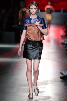
Love this! It's quite commercial (as Resort is meant to be) but in a good way. It reminds ne of her early 00s collections. I love the simplicity and straight forward approach. It's fresh and young but still Prada at heart. This will looks very appealing in the stores.
Conbothsides
Well-Known Member
- Joined
- Apr 21, 2017
- Messages
- 271
- Reaction score
- 452
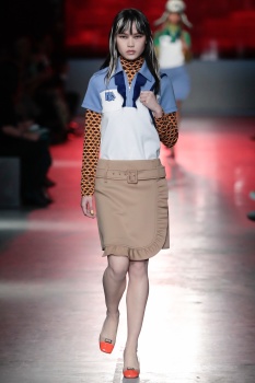
Hello!! The first look!! Can't you make a collection out of that??
Trash!
My thought exactly.
rebel
Well-Known Member
- Joined
- Dec 7, 2013
- Messages
- 1,227
- Reaction score
- 121
vogue.com“Not too many words, it’s not a serious show,” Prada demurred to the crowd of reporters afterward, then summed it up neatly: “It’s a kind of fantasy of reality.”
GivenchyHomme
Well-Known Member
- Joined
- Sep 3, 2009
- Messages
- 5,077
- Reaction score
- 3,653
I feel like she's setting herself up to go back to classic Prada, this is just a precursor of what's to come. It's about damn time. Every single collection she did from 1996-2009 along with Fall 2016, Spring 2017, and Resort 2018 remains timeless and chic. This collection is simple but resort really isn't a place to go over the top. I love the colors, very DNA Prada. The ideas here will be magnified X10 for the Spring 2019 collection. I hope she continues this direction with her Menswear show this summer! As man I want that classic Prada look!
Lola701
Well-Known Member
- Joined
- Oct 27, 2014
- Messages
- 10,171
- Reaction score
- 19,035
^^
I hope that going back to classic means more than redoing past success. I like the idea of having the essence of the past but if it’s to have a spice-free version of what she did already... No!
What I hate the most is that they are trying to hide it with silly styling.
Prefall 2010 was styled so simply that it is untouchable and brocard pants with big below the waste was hardly flattering before and now in brocade...hmmm.
I feel like by doing big shows for resort, she is setting herself up to fall into the trap of her main collections.
If for Spring she is doing a SS2007 bis, I wouldn’t mind tho.
dior_couture1245
Fat Karl
- Joined
- Jan 30, 2006
- Messages
- 9,225
- Reaction score
- 4,737
There are glimmers of hope here, but it's all still bogged down by too much muchness.
The first couple of looks, as others have mentioned - including in the Vogue review, are smart and appealing because of the simplicity and streamlined, classic look of them. Just enough odd factor, but realistic looking - which is something Prada hasn't captured in a long time. Interesting, compelling realistic propositions of what one could wear.
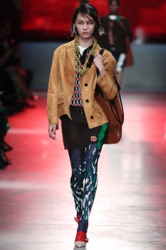
There are strong looks throughout, actually...but it really could have been scrubbed cleaner a bit. I would have dumped all the metallic brocade (the suede, fine gauge knits and georgette are really good looking materials all together), I would have dumped all the pie crust ruffles (so sick of ruffles), and I would have DEFINITELY dumped those HEINOUS graphic Prada logos they are pushing so hard. In fact, not only would I dump the logos, I would dump whoever it is on the internal design team who is coming up with those crimes against fashion immediately.
And, actually, for the first time since the failed Inside Bag (unfortunately...loved that bag), I really like the bags this season from Prada. They're really good looking and chic and not too tricky looking.
Last thing...can someone explain why Julia Nobis is still popping up? When you say you're going to retire but then you keep popping up all the time...it's kind of annoying, tbh. Either retire or don't. LOL.
The first couple of looks, as others have mentioned - including in the Vogue review, are smart and appealing because of the simplicity and streamlined, classic look of them. Just enough odd factor, but realistic looking - which is something Prada hasn't captured in a long time. Interesting, compelling realistic propositions of what one could wear.
There are strong looks throughout, actually...but it really could have been scrubbed cleaner a bit. I would have dumped all the metallic brocade (the suede, fine gauge knits and georgette are really good looking materials all together), I would have dumped all the pie crust ruffles (so sick of ruffles), and I would have DEFINITELY dumped those HEINOUS graphic Prada logos they are pushing so hard. In fact, not only would I dump the logos, I would dump whoever it is on the internal design team who is coming up with those crimes against fashion immediately.
And, actually, for the first time since the failed Inside Bag (unfortunately...loved that bag), I really like the bags this season from Prada. They're really good looking and chic and not too tricky looking.
Last thing...can someone explain why Julia Nobis is still popping up? When you say you're going to retire but then you keep popping up all the time...it's kind of annoying, tbh. Either retire or don't. LOL.
Similar Threads
- Replies
- 78
- Views
- 11K
Users who are viewing this thread
Total: 2 (members: 0, guests: 2)
New Posts
-

-
-
US Harper's Bazaar May 2024 : Anok Yai & Christy Turlington Burns by Ethan James Green (10 Viewers)
- Latest: Ivancica
-
