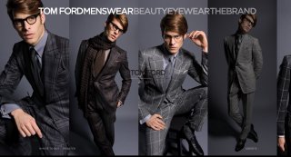
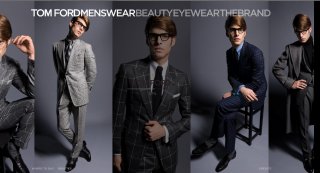
My God! Jon is so ugly and these photos just dont make sense. Me no like. He looks so creepy and ugly (yeah, i dont like him). And this is the same old ad from TF. He should hire a photographer! This recesion thing is driving me mad!
My God! Jon is so ugly and these photos just dont make sense. Me no like. He looks so creepy and ugly (yeah, i dont like him). And this is the same old ad from TF. He should hire a photographer! This recesion thing is driving me mad!
Jon and his one and only pose... God I have never seen a model this repetitive. The same 'serious' -or nauseated- face in every single campaign from Guess to TF... Enough already. He is the modern day's Zoolander. Even Marky Kark was a much more versatile model than him.
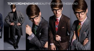
Hate the deer-in-headlights look of the first two. The 3rd shot is clearly the best and the only campaign worthy pic of the lot. He looks particularly ugly in the 4th one. I don't know how that one could get approved.
The seasonal look-book has much better photos (again, with Jon and I am guessing shot by Tom again). I do not know why those aren't used. Will try to do a screen-cap later from tomford.com.
This site uses cookies to help personalise content, tailor your experience and to keep you logged in if you register.
By continuing to use this site, you are consenting to our use of cookies.