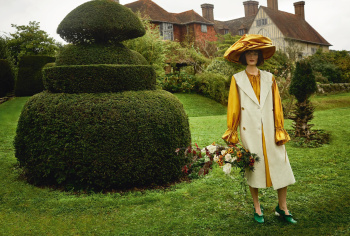
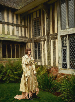
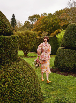
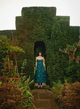
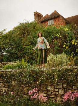
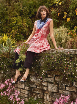
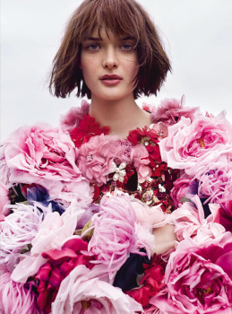
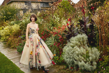
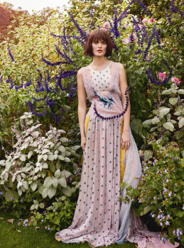
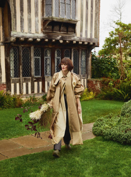
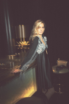
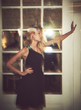
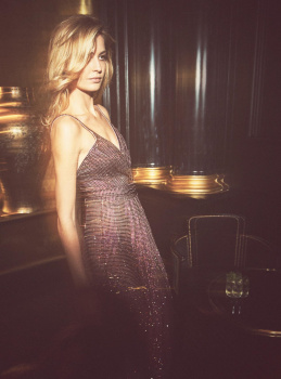
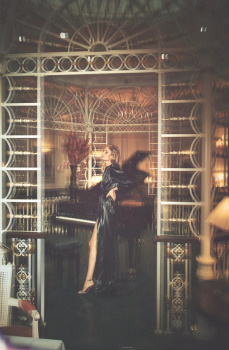
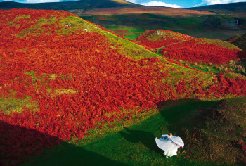
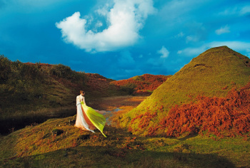
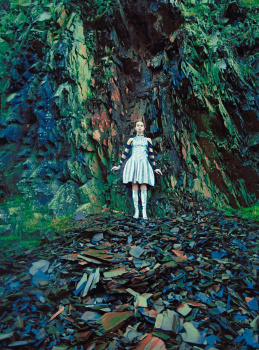
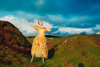
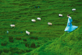
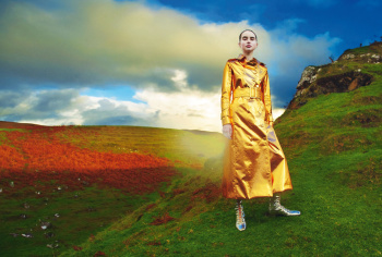
The colours are so vibrant and alive in those scans, but in the actual issue, I was disappointed at how faded the images looked, as if the paper stock used wasn't good enough to support the colours. Maybe it was a dud issue; it was the only one left on the shelf.
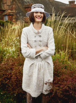
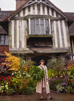
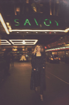
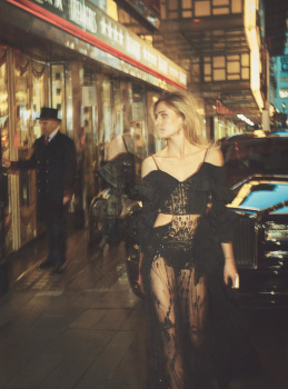
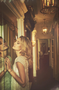
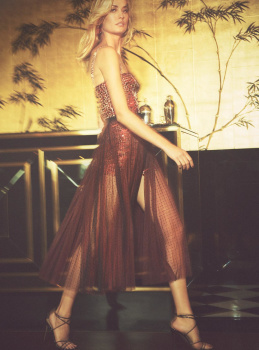
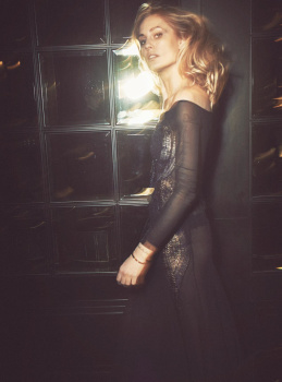
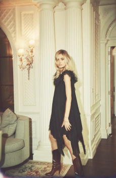
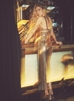
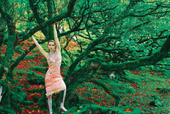
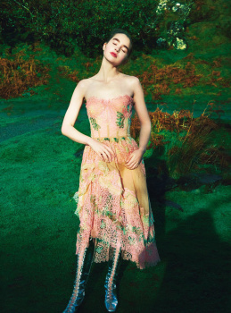
However, the fuzziness of the printing made the Nadja Bender editorial look more glamorous than it does here, it added a glow to the out-of-focus effect.