You are using an out of date browser. It may not display this or other websites correctly.
You should upgrade or use an alternative browser.
You should upgrade or use an alternative browser.
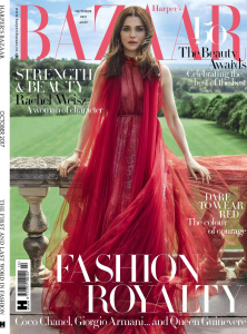
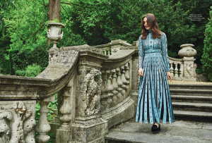
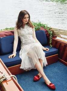
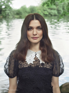
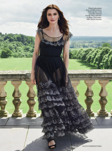
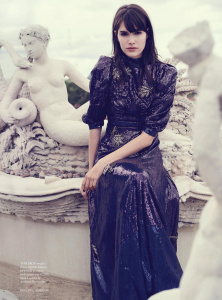
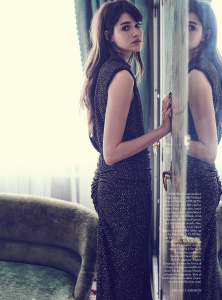
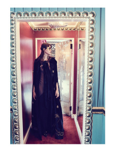
UK Harper's Bazaar October 2017 : Rachel Weisz by Agata Pospieszynska
- Thread starter vogue28
- Start date
Benn98
Well-Known Member
- Joined
- Aug 6, 2014
- Messages
- 42,530
- Reaction score
- 20,571
I hope they're only trying this art direction for subscribers, and not for the newsstand issues. It looks odd, not like a cover at all. As for the image, it should work but I'm distracted by the dress which could be ironed, and the frayed hair. But congrats to Agata for her first celebrity cover for British Harper's.
Thanks for posting, Vogue28!
Thanks for posting, Vogue28!

MON
Well-Known Member
- Joined
- Jun 20, 2009
- Messages
- 12,635
- Reaction score
- 5,184
Whoever decided this layout needs to take a long break and reconsider things. This is a disaster. That doesn't look like a cover. It looks like those mini Bazaar ads that you see online with the "Subscribe Now" icon. Tragic. Lost.
This is what you look like when you ran out of fresh ideas. What's next? An inverted logo?
This is what you look like when you ran out of fresh ideas. What's next? An inverted logo?
honeycombchild
Well-Known Member
- Joined
- Jan 22, 2009
- Messages
- 8,841
- Reaction score
- 727
I don't hate it as much as the above at all. It's nice image and Rachel looks beautiful, although at first glance it give me Keira vibes. I wish the logo had been further down the page, sitting in the middle looks a little odd, but I don't particularly hate that they've turned it on its side personally.
kokobombon
Well-Known Member
- Joined
- Oct 7, 2007
- Messages
- 18,652
- Reaction score
- 2,012
I like that they always have "unconventional" ideas for subs´ covers. I hope that the newsstands´ maintains a level of whimsy.
KateTheGreatest
Well-Known Member
- Joined
- Mar 15, 2011
- Messages
- 5,451
- Reaction score
- 831
I quite like it, although it looks less like a cover and more a of picture in the ed. Congrats to Agata, this is a big deal for her.
Can't wait to see the newsstand cover.
Can't wait to see the newsstand cover.
yes, at first glance it looks like Keira and both of them look a like actually. The masthead placement looks weird for me. It looks like a cover of romance novel lolI don't hate it as much as the above at all. It's nice image and Rachel looks beautiful, although at first glance it give me Keira vibes. I wish the logo had been further down the page, sitting in the middle looks a little odd, but I don't particularly hate that they've turned it on its side personally.
- Joined
- Jan 9, 2008
- Messages
- 35,344
- Reaction score
- 20,398
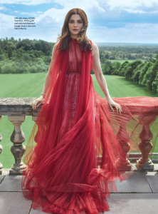
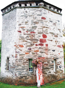
^Sure! The newsstand cover is a full-length shot of Rachel wearing a red silk Valentino dress, shot outside on location with a sweeping countryside backdrop.
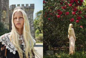
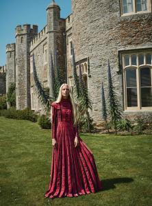
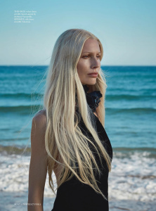
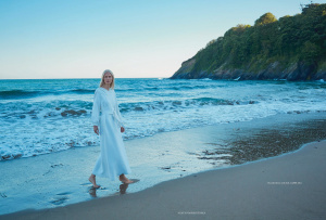
There are five covers in total. Two featuring Rachel (the newsstand and subscribers), a limited edition cover available at Harrods, Selfridges and selected independent retailers featuring Kirsty Hume by Agata Pospieszynska (which I have a feeling everyone will die over Kirsty's editorial) and two remaining covers with art by Peter Joyce (available at Lapada Art & Antiques Fair) and one with a photograph by Richard Dormer (available from Goodwood Revival). Review of the issue to follow!
There are five covers in total. Two featuring Rachel (the newsstand and subscribers), a limited edition cover available at Harrods, Selfridges and selected independent retailers featuring Kirsty Hume by Agata Pospieszynska (which I have a feeling everyone will die over Kirsty's editorial) and two remaining covers with art by Peter Joyce (available at Lapada Art & Antiques Fair) and one with a photograph by Richard Dormer (available from Goodwood Revival). Review of the issue to follow!
- Joined
- Jan 9, 2008
- Messages
- 35,344
- Reaction score
- 20,398
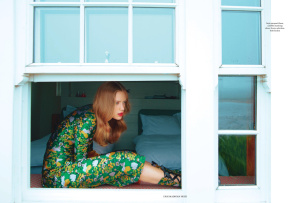
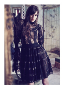
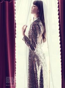
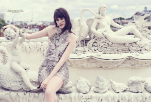
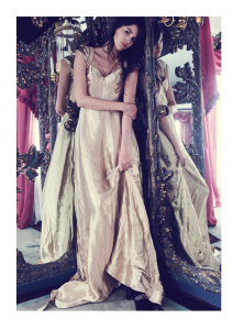
Review - 354 Pages.
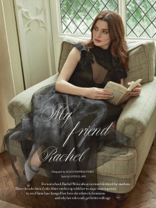
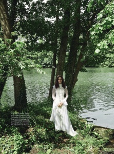
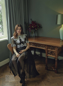
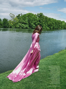
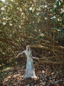
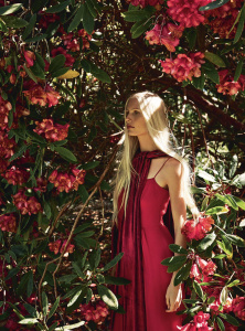
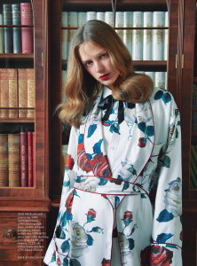
MY FRIEND RACHEL
Cover Star: Rachel Weisz
Photographer: Agata Pospieszynska
Stylist: Leith Clark
9 Photos
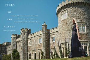
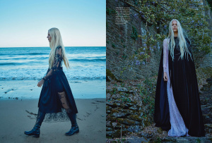
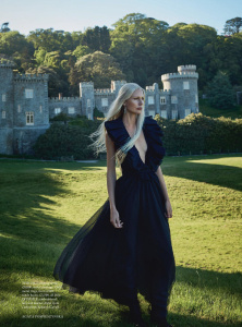
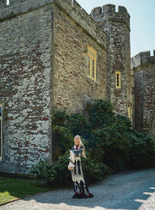
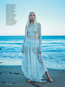
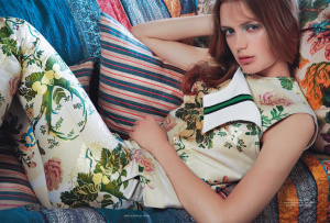
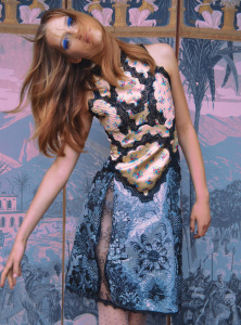
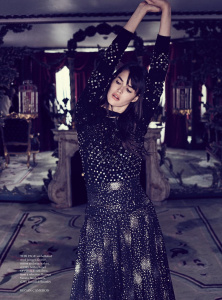
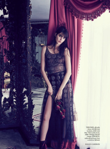
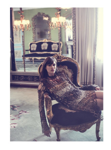
QUEEN OF THE CASTLE
Model: Kirsty Hume
Photographer: Agata Pospieszynska
Stylist: Charlie Harrington
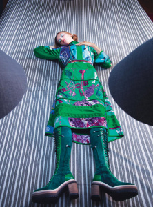
14 Photos
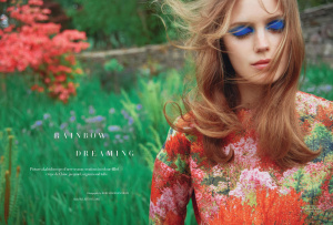
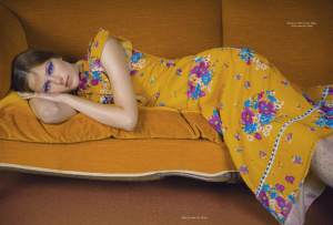
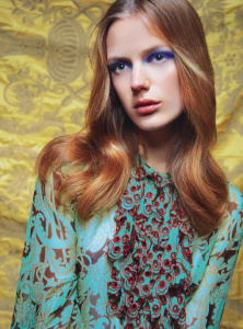
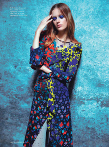
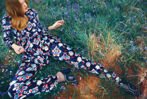
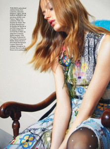
RAINBOW DREAMING
Model: Esther Heesch
Photographer: Erik Madigan Heck
Stylist: Leith Clark
17 Photos
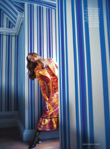
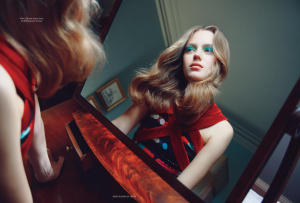
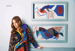
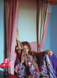
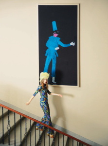
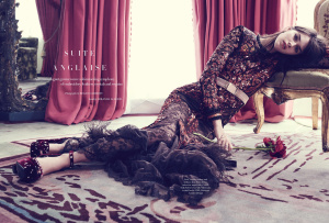
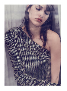
SUITE ANGLAISE
Model: Vanessa Moody
Photographer: Regan Cameron
Stylist: Miranda Almond
12 Photos
mistress_f
Hell on Heels
- Joined
- May 27, 2007
- Messages
- 7,238
- Reaction score
- 364
she's so beautiful, i can't even focus on anything else.
and im - as usual - looking forward to erik madigan heck's ed
and im - as usual - looking forward to erik madigan heck's ed
zzzyao76
Active Member
- Joined
- Jan 27, 2016
- Messages
- 4,748
- Reaction score
- 87
zzzyao76
Active Member
- Joined
- Jan 27, 2016
- Messages
- 4,748
- Reaction score
- 87
zzzyao76
Active Member
- Joined
- Jan 27, 2016
- Messages
- 4,748
- Reaction score
- 87
zzzyao76
Active Member
- Joined
- Jan 27, 2016
- Messages
- 4,748
- Reaction score
- 87
Similar Threads
- Replies
- 1
- Views
- 2K
- Replies
- 0
- Views
- 2K
- Replies
- 8
- Views
- 4K
Users who are viewing this thread
Total: 2 (members: 0, guests: 2)


