UK Vogue July 2012 : Rachel Weisz by Alasdair McLellan

vogue28

Mod Squad Team Leader
Staff member
Joined
Jan 9, 2008
Messages
33,838
Reaction score
17,024
.
Vogue_July_12_cover_320x480.jpg


vogue.co.uk
 
Last edited by a moderator:
Quite a departure from last month's ultra-glam cover, but this is beautiful and quietly elegant. I anticipate Karen's feature as well.
 
This would be better as an October cover, I think.
 
I agree, there's a slight autumnal colouring, but I do like it, it says a sort of muted tropical vibe to me. Vogue is generally quite bad when it comes to such close up head shots (just look at what they did to Gwyneth last time...) but this is nice. I'm not blown away... but nice.
 
I agree with everyone else, but I don't actually mind it, I think Rachel has such an endearing beauty and she has disappointed one bit with this appearance and I'm grateful that the cover isn't in the typical nature of McLellan's work.
 
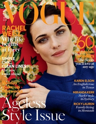
I do agree that this does not feel very July, however, i simply love the fact she appears to have minimal to no make-up. The whole styling feels a bit too casual for The Vogue cover, and the background clashes with the font though. It will be noticeable at the newsstands i believe, we did see worse covers from them.
 
I love it! Great use of colours.
 
Groce, awful, oh my god

Can't believe it's the same woman:
images

(vogue.co.uk)
 
Beautiful cover, Rachel looks really good. Love the colors as well.
 
well it's beautiful but it looks so autumnal and somehow it looks like the Good Housekeeping's cover rather than Vogue. Too safe and bit boring for me
 
I had to look up to see what she is promoting, didn't realise she is in the new bourne and the upcoming oz film. Rachel is a classic beauty, she looks gorgeous. Love the feel of the colours, although yes, very fallish. It's a pretty safe picture but all in all it's a pretty cover.
 
Rachel looks beautiful but the choice of colours for this time of year are a bit off.
 
She looks a bit weird...even bored? The hand on the shoulder is awkward, too. I'm all for an up-close, beauty shot but it needs to be much more effective than this to be a cover.
 
What a sad cover and after last months. I can't believe theY have made her look plain. Hopefully inside is better.
 
Its quite depressing for a cover. But I like it tho. Rachel is so stunning...
 
I like it. It looks so subtle and so serene.
 
I don't like it. I get it, not everything has to be sexual and provocative or whatever, but Rachel's such a beautiful woman and this cover doesn't bring her justice. It looks very outdated too, like an old cover from 80's or 90's.
 

Users who are viewing this thread

Forum Statistics

Threads
210,705
Messages
15,124,473
Members
84,412
Latest member
Florencie
Back
Top
monitoring_string = "058526dd2635cb6818386bfd373b82a4"
<-- Admiral -->