Follow along with the video below to see how to install our site as a web app on your home screen.
Note: This feature may not be available in some browsers.
Xenforo is upgrading us to version 2.3.7 on Thursday Aug 14, 2025 at 01:00 AM BST. This upgrade includes several security fixes among other improvements. Expect a temporary downtime during this process.
More info here
Lol, the 'Vogue' treatment, by that I mean neatening up her look, is very impressive! Though there must've been a better shot and dress. And that lip colour looks out of place.
Halsey reminds me a bit of Pink in her early years. Trying very hard to be punk and bad-***, but failing horribly.
Never heard Halsey's music but I do think she's photographed beautifully here, especially for the cover image which looks and feels very 90s - I like it! For some unknown reason, I'm having a soft spot for American Marie Claire lately.
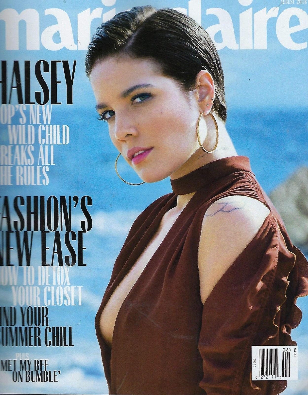
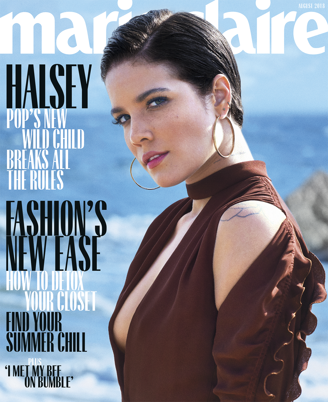
I actually don’t mind this cover, but I do agree about the lip color.
And I’m a freak when it comes to text so I definitely think because their logo is a sans serif font, they should choose a nice serif font to break up the logo and headlines, but I do like the font they stole from Vogue Paris, it’s modern.
Her editorial looks like a series of 'cut' shots. Odd. They're all seemingly in anticipation of the proper/final image. I quite like the shot of her on the rocks, but it's zoomed out way too much. Had all the makings to be something great imo, but failed.
This site uses cookies to help personalise content, tailor your experience and to keep you logged in if you register.
By continuing to use this site, you are consenting to our use of cookies.