Vogue Arabia November 2018 : Naomi Campbell by Chris Colls

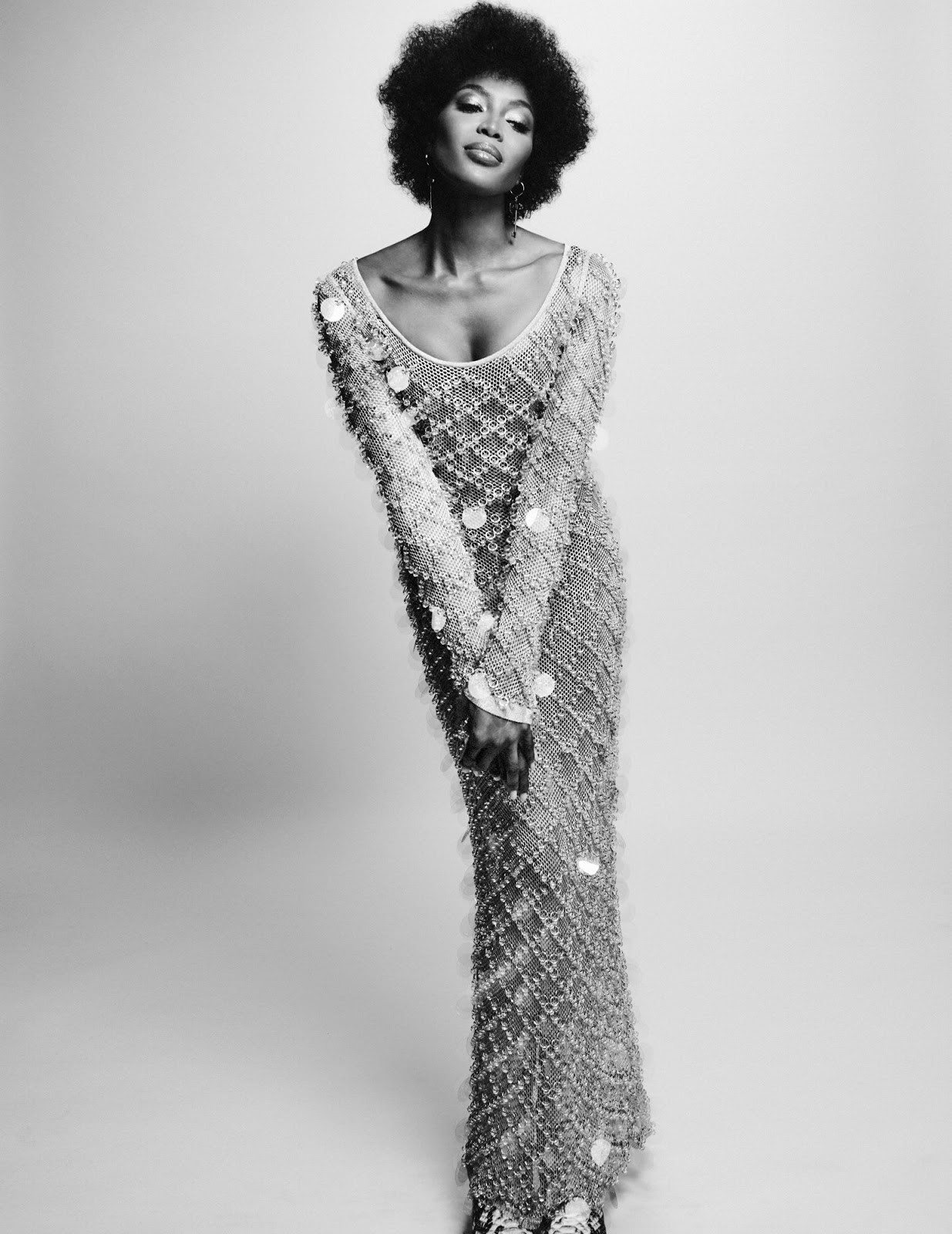
I want to like it, i really do but there's something off with it. This is not as vivid as it should be and even if i love that Tom Ford collection, that dress doesn't really work with Naomi.
It's supposed to be joyful but it doesn't scream joy!
 
After reading the thread title I was expecting to be blown away by two sensational and instantly-iconic Naomi Campbell covers (especially also given the fact Chris Colls has been producing some brilliant work lately).

What on earth happened? This is so flat and mediocre. A total missed opportunity... like something The Edit would discard.
 
Honestly isn’t that bad for Vogue Arabia Edition... there’s not a reprint at all! And having Naomi there. Could be better the covers for sure but i like those covers from Vogue Arabia
 
Im confused. This is quite random. Gotta love the TF on the 2nd cover, but overall :unsure:
 
I just feel like with the styling, we could've done with a joyful Naomi smile, especially on the first cover. But she's serving us that same "I'm a fierce diva queen b*tch" face she's been giving for years now. Naomi is one of my favourite models ever and she has produced some of the most iconic fashion images ever. But I feel like she's just fully bought into her image as that above-it-all legend and that's all she knows how to portray. It would be amazing to see some vulnerability in her work again, instead of all this "Next question" attitude. ESPECIALLY with the ludicrous over the top styling of a shoot like this.
 
I just feel like with the styling, we could've done with a joyful Naomi smile, especially on the first cover. But she's serving us that same "I'm a fierce diva queen b*tch" face she's been giving for years now. Naomi is one of my favourite models ever and she has produced some of the most iconic fashion images ever. But I feel like she's just fully bought into her image as that above-it-all legend and that's all she knows how to portray. It would be amazing to see some vulnerability in her work again, instead of all this "Next question" attitude. ESPECIALLY with the ludicrous over the top styling of a shoot like this.

I agree. The longevity of her beauty in this industry is arguably unmatched, but she seems to be--for a lack of better word--typecasted. It's as if fashion editors don't know what to do with her anymore and photographers are unable to challenge her--like you addressed--vulnerability. It's not that she doesn't have the capability anymore, on the contrary, one needs to look at her recent editorial for Vogue Paris' September Issue to see that, with the right photographer, she can still project candidness and warmth.
 
It looks as cheap as any American Vogue's cover.
 
Vogue Arabia Novermber 2018 : Naomi Campbell

editorial

BY CHRIS COLLS


source: awake-smile blogspot
 
How Manuel Arnaut never chose that second to last shot of Naomi wearing Azzedine Alaia for either of the two covers is just baffling to me!

I gasped when Chris Colls uploaded it onto his IG! It screams cover shot, is a thousand times more compelling than the naff and comical Balenciaga and Tom Ford shots and is easily one of Naomi's strongest fashion images in recent years. A gold masthead, minimal amount of cover lines and I'd of been sold.
 
There's a lot going for both covers. The fashion is madcap mashup of prints and textures but still quite adaptable to real life (I've a weakness for zebra pattern; I blame 90s Bazaar). The hair and make-up spot on. Cover photo and text interactions are tastefully minimal yet playful.

Swooning over the second cover. The subtle pops of hot pink text and naturalistic Arabic script perfectly ties together the textural fashion elements of the patterned tights and shiny sequined mini dress. Both sans serif and script typefaces are gorgeous and pair perfectly. Despite not showing much skin fashion-wise Naomi's oozes sex appeal. She looks amazing.

My main complaint only applies to the first cover. The glaringly obvious overblown Photoshop highlight on Naomi's face completely unnecessary plus the weirdness going on with her upper body. That constricting blue sash around her arms/torso appears computer generated. Then they proceeded to copy paste the shiny stiff torso onto the wildly active kicking zebra legs. Makes for a strange, unnatural juxtaposition of body movements. It also appears as if Naomi is pooping out some blue spotted animal. Shots 1 & 4 are pretty but the rest of the cover editorial shots are forgettable.
 

Users who are viewing this thread

New Posts

Forum Statistics

Threads
210,661
Messages
15,123,051
Members
84,363
Latest member
waffleninja
Back
Top
monitoring_string = "058526dd2635cb6818386bfd373b82a4"
<-- Admiral -->