You are using an out of date browser. It may not display this or other websites correctly.
You should upgrade or use an alternative browser.
You should upgrade or use an alternative browser.
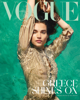
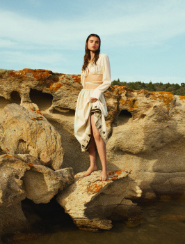
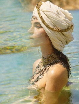
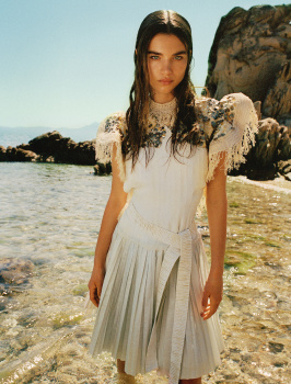
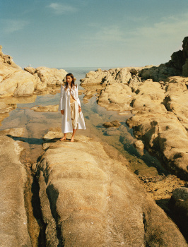
Vogue Greece July/August 2021 : Meghan Roche by Nico Bustos
- Thread starter amby
- Start date
Abby Zacky
Active Member
- Joined
- Jul 30, 2020
- Messages
- 133
- Reaction score
- 65
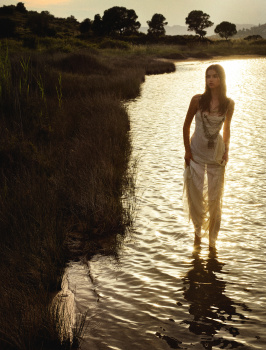
second cover is gorgeous
VogueGirl8910
Well-Known Member
- Joined
- Apr 14, 2008
- Messages
- 50,024
- Reaction score
- 8,416
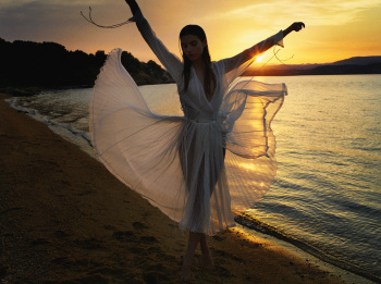
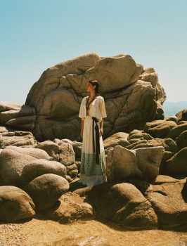
All the three covers are great, i really like the atmospere on these images.
Serend1pity
Well-Known Member
- Joined
- Aug 21, 2020
- Messages
- 469
- Reaction score
- 811
She is absolutely stunning
FashionMuseDior
Well-Known Member
- Joined
- Feb 27, 2012
- Messages
- 1,782
- Reaction score
- 705
The second cover is absolutely stunning!
- Joined
- Jan 9, 2008
- Messages
- 35,329
- Reaction score
- 20,362
Greece is a country full of absolutely spectacular and magnificent landscapes but the only cover that's doing it for me here is the third, with Megan Roche photographed in the water. The first and second just don't read as 'fashion magazine' to me, personally.
Phuel
Well-Known Member
- Joined
- Feb 18, 2010
- Messages
- 5,723
- Reaction score
- 8,706
Thanks @Zorka.
The submerged covershot has the most potential but the top ruins it. You know, there are certain pieces of clothing that just do not work when it’s submerged in water. Why some so-called stylists can’t understand this— let alone an editor can’t see this and even selects it for a covershot, speaks volume of the shortage of talent that’s currently working in the industry. Fabien/Franca/Emmanuelle/Liz would never.
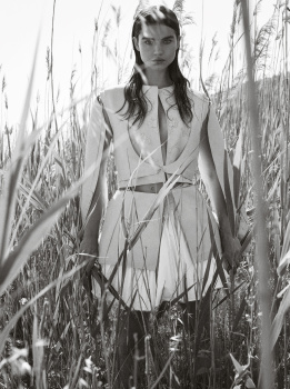
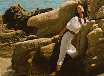
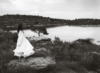
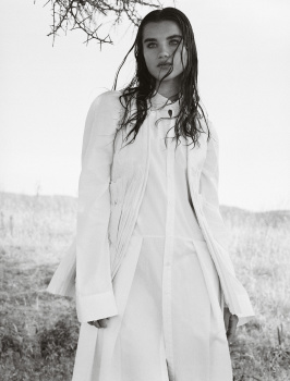
There are some "nice" shot for the story, but again, tepid styling and a lack of direction that just goes nowhere is laughably clueless, despite the gorgeous locale. The shot standing amongst the reeds is the strongest for its pure simplicity and allure. The artsy ones with the blurring/overlay exposure are so embarrassingly clueless. Very amateur.
carolisque
Well-Known Member
- Joined
- Dec 5, 2017
- Messages
- 4,750
- Reaction score
- 861
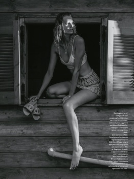
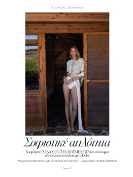
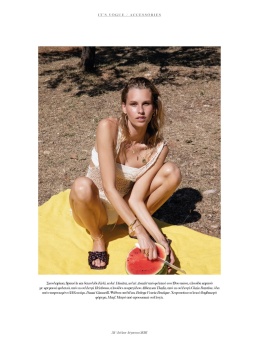
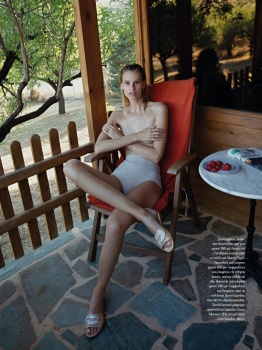
"Sophisticated Simplicity"
Photographer -- HARIS FARSARAKIS
Stylist -- GEORGE KARAPETIS
Hair Stylist -- JOSE QUIJANO
Make-up Artist -- ATHINA KARAKITSOU
Model -- MARIINA KESKITALO
Source -- Fashion Gone Rogue | Fashion Editorials, Models & Celebrity Style
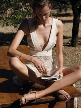
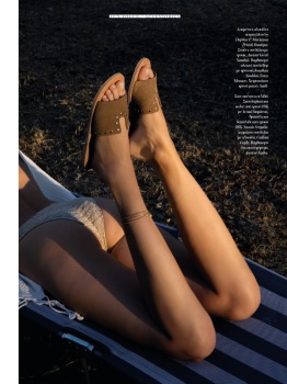
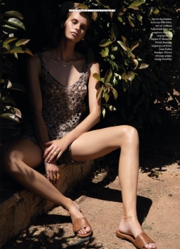

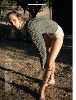
Photographer -- HARIS FARSARAKIS
Stylist -- GEORGE KARAPETIS
Hair Stylist -- JOSE QUIJANO
Make-up Artist -- ATHINA KARAKITSOU
Model -- MARIINA KESKITALO
Source -- Fashion Gone Rogue | Fashion Editorials, Models & Celebrity Style


carolisque
Well-Known Member
- Joined
- Dec 5, 2017
- Messages
- 4,750
- Reaction score
- 861
Thank you Zorka for posting this nice editorial, really appreciate it.
CRAFT AND DESIGN
Photographer: Nico Bustos
Stylist: Nicholas Georgiou
Hair: Christos Vourlis
Make-Up: Athina Karakitsou
Model: Meghan Roche
weibo.com
carolisque
Well-Known Member
- Joined
- Dec 5, 2017
- Messages
- 4,750
- Reaction score
- 861
"OUT OF THE BOX"
Photographer -- THANASSIS KRIKIS
Stylist -- NICHOLAS GEORGIOU
Hair Stylist -- CHRISTOS VOURLIS
Make-up Artist -- HARA PAPANICOLAOU
Model -- Jip Boxstart
Source -- Fashion Gone Rogue | Fashion Editorials, Models & Celebrity Style

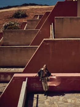
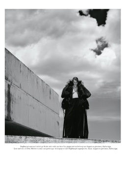
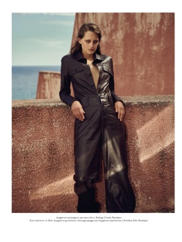
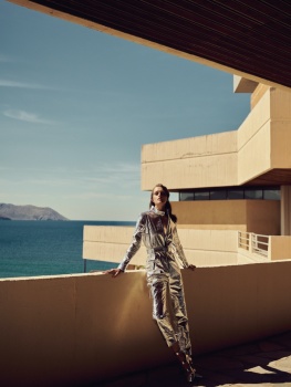

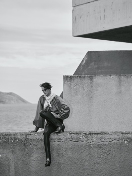
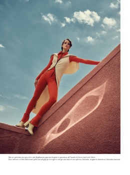
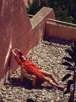
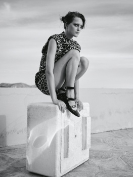
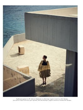
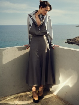
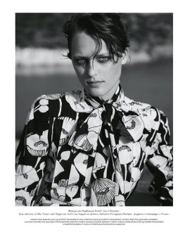
Photographer -- THANASSIS KRIKIS
Stylist -- NICHOLAS GEORGIOU
Hair Stylist -- CHRISTOS VOURLIS
Make-up Artist -- HARA PAPANICOLAOU
Model -- Jip Boxstart
Source -- Fashion Gone Rogue | Fashion Editorials, Models & Celebrity Style


Similar Threads
- Replies
- 22
- Views
- 20K
- Replies
- 3
- Views
- 1K
- Replies
- 4
- Views
- 2K
- Replies
- 2
- Views
- 1K
Users who are viewing this thread
Total: 2 (members: 0, guests: 2)


