Vogue Italia April 2017 : Sara Grace Wallerstedt by Mert Alas & Marcus Piggott

AlbertNoir

Active Member
Joined
Dec 9, 2009
Messages
9,789
Reaction score
67


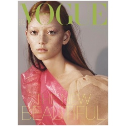
Photographers: Mert & Marcus
Model: Sara Grace @ The Society NYC
Stylist: Marie Chaix
Hair: Soichi Inagaki
Make-up: Peter Philips
Casting: Piergiorgio Del Moro and Samuel Ellis Scheinman
Editor-in-chief: Emanuele Farneti

instagram.com/vogueitalia/
 
Last edited by a moderator:
Flat, and uninspiring, this just so bland, almost, can't even comment!!
 
Boring. Looks like they tried to imitate Meisel style for VI.
 
When it comes to not-so-mainstream magazines, making a really good minimalist cover requires more than selecting any old image then layering two or three words on it. Anyone can do that.
 
Dull, dour and forgettable - the girl, styling and photographers! Who would choose lime for a masthead, this guy's got no idea what he's doing.
 
HATE the font they used

and the color scheme is not working

she's so pretty but overall... meh
 
M&M know how to do their work, so I'm sure they have purposely chosen this "Meisel" style.
Maybe this will not an epic cover, but it's really well balanced. The layout, the color tones. Sara looks gorgeous and I love that make-up on her!
A classic Vogue Italia cover..nothing shocking, but gorgeous.
 
It's ok, I like the colors. But it really lacks something, some oomph.
 
It's just another VI cover, not failed but flat. I'd rather see them copying Meisel than Bruce's awful covers for VI. :rolleyes:

Who is she wearing, I think it looks quite cheap.
 
Apparently it's a foldout cover, + Ansley Gulielmi and Cara Taylor.

 
Love it! I've been completely in love with this girl for the past few months, so I couldn't be happier with her scoring a VI cover. Major! She looks amazing.
It really looks like Meisel and it's a classic VI cover. I was shocked when I noticed it's not by him. But it's much better than what he did last month and better than any Bruce Weber's cover, so I'm happy.
 
Last edited by a moderator:
When i first saw the Sara's solo cover, I thought it was amazing. However, when I saw the other cover image, I felt that the harmony of the cover was broken.
 
I think I love it. The shadow bothers me a little bit...

UGHH, the foldouts are terrible tho!
 
Last edited by a moderator:
Lmao I actually really like this. The Gucci dress was the only standout piece from that collection that isn't overused and the lime masthead makes it look fabulous.
 
I kinda love it but I also feel like that's because it looks like Meisel?
 
Beautiful! Classic VI IMO. Minus the 'youth' issue, M&M have been wonderful for VI!
 
I Love it!
Let's be honest, VI identity for the past 28years has been Meisel. So the best way to do a good VI cover is to emulate Meisel...
The same for VP that has always referenced the most important photographers of the publication.

This new EIC seems to have a clear vision. No more "carte blanche". I like that.
Perfect...
 

Users who are viewing this thread

Forum Statistics

Threads
210,721
Messages
15,125,072
Members
84,422
Latest member
paulpaul
Back
Top
monitoring_string = "058526dd2635cb6818386bfd373b82a4"
<-- Admiral -->