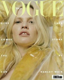
That looks unflattering. Ouch. I love Lara and I like Harley Weir. What's up with Vogue Italia?? The second cover looks undone and unnecessary. Wow. What happened? And that hideous art direction! One word would've sufficed!
The first cover had so much potential! Zoom it way out, Lara half-naked in a plastic covered CK fur coat on white linen - instant seller! And it would certainly be much more interesting than this. It's Lara's only appeal after all. This duo simply don't work for me. Harley showed a more sensual model with Raquel for VP, why not use Raquel for this instead. I don't even regard the 2nd cover. My only takeway is that Michele must love lime green for his covers....
I guess Vogue Italia weren't able to match the brilliance of last month's flawless Grace Elizabeth cover and just created something sub-standard to follow. A thumbs down from me this month, I'm afraid.
I just don't get how a change in photographer completely changes the identity of this magazine. This feels like a DAZED cover. Other Vogue editions use various photographers and yet the magazine's identity remains intact. Say what you want with U.S. Vogue, VP and U.K. Vogue, but put all their covers together, the identity is there. You see direction, albeit tragic.
It does!! Whoever is doing the art direction should be fired, no, shot! Because that, for me, is what instantly plunges this cover into irrelevance. Art direction aside, there's no narrative with the image at all. It's as hollow as the Anna Ewers cover earlier this year. The photographers they're going with are filler photographers at best. Harley Weir is a perfect example of fashion right now - dull, lifeless, without anything noteworthy to say at all. Trust me, people will forget this cover as soon as they've seen it. Come to think of it, Lara also covered VI August last year. Talk about originality, at least there was some story.
Is this the first Vogue Italia cover for Harley Weir? If so, congrats! The first cover is just ok. I'm a sucker for this CK yellow coat. But hideous layout ruined it! And I agree, the second cover is totally unnecessary.
I feel like this has so much potential. I'm hoping by filling other photographers, Meisel will be back for September issue. I kind of like the styling but the first over needs to be zoomed out. It just doesn't really make sense and not very summery.
I think he will. Anyway, I don't understand the hate Harley is getting. I think she's a good photographer. This cover however, is awful.
I don't think the second one is a cover. It looks more like a promo pulled from the editorial. With that being said, the cover is good but the text throws it off. A simple headline would have been better.
I quite like it. Although i do think a bit more zoomed out ould be more flattering. Yes to Lara and another photographer. Meisel is really a hit or a miss and i'm waiting for him to do a hit where he doesn't shoot a new young girl. Honestly, i had to look last months cover back, but i still remember the awful cover with Lulu and the one with Caitie Green..
I don't get the connection of this comment with the cover? This wasn't even photographed by Meisel, and yet he's being dragged.