
You are using an out of date browser. It may not display this or other websites correctly.
You should upgrade or use an alternative browser.
You should upgrade or use an alternative browser.
Vogue Italia July 2019 : The 'DNA' Issue by Alasdair McLellan, Theo Sion & Harley Weir
- Thread starter anaa lpz
- Start date


- Joined
- Jan 9, 2008
- Messages
- 33,832
- Reaction score
- 17,002
Must admit that I was instantly taken aback by how beautiful, raw and melancholic Gigi Hadid's cover is, like a perfect blend of the Sofia Coppola and Magali Amadei covers from 1992 by Steven Meisel. Gigi's is the only cover they needed, the other two pale in comparison. Might just have to get this!
bluebanter
Well-Known Member
- Joined
- Feb 1, 2018
- Messages
- 1,132
- Reaction score
- 753
I love the picture of Nora’s grandmother.
- Joined
- Jul 14, 2017
- Messages
- 14,342
- Reaction score
- 19,997
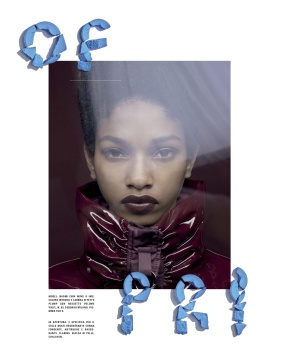
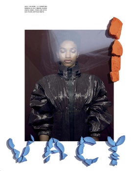
From a far those things they used to build the letters look like tampons in title of Karen's editorial, it's hilarious how hard they try and yet end up with nothing. Comte went off with Vittoria, Naomi looks really beautiful, love the mood of Gigi's editorial, Imaan's is just a waste of paper, Karen looks stunning obviously and that family editorial is cute.
TommysBaby
Well-Known Member
- Joined
- Feb 1, 2019
- Messages
- 184
- Reaction score
- 153
Gigi's cover was sufficient! Wasted opportunity with Imaan and Karen. I like Nora's editorial - would love to see her on the cover someday too.
russianelf
Well-Known Member
- Joined
- Aug 21, 2014
- Messages
- 1,361
- Reaction score
- 747
Give Hugo Comte the cover already!
MON
Well-Known Member
- Joined
- Jun 20, 2009
- Messages
- 12,628
- Reaction score
- 5,179
The Magazine has a NEW ART DIRECTION
Observations:
1. The WeIrD text in Karen Elson's video runs all through out the magazine. Its an eyesore. WhO evEr tHouGht tHaT thIs lOoKs goOd neEds To gO
2. In the MASTHEAD page (where Farnetti's name is located), the VOGUE ITALIA logo is encircled and its connected to a quote that says "Fashion is Bigger than a Dress - FRANCA SOZZANI". Odd. Are we playing name associations now? Basking on Franca's former glory still?
3. The pages are cleaner, back to white pages. They removed GB's sepia backdrop.
4. The page numbers are written TWICE on the same page. "DNA In Fashion Vogue Italia 327" on TOP and on the BOTTOM
5. Article titles are also written ON EACH PAGE of the article. I mean?????? Maybe they're scared that reader's might forget the title? I don't know. Who are your readers, Centenarians??
For a man of his age, Farnetti is so out of touch. He needs to go.
Benn98
Well-Known Member
- Joined
- Aug 6, 2014
- Messages
- 42,531
- Reaction score
- 20,511
The Magazine has a NEW ART DIRECTION
Observations:
1. The WeIrD text in Karen Elson's video runs all through out the magazine. Its an eyesore. WhO evEr tHouGht tHaT thIs lOoKs goOd neEds To gO
2. In the MASTHEAD page (where Farnetti's name is located), the VOGUE ITALIA logo is encircled and its connected to a quote that says "Fashion is Bigger than a Dress - FRANCA SOZZANI". Odd. Are we playing name associations now? Basking on Franca's former glory still?
3. The pages are cleaner, back to white pages. They removed GB's sepia backdrop.
4. The page numbers are written TWICE on the same page. "DNA In Fashion Vogue Italia 327" on TOP and on the BOTTOM
5. Article titles are also written ON EACH PAGE of the article. I mean??????
For a man of his age, Farnetti is so out of touch. He needs to go.
Noticed that as well! I've been meaning to post some excerpts in the Magazine Redesign thread.
caioherrero
Well-Known Member
- Joined
- Sep 2, 2017
- Messages
- 2,864
- Reaction score
- 1,427
Post the pic of the masthead?The Magazine has a NEW ART DIRECTION
Observations:
1. The WeIrD text in Karen Elson's video runs all through out the magazine. Its an eyesore. WhO evEr tHouGht tHaT thIs lOoKs goOd neEds To gO
2. In the MASTHEAD page (where Farnetti's name is located), the VOGUE ITALIA logo is encircled and its connected to a quote that says "Fashion is Bigger than a Dress - FRANCA SOZZANI". Odd. Are we playing name associations now? Basking on Franca's former glory still?
3. The pages are cleaner, back to white pages. They removed GB's sepia backdrop.
4. The page numbers are written TWICE on the same page. "DNA In Fashion Vogue Italia 327" on TOP and on the BOTTOM
5. Article titles are also written ON EACH PAGE of the article. I mean?????? Maybe they're scared that reader's might forget the title? I don't know. Who are your readers, Centenarians??
For a man of his age, Farnetti is so out of touch. He needs to go.
dior_couture1245
Fat Karl
- Joined
- Jan 30, 2006
- Messages
- 9,225
- Reaction score
- 4,737
Completely agree.Give Hugo Comte the cover already!
He’s proven to me, pretty quickly, that he has an eye and some personality...which is more than I can say for almost all new generation photographers working today. His work is referential, but still manages to have a sense of his own individual point of view...much in the way that Meisel could do Avedon, or Penn or DiCorcia, etc, etc, etc. while still remaining Meisel.
I feel that what Vogue Italia should do is take a chance...as they did with Steven Meisel, and commit to a 100% working relationship with Hugo, with a lot of creative freedom. All covers and all cover stories. Why not?! I get the sense that Hugo is someone that would push himself, if given the opportunity to run free, as Meisel did for so many years at the head of this magazine.
Plus...I’m finding that a big problem with print magazines these days is they’ve lost all personality and point-of-view and the desperation to please everyone by trying everything is very apparent. And in the digital age, when they already are at a disadvantage, all the more reason to need something, and someone strong to guide them. It’s their only chance of survival. It would be very refreshing and positive to have someone young and seemingly talented like Comte be given this opportunity to grow and express and develop an important and meaningful career. That’s totally lacking in fashion now - the ability and willingness to nurture someone creatively.
TommysBaby
Well-Known Member
- Joined
- Feb 1, 2019
- Messages
- 184
- Reaction score
- 153
Sounds very amateurish and r/fellowkids.The Magazine has a NEW ART DIRECTION
Observations:
1. The WeIrD text in Karen Elson's video runs all through out the magazine. Its an eyesore. WhO evEr tHouGht tHaT thIs lOoKs goOd neEds To gO
2. In the MASTHEAD page (where Farnetti's name is located), the VOGUE ITALIA logo is encircled and its connected to a quote that says "Fashion is Bigger than a Dress - FRANCA SOZZANI". Odd. Are we playing name associations now? Basking on Franca's former glory still?
3. The pages are cleaner, back to white pages. They removed GB's sepia backdrop.
4. The page numbers are written TWICE on the same page. "DNA In Fashion Vogue Italia 327" on TOP and on the BOTTOM
5. Article titles are also written ON EACH PAGE of the article. I mean?????? Maybe they're scared that reader's might forget the title? I don't know. Who are your readers, Centenarians??
For a man of his age, Farnetti is so out of touch. He needs to go.
VogueGirl8910
Well-Known Member
- Joined
- Apr 14, 2008
- Messages
- 51,234
- Reaction score
- 8,123
I don't get it why this issue is relate to DNA? Nothing, is a bunch of editorials than appears on every fashion mag. Hate the new art direction & the Hugo Comte's story saves this issue & the inspiration of this photographer it seems to be Steve Hiett for the style of take pictures.
Similar Threads
- Replies
- 36
- Views
- 11K
- Replies
- 14
- Views
- 4K
- Replies
- 105
- Views
- 36K
- Replies
- 18
- Views
- 3K
Users who are viewing this thread
Total: 2 (members: 0, guests: 2)