Vogue Korea January 2017 : Milla Jovovich by Mario Sorrenti

I like the concept of the first cover but the execution is a big fail imo. I prefer the second one :smile:
 
I like the concept of the first cover but the execution is a big fail imo. I prefer the second one :smile:

You took the words out of my mouth indeed :smile: Why did they pick that first one where they cut both of her legs and the hands are not well, her face is like she is falling and wow major fail, the second one is more standard, but I would not call it an outstanding success either, it looks like they were in a rush with both images, the second one actually gives me a ``wait I´m fixing the light Milla and then we take the shot´´because she does not look like she is totally ready for her face to be photographed. Do you know what I mean?
 
^LOL yeah, it´s like she´s asking a question and got photographed in the middle of it.
I just noticed that these are by Sorrenti :o double fail, I expect more from him.
 
Cover 2 is nice but her expression is a bit awkward
I like the styling, colors & photography a lot
 
Milla is starting to morph into Linda Evangelista.

Both covers are forgettable.
 
The first cover is amazing. She's everywhere now.
 
Milla is starting to morph into Linda Evangelista.

....which is why I can't stand the second one. She must stop with the plastic surgery, it's enough now!

The first cover however really intrigues me, and if I'd see it, I'd buy it. It's the shade of blue, and the movement. Love it. It's just their weird obsession with italics and caps, still not as bad as Dutch Vogue.

She seems to consistently book these indie-style Vogues (Ukraine, Italy, Portugal, now Korea). It's commendable to see her go with the flow each time for something more contemporary, and not resort to the Kate/Gisele type of referetial approach.
 
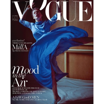
^^^ The color-palette of the first cover is rich and gorgeous.

The image is a hilarious mess, though: She looks like she’s taking a drunk tumble into the Vogue masthead. It’s such an unflattering, graceless composition, with the skirt wrapping around her open legs like a quesadilla LOL The shot reminds me of SNL alumni Molly Shannon’s character of Mary Katherine Gallagher and her creepy, spastic habit of falling backwards into prompts. Well done VK if that’s who you’re attempting to conjure with this hilarious, hot-mess of a cover. Mary Katherine Gallagher lives!
 
Mario Sorrenti hasn't really captured either the verve or the vulnerability of Milla. The pictures of her by Talia Chetrit in the latest issue of Pop make this look like commercial movie press shots.
 
What a disastrous set of covers. I can see what they're trying to do, but the execution was awful. The first cover feels like she was dancing and the shot they chose was the exact moment when she was just about to topple. The layout (especially the logo placement of the O) does not help the image at all. Instead of looking elegant, they managed to make her look clumsy. What a big joke.

The second cover looks lovely in terms of her beauty. What's gorgeous woman indeed. But what puts me off is the styling. The suit doesn't fit her. It's too big on her. The sleeves look bad. Really bad. It's not appealing at all.

Vogue Korea seriously needs to stop with this HorribLe LayOut of ThEirS. I dOn'T knOw whAt thEir rEadErS fINd AppEaLinG wiTh THiS? It doesn't look elegant. It doesn't fit Vogue. It doesn't feel classy. No. stop it.

One thing I love about Vogue Korea (excluding their layout) is that they produce really good content.
 
Vogue Korea seriously needs to stop with this HorribLe LayOut of ThEirS. I dOn'T knOw whAt thEir rEadErS fINd AppEaLinG wiTh THiS?

Lmao, ditto! I can deal with the italics, but not the caps/lower case mash up.
 
The first one looks like an accident. Literally.
The second one is very meh.
 

Users who are viewing this thread

New Posts

Forum Statistics

Threads
210,752
Messages
15,126,816
Members
84,486
Latest member
dkim991905
Back
Top
monitoring_string = "058526dd2635cb6818386bfd373b82a4"
<-- Admiral -->