I like this, the main font that Vogue Korea use on their covers however is not appealing. the random letters highlighted in the different colour is a bit weird to look at also.
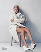
I love this, this is a great artistic cover: great use of the black & white whish I usually hate for a cover. Carolyn has been featured in the past on several Korean Vogue covers so it's nice to see her again there, love the pose, the clothes look great and great coverlines' placement too. Good job
This site uses cookies to help personalise content, tailor your experience and to keep you logged in if you register.
By continuing to use this site, you are consenting to our use of cookies.