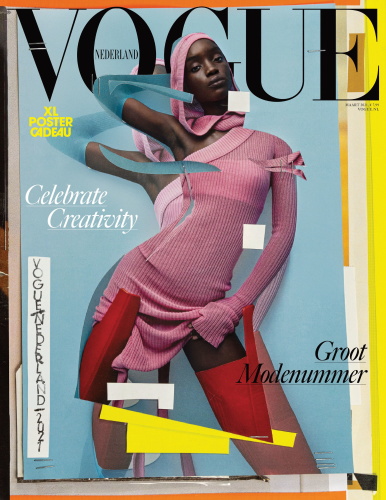
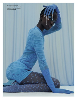
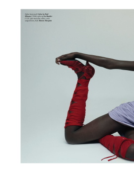
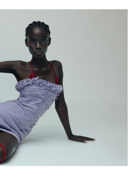
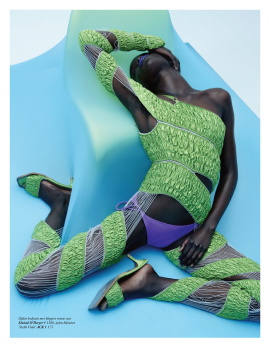
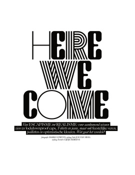
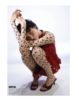
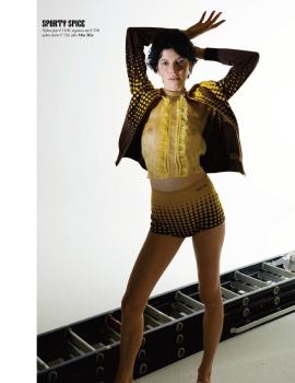
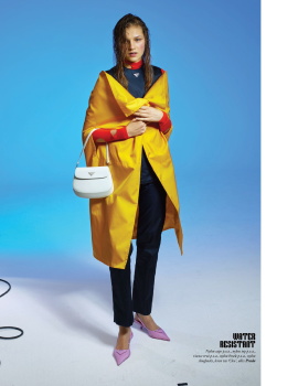
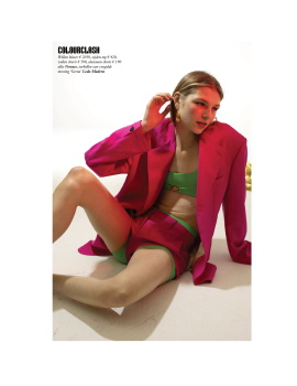
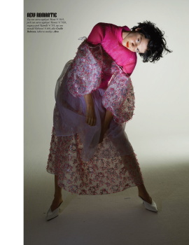
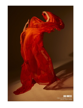
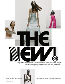
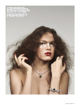
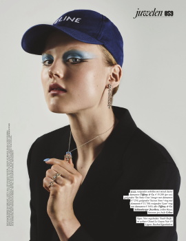
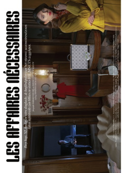
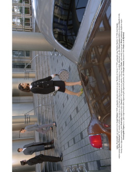
Really appreciate the art direction effort of this issue if I’m being generous. At this point, you either just accept the VP lil sis shadow— or you despise it and nothing works. Good art direction unfortunately can’t hide/save/elevate the overall weak concept, photography and styling. The only redeeming story of the lot is Sarah Van Rij’s “Les Affaires Necessaires” with its 1960s Catherine Deneuve lonely housewife cinematic vibe: She's really good. But in relation to the rest of the issue, which is a celebration of Black influences in fashion/pop culture in all its graphic pop colors, it’s so out of place.
Frankly, Vogue Netherlands is becoming more and more appropriate as a Vogue Paris supplement.