kokobombon
Well-Known Member
- Joined
- Oct 7, 2007
- Messages
- 18,503
- Reaction score
- 1,769
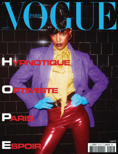
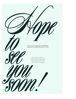
I like the cover image but that layout... 
The simple fact that they used the literal translation of the word Hope (Espoir) to relate to the E at the end of the word is hilarious!I laughed out loud when I read the cover lines. Having work at fashion magazines and with the French.
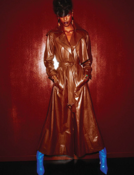
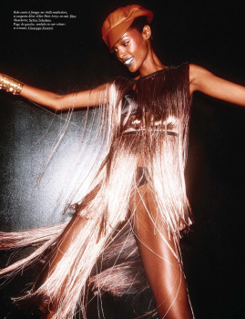
Still, this cover is what I've expected. It's unapologetically 80's and I really like it.
That being said, there wasn’t any other way to place the Hope thing on the cover? And I can only laugh at imagining what the meeting looked like when they tried to find words to relate to each letter of HOPE (Paris, Espoir) lol
The simple fact that they used the literal translation of the word Hope (Espoir) to relate to the E at the end of the word is hilarious!
Like yes, French are clueless when it comes to English but come on Emmanuelle! LOL
I totally understand the difference of realities from the US and European market. Let’s be honest, diversity on the cover works in terms of image and brand value but does not always translate in sales. The thing with VP is to now be diverse in it pages. This is the hope all the Vogue should commit to. Prior to Edward, US Vogue was the only Vogue to have women of colors in it pages every month.If brands like VP acknowledged that they have a poorly diverse past and made a loud and proud commitment to doing better in the future then maybe covers like this wouldn’t feel so performative
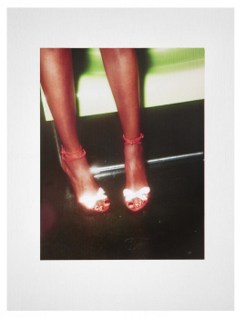
You love it because it’s Vogue Paris. The cover is too weak for September, and is this shot in a random washroom using a Nokia phone?