I'm not mad at this at all, it looks good. With this and Natalia's cover last month, perhaps I am starting to see a bit of a directional promise, or maybe it's the repeated white background.
Absolutely hideous! And the masthead doesn't appear to be blending in with the image. I don't think I like their 'direction', whatever it is. It's not bringing anything new to the table which begs the question why they even bothered to launch another magazine.
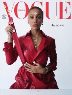
She styled her own cover?? Writer, stylist, watch, she'll shoot her own cover next. Can't believe the passes this girl is getting and with not much of a professional modelling career.
This trend will all come down like a pack of cards.
So bored of Tim Walker...every shoot looks the same with little style or substance. I'll hold my tongue on Adwoa as my feelings re her modelling are not positive, to be frank.
Totally off topic for Vogue Poland but I'd much rather see a cover from Nick Knight...to me he is extremely under utilised and has far much more to offer. His work is on a completely different level to Walker imo.
No. And what's with the awful art direction behind her holding the belt up towards the V of the Vogue as if to blend in with it? I can't believe the whole industry often makes it appear like it's so hard to create a beautiful cover image these days. Really? It's not hard!
I'm really tired of being negative, but come on... What are those little flowers? They put one on her forehead and photoshopped more on the logo? Her hand on her tummy looks like her lunch from Chipotle didn't agree with her. I'm sure she was very gassy on set. Her eyes are dead and she's holding that belt like its a plank of wood. Talk about a generic looking cover.
This site uses cookies to help personalise content, tailor your experience and to keep you logged in if you register.
By continuing to use this site, you are consenting to our use of cookies.


 Her hand on her tummy looks like her lunch from Chipotle didn't agree with her. I'm sure she was very gassy on set. Her eyes are dead and she's holding that belt like its a plank of wood. Talk about a generic looking cover.