GivenchyHomme
Well-Known Member
- Joined
- Sep 3, 2009
- Messages
- 5,077
- Reaction score
- 3,653
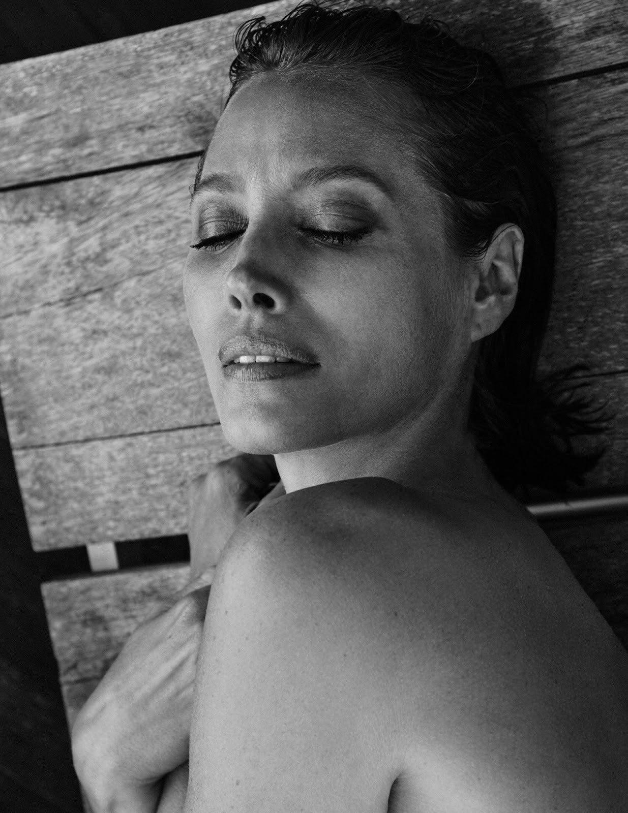
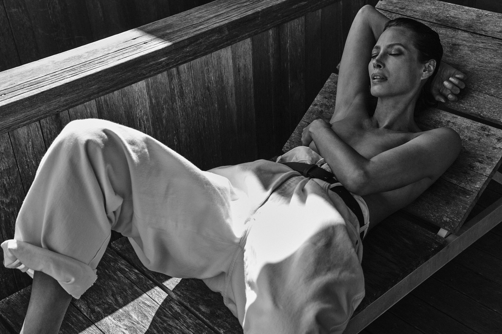
But that's why black and white pictures are bad because people like you think that they can take any picture put it in grayscale in photoshop, adjust the contrast and that's great. That is not black and white photography and a picture like that is not great. You should go back to schoolCheck out classics like Rodchenko or Man Ray that's pure black and white photography and I don't see many people creating 'easy and safe' photographs like that anymore, even when photography is very popular and inexpensive currently.


Were not talking about out Man Ray here.
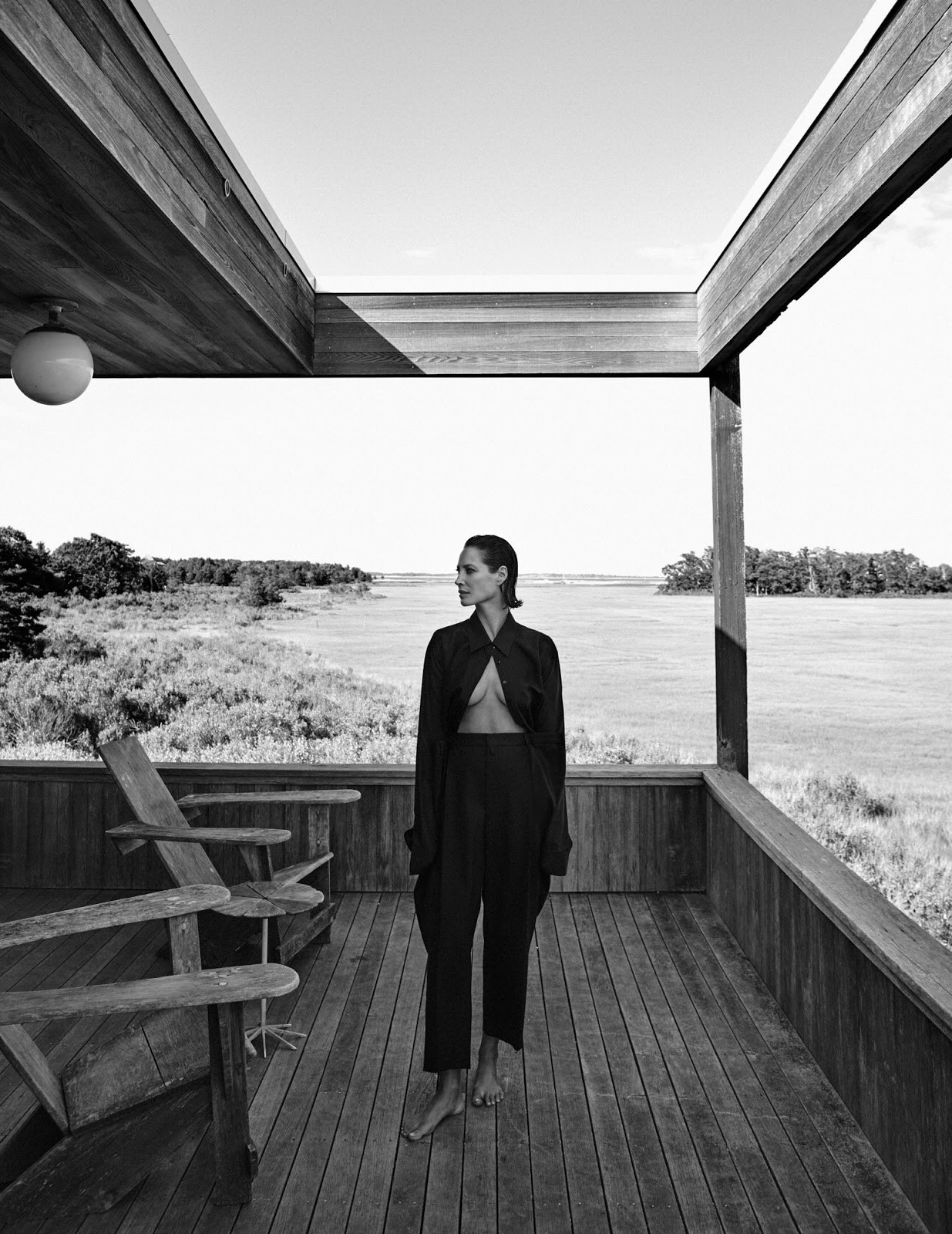
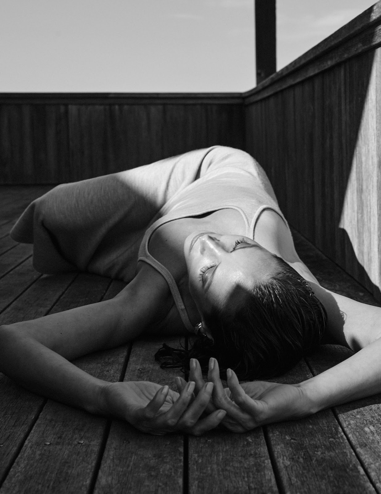
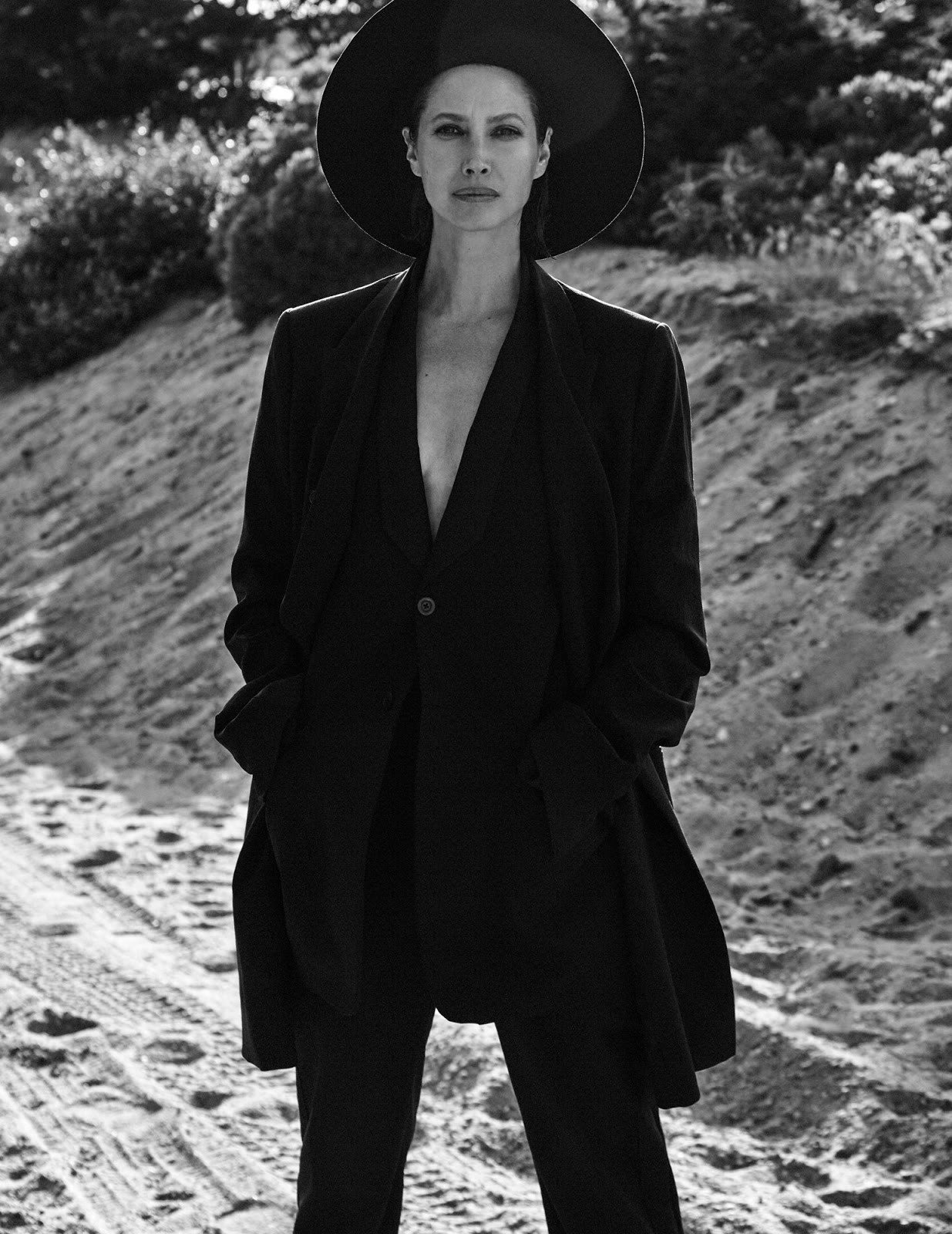
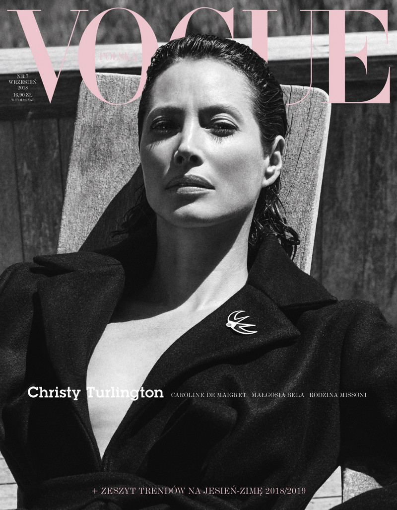
 I’m not criticizing all photography, just fashion photography. This isn’t the golden days of Avedon. There’s an artistry missing these days. Photography was a craft and a skill, now everything is digital. Very few photographers make black and white look beautiful and artistic. Meisel is one of the very few that combine art and commerce. Like I mentioned above it’s my opinion that advertisements and covers should be in color, unless they are beautifully executed. I’ve been disappointed many times when I’ve seen an amazing and colorful collection that have fallen flat when shot in black and white. Vogue Paris and Vogue Italia created some exceptionally beautiful black and white covers in the mid 2000s. I really haven’t seen anything that good since. This cover is what I mean by artistic and beautiful
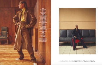
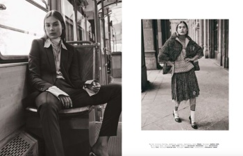
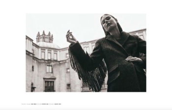
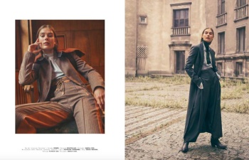
Designscene
Last edited: