Vogue Portugal July/August 2021 : The Nonsense Issue

I actually like the NASA cover. It's so relevant what with the Richard Branson enthusiasm.
Until I scrolled down to see the boots. What a way to ruin a cover.

Anyway, this edition should be permanently renamed to The Nonsense Edition.
 
I've seen them do worse concepts, "nonsense" at least is a self aware way to have some fun...and showcase those absurd Balenciaga boots.

Either way the rest of the Vogues will be a reprint special all year round...
 
I actually like this, especially second and third cover (I like the color scheme and Fryderyka on the latter).
 
VP won VI theme this month… VI deliver the Nonsense issue month after month disguised as another theme.That being said, i like the second cover….
 
Correct me if I am wrong, but we have see this? I thought all magazines followed nonsense topic for the past 4 years???
 
I love the concept behind the issue and the 1st and 2nd covers are great in my opinion. Can't wait to see more!
 
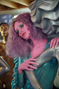
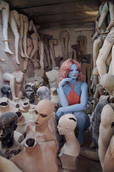
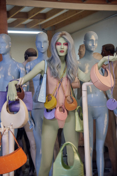
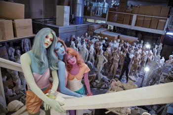
Given the state of magazines at the moment, I've gone from seeing Vogue Portugal as "try-hard" to thinking "at least they're trying".

Vogue Italia as we knew it is long gone, but what's sprung up is this disciple, still trying to keep a tiny bit of the faith alive, with the limited measures they have to hand.

That's not a commentary on how good the magazine is - it's a reflection of how bad most other ones are.
 
What is with portuguese flag? I am confused.
As magazine, they hardly ever support or speak or country the magazine should support. No portuguese models, no support to portuguese brands... even they hardly speak of fashion on inside.

This magazine with past publishing team already had some severe problems with reprint, how promotion it was done wasn't enough to support a small industry but how this team choices to do it is even more critical - magazine is basically a mash up of easthood european + american pop culture.
 
Just the second cover fits the theme for this issue & i don't get it the other two are related.
 
I really like the first cover, just a mashup of different things and references. The second one with color would've been great.
 
KIM POSSIBLE
Photographer:
Jamie Nelson
Stylist: Karen Levitt
Hair: Elsa
Make-Up: Lottie
Models: Kyla Shay, Savannah Lehman & Moa Aberg


helloadhesive.com
 

Users who are viewing this thread

New Posts

Forum Statistics

Threads
211,795
Messages
15,164,253
Members
85,690
Latest member
156sprinter
Back
Top
monitoring_string = "058526dd2635cb6818386bfd373b82a4"
<-- Admiral -->