You are using an out of date browser. It may not display this or other websites correctly.
You should upgrade or use an alternative browser.
You should upgrade or use an alternative browser.
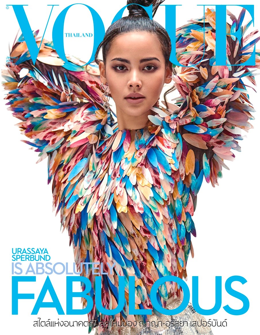
Vogue Thailand January 2019 : Urassaya Sperbund by Joseph Degbadjo
- Thread starter ChicSaks
- Start date
Agreed! While I like that they chose a blue that matched the dress, I'm not hot on the font chosen for the text at the bottom. The white background balances out how colourful the dress is for me, but a quick glance and it looks like they accidentally photoshopped her arms out because of the pose.It had all the elements of being a stunning cover, but it fell flat.
jeffandtheworld
Active Member
- Joined
- May 11, 2009
- Messages
- 1,136
- Reaction score
- 33
Oh no honey.. somebody needs an art director..
phungnam96
Well-Known Member
- Joined
- Jul 7, 2011
- Messages
- 1,093
- Reaction score
- 729
Maybe it's time to ignore this edition like people in this forum do to Taiwanese Vogue...
Benn98
Well-Known Member
- Joined
- Aug 6, 2014
- Messages
- 42,531
- Reaction score
- 20,512
I like the colour of that font, that's it. Not a fan of these floral outfits on magazine covers. Too obtrusive. And in my mind it's probably a onesie, like the one Karlie Kloss wore on Vogue Spain last year.
This magazine started off on a high and I liked it for some time afterwards. Even when they covered local celebs. But lately it's just gone off.
This magazine started off on a high and I liked it for some time afterwards. Even when they covered local celebs. But lately it's just gone off.
phungnam96
Well-Known Member
- Joined
- Jul 7, 2011
- Messages
- 1,093
- Reaction score
- 729
This magazine started off on a high and I liked it for some time afterwards. Even when they covered local celebs. But lately it's just gone off.
I know some people from Thailand who will buy this for their social life... the fact that this magazine is only for “elite class” is a big let down on how they serve it. Last month the main ed is completely a Steven Meisel’s rip off that shows how pretentious the scene is. I don’t care about this edition anymore like many people here so let it be its own way.
versustito
Well-Known Member
- Joined
- Apr 19, 2006
- Messages
- 10,953
- Reaction score
- 707
Amazing cover 

Ken Doll Jenner
Well-Known Member
- Joined
- Feb 2, 2018
- Messages
- 1,069
- Reaction score
- 1,420
I can see the appeal of that Vuitton dress. It has an over-the-top quality that would appear eye-catching on the newsstand, which explains why several editors have put it on their respective covers (I believe that cover of VP with Kaia also used this dress, and there’s also a Vogue spain cover with Alicia iirc). But shooting it from this angle and with that pose is risky if the model can’t take that much fabric. The outfit is clearly overwhelming the model here. Maybe instead of that dated, armpit-showing pose, they should’ve just gone with a beauty shot.
WilliamsLe010919
Well-Known Member
- Joined
- May 26, 2010
- Messages
- 642
- Reaction score
- 141
the cropping definitely destroyed a promising cover
Urban Stylin
ɐʎ ʎǝɥ
- Joined
- Jul 16, 2003
- Messages
- 20,676
- Reaction score
- 3,260
Agreed, the blue is an eyesore! The model and the blouse plus the clean white background were enoughIt had all the elements of being a stunning cover, but it fell flat.
The colors are an eyesore, the layout is no better.
Similar Threads
- Replies
- 10
- Views
- 2K
- Replies
- 68
- Views
- 19K
- Replies
- 25
- Views
- 15K
- Replies
- 39
- Views
- 9K
Users who are viewing this thread
Total: 2 (members: 0, guests: 2)
New Posts
-
A Retrospective : US Harper's Bazaar under Anthony Mazzola (1972–1992) (1 Viewer)
- Latest: blueorchid
-
-
-
-


