This ed is so boring and uninspired...at this point Kate is like one of those annoying dads who turns up to every school dance to embarass their kids, she's where she's not needed...she needs a vacation (and I would say the same for M&M too judging by this lame ed)
^ Don't get me wrong the cover is great, but this ed is so boring and just an edgier repeat of the TopShop ad. Look at what Interview did with their one designer showcases, it was wonderful and I know Alex White can do much more than this.
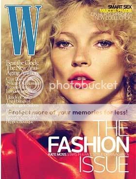
^^^finally! the cover!!! but the yellow text is kind of irritating and not complimenting. the blue text is just fine for me. thanks for posting Miss D.!
The ed's decent. It gives the clothes a different feel, which is nice. But the hair is awful, it's like what any hairstylist would try like hell to keep from happening.
But I'm with Fiercification. I'm tired of being force-fed Kate Moss all the time. I've had my fill.
This site uses cookies to help personalise content, tailor your experience and to keep you logged in if you register.
By continuing to use this site, you are consenting to our use of cookies.