Interview August 2010 : Marion Cotillard by Mikael Jansson

ahaha, well, there are always mesh handkerchieves and good old blur

Yes, that counts as an evasive manouvre :lol: And I have nothing against them, either...I definitely prefer non-photoshop solutions to imperfections - I'm not sure why it works better that way, in general.
 
^ I was under the impression the grain was intentional throughout cover and ed.
All of the bw images in Marion's editorial have a grain in them which supports the 70s 'pin-up' vibe.

Yes, it's most likely intentional...the only thing I like about the cover is the grainy, texture quality. I've yet to see a 70s pin-up displaying so little emotion...that's my main problem with the images...
 
Modern Love
Ph: Craig McDean
Styling: Karl Templer
Models: Freja Beha, Dan Kling


My Scans
 
Love the cover.

Kwonsm posted this already in Patricia's thread:

Interview Magazine August 2010
Photographer: Craig McDean
Stylist: Karl Templer
newyorkmodels
One more shot of Patricia from the front of the book:


My Scan
 
^^ I'm in love with this spread!:heart:
Thank you for the amazing scans.
 
i am in love with the dark feel of the modern love spread. freja went in!
 
Wow, I love the Freja/Dan editorial. Really amazing. Thanks for scanning!
 
MODERN LOVE is amazing :woot:
reminds me a lot of that 60+ page rock stars editorial from vogue italia a couple of years ago :heart:

this issue is a must
 
The Freja ed is good...although I'd like to see the editorials move themself out of this moody, urban aesthetic. The styling is as per usual the star of the show. Thanks Behansu.
 
Freya looks so beautiful in her ed. I'm not usually a fan of her look.
I really love the vintage aesthetic of this issue!
 
In love with Freja's ed, the dark mood of it is just amazing, i quite like her hair in it too! :wub: Thanks for scanning! ^_^
 
I picked up a copy at B&N today and have pretty much read it cover-to-cover. Lovely issue. I love how the editorials of whoever is on the cover are always quite long. I hate it when I see a celebrity I like on the cover so I buy the issue and there's, like, 3 pictures of them inside.
 
I wanted to ask if the paper quality has improved? I noticed a difference between the April, June/July issues and the March issues; the colour appears stronger and glossier.
 
Christopher Bailey
Photographer : Craig McDean
Fashion Editor : Karl Templer
Models : Patricia Van Der Vliet & Adrian Bosch

Source : interviewmagazine.com
 

Attachments

  • christopher-bailey-1.jpg
    christopher-bailey-1.jpg
    275.2 KB · Views: 22
  • christopher-bailey-2.jpg
    christopher-bailey-2.jpg
    282 KB · Views: 33
  • christopher-bailey-3.jpg
    christopher-bailey-3.jpg
    299.7 KB · Views: 26
  • christopher-bailey-4.jpg
    christopher-bailey-4.jpg
    291.2 KB · Views: 33
  • christopher-bailey-5.jpg
    christopher-bailey-5.jpg
    330 KB · Views: 27
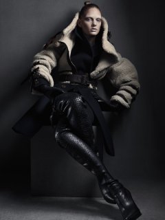
I don't like Marion's ed per se, but she is much less vapid in this ed than she has been in her other recent print work - unlike the Vogue US and HB UK (I think?) eds, this one leaves me interested in seeing stuff from her down the road.

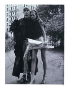
I was not impressed when I saw the thumbnails of Modern Love (Freja's ed) because it looked so repetitive and it is, plus angsty young'uns are sooo not my cup of tea, but the ed looked better than expected when I saw the photos enlarged on the noir facade blog, I don't love it, but it is not bad at all.
 

Users who are viewing this thread

New Posts

Forum Statistics

Threads
210,771
Messages
15,127,614
Members
84,504
Latest member
jenn888
Back
Top
monitoring_string = "058526dd2635cb6818386bfd373b82a4"
<-- Admiral -->