You are using an out of date browser. It may not display this or other websites correctly.
You should upgrade or use an alternative browser.
You should upgrade or use an alternative browser.
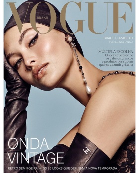
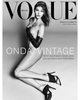
Vogue Brazil August 2018 : Grace Elizabeth by Luigi & Iango
- Thread starter MDNA
- Start date
mikel
Well-Known Member
- Joined
- Sep 30, 2005
- Messages
- 26,704
- Reaction score
- 5,813
Luigi and Iango using photoshop? NeverI like the first one, quite Meisel for Vogue Italia during the good years. Is the neck real though? It looks digitally elongated - or at least there has to be some Photoshop there.
KateTheGreatest
Well-Known Member
- Joined
- Mar 15, 2011
- Messages
- 5,450
- Reaction score
- 831
She always delivers.
tigerrouge
don't look down
- Joined
- Feb 25, 2005
- Messages
- 18,307
- Reaction score
- 8,127
The first cover shot reminds me of Gisele. The second one's just an embarrassment.
guimon
Well-Known Member
- Joined
- Dec 6, 2015
- Messages
- 3,500
- Reaction score
- 544
The first one is literally one of the best VB covers EVER! 
The VI teas are slaying my life. Just STUNNING!
I'm so surprised they went for something a little more ''high fashion''. When I read thew tittle I was ready for a commercial/smile-y cover. This got me by surprise.
Btw, VB should stop with the ''2 covers'' thing. The second one is ALWAYS unecessary. Why they keep doing that?
Phuel
Well-Known Member
- Joined
- Feb 18, 2010
- Messages
- 5,723
- Reaction score
- 8,707
The 1st cover is Vogue. Classic September issue-worthy cover. VB showing the rest how to do it right.
Timeless glamor and attitude— instantly brings back that magic from the Liz & Fabien revamped September issue of Bazaar with Linda ushering in an era of elegance. This is that stunning.
VB is easily up there as a top contender of keeping the spirit of Vogue alive and kicking.
Thanks MDNA
Timeless glamor and attitude— instantly brings back that magic from the Liz & Fabien revamped September issue of Bazaar with Linda ushering in an era of elegance. This is that stunning.
VB is easily up there as a top contender of keeping the spirit of Vogue alive and kicking.
Thanks MDNA
happycanadian
Well-Known Member
- Joined
- Mar 2, 2005
- Messages
- 8,207
- Reaction score
- 270
Grace is a superstar.
GreyVetiver
Well-Known Member
- Joined
- Apr 20, 2015
- Messages
- 464
- Reaction score
- 175
First one reminds me on Vogue Italia Oct 2014.
fashionlover2001
Active Member
- Joined
- Aug 4, 2008
- Messages
- 2,716
- Reaction score
- 4
Undeniably gorgeous covers!!! Luigi & Iango excel again, and Grace is shinning bright.
Love!
Love!
Similar Threads
- Replies
- 15
- Views
- 2K
- Replies
- 23
- Views
- 6K
- Replies
- 50
- Views
- 21K
Users who are viewing this thread
Total: 2 (members: 0, guests: 2)
New Posts
-
-
-
Matthieu Blazy - Designer, Creative Director of Bottega Veneta (5 Viewers)
- Latest: thegentlemanboyfriend
-


