You are using an out of date browser. It may not display this or other websites correctly.
You should upgrade or use an alternative browser.
You should upgrade or use an alternative browser.
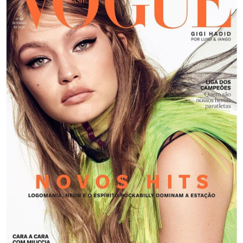
Vogue Brazil September 2018 : Gigi Hadid by Luigi & Iango
- Thread starter Vini
- Start date
guimon
Well-Known Member
- Joined
- Dec 6, 2015
- Messages
- 3,500
- Reaction score
- 544
Damn, VB is on a roll. I think this is stunning. Gigi looks gorgeous. This is once again giving me VI/Meisel teas.
I'm loving L&I for VB.
(I wish the could celebrate September with a Brazilian model. Ellen Rosa, Eduarda Bretas, Aira, Samile or someone else)
I'm loving L&I for VB.
(I wish the could celebrate September with a Brazilian model. Ellen Rosa, Eduarda Bretas, Aira, Samile or someone else)
badgalcrush
Well-Known Member
- Joined
- Mar 2, 2017
- Messages
- 728
- Reaction score
- 378
Looks like an outtake from her last Vogue Japan cover story same hair same make up ...
Luigi & Iango signature
Luigi & Iango signature
Phuel
Well-Known Member
- Joined
- Feb 18, 2010
- Messages
- 5,723
- Reaction score
- 8,707
Brazil, along with Paris, are the only Vogues that are consistently providing distinct, modern HF imagery these days.
She looks great here. Shame that they have to showcase that hideous dress— and against a white seamless. When it’s a dreadful color that bloggers and streeters already did in 2014, you know it’s over. The dreaded grey background would actually compliment this cover.
Thanks Vini
She looks great here. Shame that they have to showcase that hideous dress— and against a white seamless. When it’s a dreadful color that bloggers and streeters already did in 2014, you know it’s over. The dreaded grey background would actually compliment this cover.
Thanks Vini
D
Deleted member 1957
Guest
I actually like it, she pulled off the 60's makeup!
zacatecas570
Well-Known Member
- Joined
- Sep 27, 2008
- Messages
- 7,089
- Reaction score
- 582
I like it (eve tho I'm TIRED of Hadids on magazine covers), they are doing very Vogue Italia covers.
I like it (eve tho I'm TIRED of Hadids on magazine covers), they are doing very Vogue Italia covers.
Even the new incarnation of Vogue Italia wouldn't stoop to type treatment and layout like that! The positioning and everything seems so middle market....
Compare this with the stunning Bella Hadid covers that POP unveiled last week.....
- Joined
- Jan 9, 2008
- Messages
- 35,329
- Reaction score
- 20,365
I'm ALL for seeing Gigi Hadid by Luigi & Iango (especially given the fact their collabs for Vogue Japan have all been terrific) and this should have been a match made in heaven for September but something's missing for me. The shot itself looks like it has been rotated somewhat and just seems... off. The Prada dress clashes with the orange masthead and I'm not a fan of this 60s-esque hairstyle either.
tigerrouge
don't look down
- Joined
- Feb 25, 2005
- Messages
- 18,307
- Reaction score
- 8,127
I'm all for texture, but everything looks like it's crying out for a comb. If you had a compulsion to tidy things up, this cover would set you off.
Lola701
Well-Known Member
- Joined
- Oct 27, 2014
- Messages
- 11,482
- Reaction score
- 24,630
I feel like there's a Luigi&Iango pack when you shoot with them. Same make-up, Same hair...
I feel like i've seen it many times because i know for a fact that i've seen it too many times.
I'm not going to fall for it this time.
I feel like i've seen it many times because i know for a fact that i've seen it too many times.
I'm not going to fall for it this time.
Benn98
Well-Known Member
- Joined
- Aug 6, 2014
- Messages
- 42,530
- Reaction score
- 20,571
I'm not going to fall for it this time.


So true, while they do actually work with different editors and stylists, the result always looks the same.
From their interview with The Impression:
Working in pairs can be a challenge, too. How do you two work together?
LUIGI MURENU: Being an ex-dancer, Iango is very precise. He’s very polished and focused in all of the work that he does with the lighting, styling, and so on. I’m much more impulsive. I can decide at the last moment to propose something different for the hair and makeup, or even change the mood of the shot. But we do these things together, there is no artifice. We come together to create; we are two people in one soul, with one view.
Full interview here is worth a read as well!
Anyway, it seems this is the full edit:
Similar Threads
- Replies
- 15
- Views
- 2K
- Replies
- 41
- Views
- 11K
- Replies
- 51
- Views
- 13K
- Replies
- 22
- Views
- 7K
- Replies
- 51
- Views
- 9K
Users who are viewing this thread
Total: 2 (members: 0, guests: 2)


