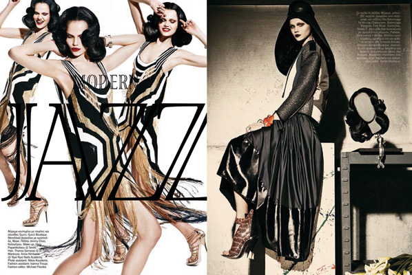
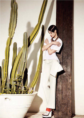
I really like the styling, the setting and the relaxed mood. But the overload of text ruins it. That orangey red doesn't suit the shot imo .
It would look so much better with less text and a different font colour. I appreciate the fact that it's not a reprint though.
This site uses cookies to help personalise content, tailor your experience and to keep you logged in if you register.
By continuing to use this site, you are consenting to our use of cookies.