You are using an out of date browser. It may not display this or other websites correctly.
You should upgrade or use an alternative browser.
You should upgrade or use an alternative browser.
Acne Resort 2013
- Thread starter Marc10
- Start date
HelplessnessGray
Active Member
- Joined
- Oct 16, 2011
- Messages
- 1,048
- Reaction score
- 0
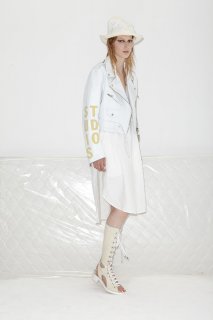
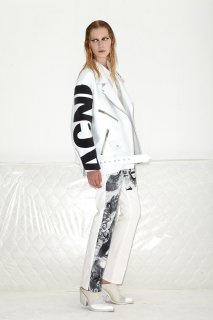
Don't like the characters on coats, weird.
Thefrenchy
Well-Known Member
- Joined
- Nov 13, 2006
- Messages
- 12,004
- Reaction score
- 1,239
I can't tell if my main problem is the clothes or the styling...
catwoman89
Member
- Joined
- Jan 22, 2009
- Messages
- 152
- Reaction score
- 0
cool shorts
TREVOFASHIONISTO
Active Member
- Joined
- Jun 2, 2008
- Messages
- 15,357
- Reaction score
- 65
i cant focus on this
Not Plain Jane
Well-Known Member
- Joined
- Mar 3, 2010
- Messages
- 15,422
- Reaction score
- 718
It's okay - maybe better than their last collection? Though I'd have to go back and look. The shift dress and longer tan shorts are both nice. Hate the logo in bold letters - UGH.
“We took a lot of influence from Madonna’s ‘Ray of Light’ video,” explained Acne creative director Jonny Johansson. If the thought of Madonna gyrating in a shrunken Lee jeans jacket conjures not-altogether-welcome memories of the denim-heavy late-nineties, not to worry. It turns out, Johansson’s actually more concerned with the time-lapse shots of teeming metropolises in the background of the Grammy Award–winning video.
“We wanted to explore the idea of a young girl who lives in a fast-paced environment,” Johansson said. “She’s the kind of person who’s quick and vocal and communicates herself in a street-style kind of way.”
It’s a subversive approach to resort—usually more associated with relaxed, warm climates—but that’s all par for the course with the ever-more forward-thinking Acne, and Johansson’s unique ability to let an initial idea germinate until it’s sprouted quirky idiosyncrasies.
Take the new money print, for instance. It was meant to evoke the hive of frenetic energy that is Wall Street—and with that, the current economic crisis, or the kinds of problems that “never seem to end,” as Johansson describes them—but blown-up and blotch-printed onto an ultra-light cotton men’s blazer, it’s hard not to discern a more playful, handmade effect. The same can be said for the dip-dyed silk shirts, intentionally given a rough finish by Johansson so it looks like the girl who inspired this season has “done it herself.” A frantic, career-driven New York girl with the time to dip dye her own silk shirts? Not likely, but a charming idea nonetheless.
Over the last few seasons Johansson has been experimenting (quite successfully, one could argue) with volume and billowing silhouettes, but this season brought with it only a few subtle nods in that direction—mainly in the form of a white leather jacket, complete with appropriately oversize Katharine Hamnett–style lettering down the backs and arms, and a pair of exaggerated men’s shorts. It all suggests that, come spring, he’ll have moved onto something else. If anyone is caught in a moment of perpetual motion, it’s Acne itself.
Attachments
-
 acne-resort2013-runway-01_100228145054.jpg125.4 KB · Views: 7
 -
 acne-resort2013-runway-02_100229949665.jpg74 KB · Views: 4
 -
 acne-resort2013-runway-03_100229760886.jpg145.3 KB · Views: 3
 -
 acne-resort2013-runway-04_100230806451.jpg119.7 KB · Views: 3
 -
 acne-resort2013-runway-05_100230618540.jpg155.5 KB · Views: 3
 -
 acne-resort2013-runway-06_100231247111.jpg98 KB · Views: 5
 -
 acne-resort2013-runway-07_1002326831.jpg153.5 KB · Views: 4
 -
 acne-resort2013-runway-08_100232592768.jpg101.8 KB · Views: 4
 -
 acne-resort2013-runway-09_100233675905.jpg131.1 KB · Views: 2
 -
 acne-resort2013-runway-10_100234382344.jpg121.4 KB · Views: 3
Last edited by a moderator:
Fatalefashion
Active Member
- Joined
- Dec 2, 2009
- Messages
- 2,923
- Reaction score
- 0
Don't like the characters on coats, weird.
I agree cheap idea, well amazing collection

i agree with you NPJ.....this is much better to me than any of their recent main collections. i actually really enjoy the culottes.....there's something in the way they're cut that make them look attractive to me. yes the currency prints are a bit kitschy but i kind of like how it's applied here. it's not so ostentatious when you pair it with these simpler pieces,so it gives it a sort of subtle humour or irony. and i know it's done to death already but i love that degrede affect in that last look.
Similar Threads
Users who are viewing this thread
Total: 2 (members: 0, guests: 2)


