You are using an out of date browser. It may not display this or other websites correctly.
You should upgrade or use an alternative browser.
You should upgrade or use an alternative browser.
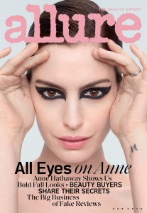
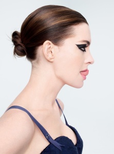
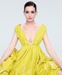
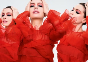
Allure September 2019 : Anne Hathaway by Solve Sundsbo
- Thread starter vogue28
- Start date
serendipity8777
Well-Known Member
- Joined
- Oct 5, 2009
- Messages
- 1,750
- Reaction score
- 150
phungnam96
Well-Known Member
- Joined
- Jul 7, 2011
- Messages
- 1,127
- Reaction score
- 759
the worst Solve Sundsbo has ever delivered
D
Deleted member 1957
Guest
The idea wasnt bad I love the dark makeup with the powdery colours but thats about it. The text and the subject dont work for this. Such concepts need high fashion models. Imagine if it was Maria Carla or Liya.
FashionMuseDior
Well-Known Member
- Joined
- Feb 27, 2012
- Messages
- 1,782
- Reaction score
- 705
It'd been if the art direction would've made the studio shoots blurrier and more whimsical which is Sundsbo's style.
tigerrouge
don't look down
- Joined
- Feb 25, 2005
- Messages
- 18,294
- Reaction score
- 8,097
There are a lot of people on whom this look would have been spectacular.
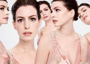
And they probably could have made Anne look good by carefully selecting the angle of each shot. But no, they had to give us a panoramic collage of all the ways in which this doesn't work.
And they probably could have made Anne look good by carefully selecting the angle of each shot. But no, they had to give us a panoramic collage of all the ways in which this doesn't work.
GivenchyHomme
Well-Known Member
- Joined
- Sep 3, 2009
- Messages
- 5,251
- Reaction score
- 4,391
These magazines would save a lot of money if they toned down the retouching. Anne is beautiful. All she would need is a few little touch ups. Instead they went to town on her face.
kokobombon
Well-Known Member
- Joined
- Oct 7, 2007
- Messages
- 18,644
- Reaction score
- 2,007
I don´t like it but at least it kinda looks like old Allure 

tigerrouge
don't look down
- Joined
- Feb 25, 2005
- Messages
- 18,294
- Reaction score
- 8,097
Flicking through this online, it seems to be 124 pgs, with a lot of L'Oreal ads and a subsequent 1 pg interview with spokesmodel Duckie Thot, and Bambi Northwood-Blyth in a fashion editorial. They already seem to have abandoned their back page feature looking at people's beauty spaces, because it's another picture of Anne instead, wearing a stupid hat. A shot that they almost chose for the cover.
Source: reading Allure every month through my local library's free access to rbdigital.com

Source: reading Allure every month through my local library's free access to rbdigital.com

Similar Threads
- Replies
- 14
- Views
- 2K
- Replies
- 24
- Views
- 11K
- Replies
- 241
- Views
- 56K
- Replies
- 2
- Views
- 3K
- Replies
- 22
- Views
- 5K
Users who are viewing this thread
Total: 2 (members: 0, guests: 2)


