-
Announcing... The 3rd annual theFashionSpot Awards for 2025. Vote NOW via the links below:
Designer of the Year
Ready-to-Wear Collection of the Year
Haute Couture Collection of the Year
Model of the Year
Photographer of the Year
Stylist of the Year
Magazine Cover of the Year
Ad Campaign of the Year
Thank you for participating!
VOTING WILL CLOSE 29/12/2025 EOD!
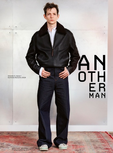
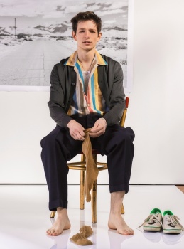
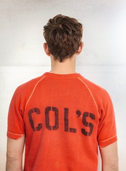
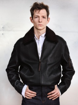
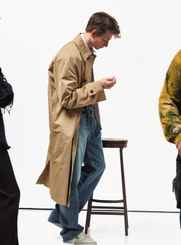
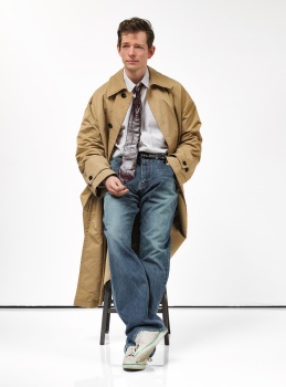
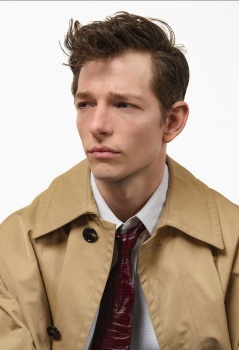
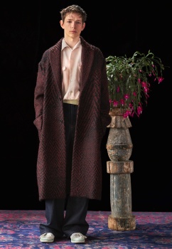
AnOther Man Spring/Summer 2024
- Thread starter Marc10
- Start date


Similar Threads
Users who are viewing this thread
New Posts
-

-

-

-
 Jonathan Anderson - Designer, Creative Director of JW Anderson & Christian Dior (5 Viewers)
- Latest: fenty
-