• The Red Carpet Highlights of... The 77th Annual Cannes Film Festival 2024!

  • We experienced a brief downtime due to a Xenforo server configuration update. This was an attempt to limit bot traffic. They have rolled back and the site is now operating normally. Apologies for the inconvinience.

Boss F/W 2015.16 : Edie Campbell and Clément Chabernaud by Inez and Vinoodh

marcBarna

Well-Known Member
Joined
Aug 4, 2010
Messages
29,041
Reaction score
286


style.com

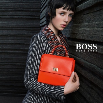
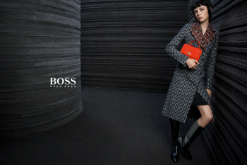
For Fall, Boss is channeling a Berlin mood with a campaign starring Edie Campbell and Clément Chabernaud. Shot by Inez van Lamsweerde and Vinoodh Matadin, the ads see Campbell and Chabernaud posing inside rooms built of dark gray felt. The goal? Add something unexpected into the Boss vernacular.

“There’s an edge about the two of them, which is something that we did not explore as much in the first two campaigns,” explained Jason Wu, Boss’ artistic director. “It’s an interesting evolution. Clément has a very masculine look but also possesses a refinement that is extremely modern, while, for me, Edie is the face of this generation. They both bring that refreshing sense of now.” For the images, the pair’s movements were coached by Stephen Galloway, resulting in a statuesque nature that touches on the stoicism of the Fall 2015 collection.

Preview the campaign exclusively here, and stay tuned for more from Boss.
 
I never disliked Edie. In fact, I liked her a lot a year ago.

However, she's starting to bore me. She's outdated. Trite. Stale.
A dynamic model would have made the boring clothes and setting come to life. I'm sure there was enough budget to hire Raquel Zimmermann.
 
^agreed, a more dynamic model would've made this better. Amanda Murphy would've looked great. Still, this isn't terrible.
 
And yet again the mens shots are way more appealing than the womens. Edie isn't a terrible model, but she just needs to take the quirk down a bit. Jason Wu needs to get his sh#t together because I've not seen a good campaign since he took control.
 
In the first two pics I think there is way too much negative space it just looks odd. Edie is quickly becoming lackluster in my eyes and this campaign is easily forgettable - YAWN.
 
I found the collection to be very rigid and reminiscent of old Germany and the scenery is not.helping.at.all. :shock:
 
I love Edie and Clément, but I don't know, something is bothering me in these pictures. I find them a bit boring and not very powerful.
 
It's nothing. But I don't expect more from this brand.
 

Users who are viewing this thread

Back
Top
monitoring_string = "058526dd2635cb6818386bfd373b82a4"
<-- Admiral -->