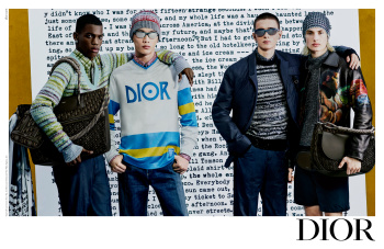
The single shot with the green background is the strongest in terms of image. The Jack Kerouac writing-backdrop in the other shots looks very amateurish and distracting. It might have worked well as the set design, but as a backdrop to the campaign? Not so sure...
The styling in that group shot, don't get me started. Terrible!