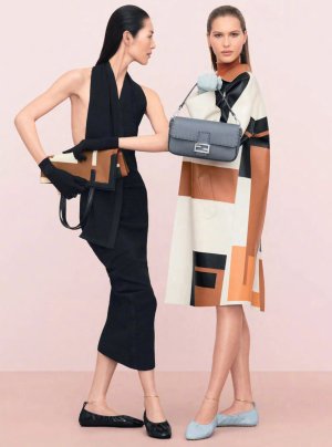
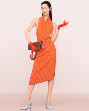
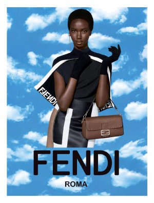
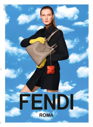
Fendi S/S 2024 by Steven Meisel

The clothes and the bags look awful, the worst colour combinations. Still can't fathom how this is also a S/S collection. Maybe that's why they added the clouds, to make it look more on season but really it does the opposite.
 
Is Meisel trolling Ethan James Green with this? It looks so much like his "inspired by Meisel" work.
Or EJG is the main assistant these days and that's the reason he is booked solo this often...

Still can't belive that this art director is same person who was behind many iconic Lanvin campaigns
 
Last edited:
I'm still baffled that this campaign is credited to Meisel... I never would've thought it was his work. It's as if he hates Kim Jones, he's produced some of his worst work to date for that man.
 
Don't kill me but somehow I like it. Each girl looks stunning. I love the one with Julia.
 
Always and forever will I come to Steven Meisel's defense but I do find myself unable to defend this! Static, amateur and lackluster beyond belief. The art direction is what ultimately kills Meisel's photography! Those portraits of the girls would've been far superior and less offensive without that atrocious sky backdrop.
 
The photographs look good but the ad campaign is ruined by the awful sky background.
 
Why is it that 99% of fashion/art photography nowdays look so flat? There is no depth, no real shadows at all in these photos. I don´t believe digital is the only culprit. Meisel is not an amateur, he´s really cultivating this drab style of photography.
 
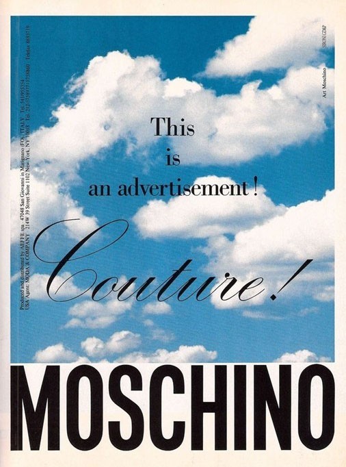
^^^Because it's catering and pandering to a demographic that is very basic--only looking at content on their phones. Amazing how this 1990 Moschino campaign still looks clever, witty and still expensive, even with no model:

1118940.jpg


Brad was so hot at the time!

I thought that maybe he had hit skid row or something by your post. He's still a handsome man. But he does look much older than his 44 years-- more like 54...

FAMILY_4_ijxigv.jpg


Anyway, not the least bit phased by how cheap and amateur this campaign looks. First and foremost, it's Kim. And by this point, they're all racing to the very bottommost of the bottom...:shrugs:
 
Last edited:
i cant with how they are cropping the girls feets/bottoms in this sky photo
 
I think the only girl Meisel shot himself was Julia. The rest just look off. Another thing, Is anyone else getting a little tired of Liu's stiff posing? I feel like all of her work is starting to bend together these days.
 
Lighting was too stark, the graphic backdrop- totally unnecessary and wrong choice.
With the criticism that Kim Jones has gotten, why was this thought of as a good direction to go in?
 

Users who are viewing this thread

New Posts

Forum Statistics

Threads
212,463
Messages
15,185,933
Members
86,335
Latest member
Roby85
Back
Top
monitoring_string = "058526dd2635cb6818386bfd373b82a4"
<-- Admiral -->