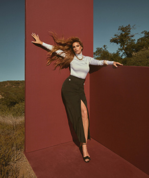
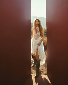
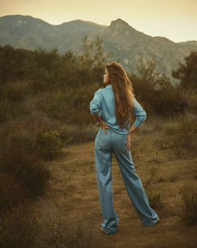
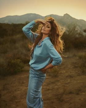
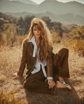
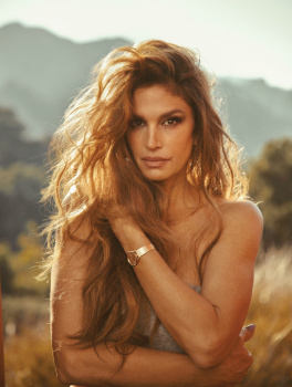
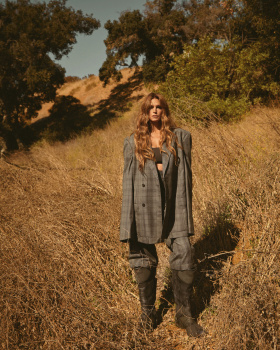
Flaunt Magazine February 2024 : Cindy Crawford by Greg Swales

This actually does make sense in terms of us saying this. You see her as somewhat closer to vacant, otherwise put more available to the mass appeal, however vulgar is not far from this. We do have "vulgarizer, vulgarization" en français not for nothing, signifying dumbing down and simplifying complexity to be more accessible after all!

While the image suits her well and is her trope, the Americana, I do agree also that it is very one note for her. Dare I say I am even surprised when people praise Cindy, who has looked and done the same for decades, and then criticize any other current model doing the same thing they may excel at after some time. But her lucky being included in the supers group made her almost immune to that, unfortunately. Unbound yasss-queenism of Linda and Meisel continues here as well, albeit more deserved.

More bluntly put, perhaps she's déclassé…

I lived through her phenomenon as a kid: The commoners all lining up to see her at malls; her MTV’s House of Style; her infomercials and product placements; and that horrid movie “Fair Game” LMFAO… In North America, she was a household brand that’s so far removed frorm high fashion. There’s never been a model that’s reached her level of commercial success since. And achieving so much on such a severely limited range— she only ever had and still has one look LOL If she ever released a tome, all the shots would looks the same… Why she won’t edge slightly off her branding in 2024, try out a more American grande dame sensibility— maybe in Marc Jacobs classic 1950s matriarchal high society preppy style meets The Stepford Wives comes to mind, rather than always rely on her same old same old wholesome 90s-branding makes her even more bland than when she was in her imperial phase of her reign.

This is what makes a lot of sense for people with varying backgrounds. Today I, and I assume many others, often forget that we are an amalgam of nationalities and generations. While she was happening I first hadn't been born and then too little to witness, and many people have skipped her prime, to whom she was ultimately rendered into irrelevance, but not because of her actions, rather her image being so strong and emblematic of that time, and Cindy failed to escape from that unlike Linda or Kate, who are more of chameleons. Cindy has a weaker grasp and on a very niche market or two: Americana and old-school sex appeal, similar is happening to Gisele now if she does not switch it up with her Mother Nature look. Linda, Kate, Christy, Amber, and etc. stuck to fashion as pure form of itself, and I feel that made them more relevant and not glued to one image/idea.


LET'S EXTEND THIS LEGACY, SHALL WE? (UHQ)
Photography: Greg Swales
Styling: Mui-Hai Chu
Hair: Dimitris Giannetos
Make-up: Harold James
Model: Cindy Crawford


flaunt.com

The photography is top tier, the style reminds me of RL ads which I also love. Hope to see more of this photographer's work in fashion.
 
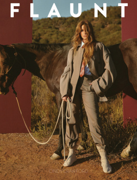
Like they animorphed Kaia with JLo. I think they were also trying to get a touch of Raquel Welch in there with "Vamp" Shana by Meisel. Kind of weird, especially that cover. The styling suits her though. That's a plus, I guess.

Mind you, what this presents is far better than what Naomi is trying to maintain. Still doesn't work, but it isn't the worst of the supermodel bunch by a long shot.
 
Definitely see some major Raquel Welch influences here, and I'm massively into it. I'm able to agree with everyone else, however, that Cindy looks unrecognizable in the cover image. There's far superior and more cover-worthy images from Greg Swales from the cover story... like those two portraits and the shot of Cindy in the brown denim suit.
 

Users who are viewing this thread

New Posts

Forum Statistics

Threads
212,571
Messages
15,189,476
Members
86,463
Latest member
Zainab s
Back
Top
monitoring_string = "058526dd2635cb6818386bfd373b82a4"
<-- Admiral -->