You are using an out of date browser. It may not display this or other websites correctly.
You should upgrade or use an alternative browser.
You should upgrade or use an alternative browser.
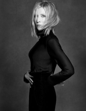
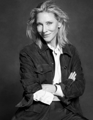
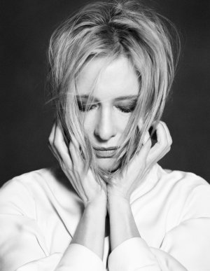
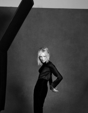
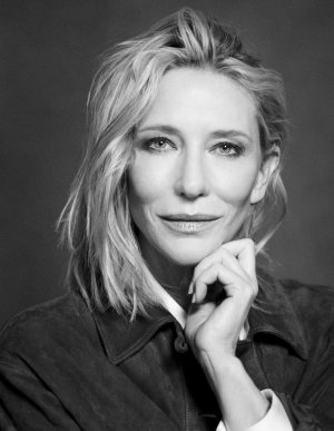
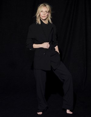
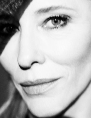
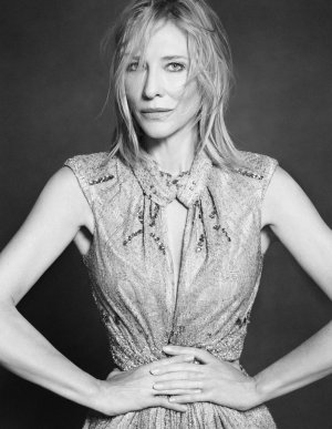
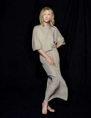
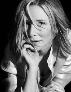
Harper’s Bazaar España February 2025 : Cate Blanchett by Nico Bustos
- Thread starter vogue28
- Start date
kokobombon
Well-Known Member
- Joined
- Oct 7, 2007
- Messages
- 18,852
- Reaction score
- 2,414
A nice cover ruined by the layout 😅
fauxfashion
Well-Known Member
- Joined
- Oct 11, 2023
- Messages
- 1,001
- Reaction score
- 3,813
Cate always sells, even this cover challenge attempt 🤗
fauxfashion
Well-Known Member
- Joined
- Oct 11, 2023
- Messages
- 1,001
- Reaction score
- 3,813
GivenchyAddict
Well-Known Member
- Joined
- Feb 5, 2012
- Messages
- 2,546
- Reaction score
- 7,070
I love her GAZE! (If you know you know).
Besides that, the layout ruined everything indeed.
Besides that, the layout ruined everything indeed.
fauxfashion
Well-Known Member
- Joined
- Oct 11, 2023
- Messages
- 1,001
- Reaction score
- 3,813
what happened on image 5 ??? 😱😵💫
a model!
Phuel
Well-Known Member
- Joined
- Feb 18, 2010
- Messages
- 6,291
- Reaction score
- 11,446
The cover select is the only worthy shot— drop dead gorgeous, actually. Very reminiscent of Barbra Streisand in the 1970s. The rest is admittedly technically solid enough: Good lighting and composition; complimentary styling; solid retouching that doesn’t turn her into a 20yo version of her current self. But Nico has absolutely not an individual expression other than copying Lindbergh. The entire shoot just rips off Lindbergh shooting Amber for Liz’s Bazaar wholesale. And unfortunate the art direction ruins a strong portrait: Spanish Bazaar can’t decide if she wants to mimic her French or Italian sister’s style. And the unfortunate, unskilled results end up looking like Glenda’s Bazaar.
Photographer: Nico Bustos
Feature editor: Paula Menendez
Stylist: Claudia Laukamp
Star: Cate Blanchette


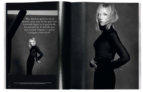
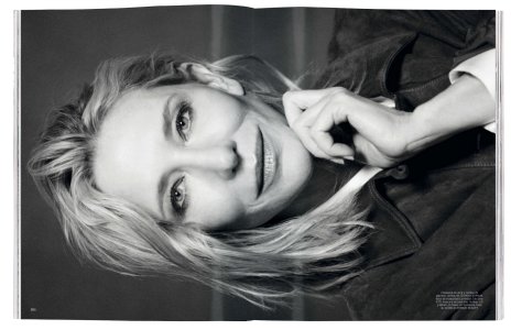
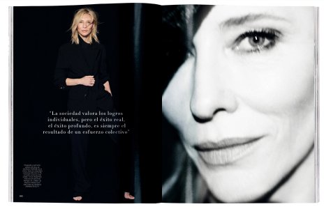
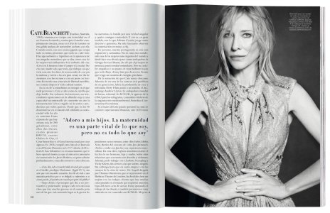
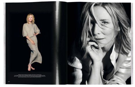
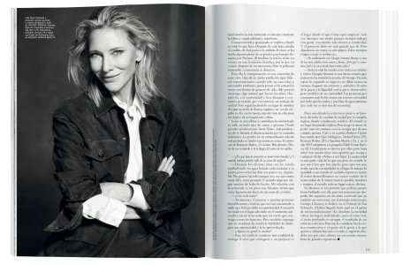
Harpers Bazaar Spain Spain February 2025
Photographer: Nico Bustos
Feature editor: Paula Menendez
Stylist: Claudia Laukamp
Star: Cate Blanchette


Harpers Bazaar Spain Spain February 2025
Deleted member 116957
New/Inactive Member
- Joined
- Apr 4, 2009
- Messages
- 13,746
- Reaction score
- 15,824
What... on earth is with that magazine "effect" in the editorial? I looked at the copy on Libby and that "effect" isn't on the ads, but on most of the regular magazine editorial pages. Please tell me this isn't how the magazine looks in real life? Oh my god... 

- Joined
- Jan 9, 2008
- Messages
- 36,923
- Reaction score
- 24,869
Questionable art direction aside (which does make complete sense for an issue centered around paper), I am loving this. Cate Blanchett looks fantastic here, love how the team has profiled Cate here. The two covers are terrific. You can never go wrong with a classic black and white studio shoot.
Phuel
Well-Known Member
- Joined
- Feb 18, 2010
- Messages
- 6,291
- Reaction score
- 11,446
The model in "La Delicadeza" has that classic androgynous physicality that, had she been shot by Meisel in Franca's Vogue 20 years ago, she would have been fully styled and shot in her androgynous gamine glory.
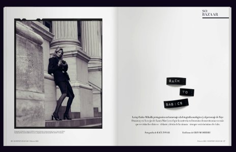
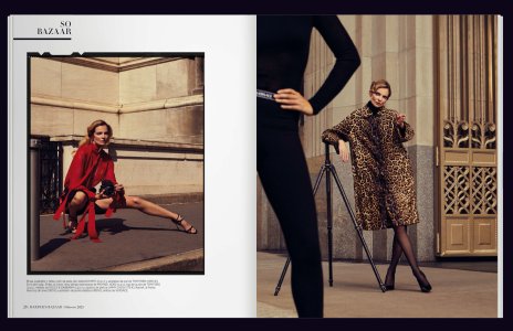
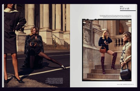
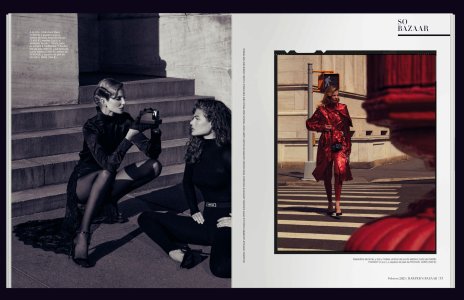
"Back to Basics"
Photographer: Raul Tovar
Stylist: Erin McSherry
"La Delicadeza"
Photographer: Javier Biosca
Stylist: Claudia Laukamp
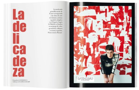
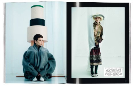
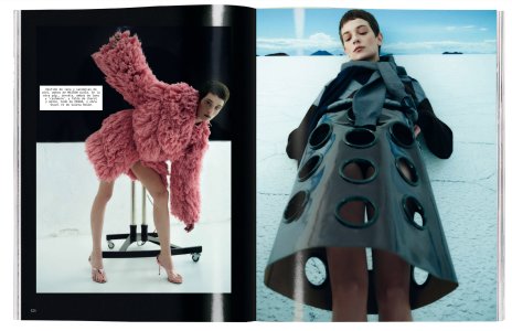
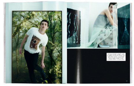
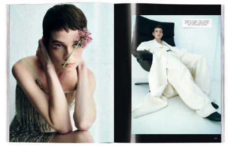
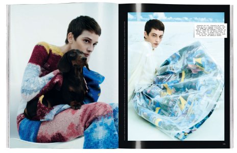
Harpers Bazaar Spain February 2025


"Back to Basics"
Photographer: Raul Tovar
Stylist: Erin McSherry


"La Delicadeza"
Photographer: Javier Biosca
Stylist: Claudia Laukamp


Harpers Bazaar Spain February 2025


The Model Gene
Member
- Joined
- Apr 27, 2022
- Messages
- 20
- Reaction score
- 17
This reminds me of Peter Lindbergh's last Pirelli Calendar, love it
Similar Threads
- Replies
- 7
- Views
- 4K
- Replies
- 34
- Views
- 4K
- Replies
- 9
- Views
- 2K
- Replies
- 3
- Views
- 2K
- Replies
- 17
- Views
- 6K
D
Users who are viewing this thread
Total: 1 (members: 0, guests: 1)

